Total Pageviews

Monday, 15 November 2010

Poster Design III

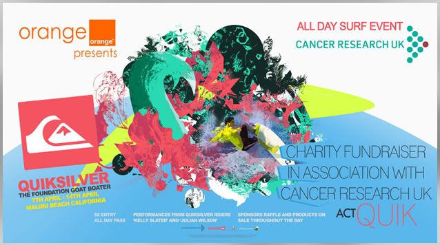
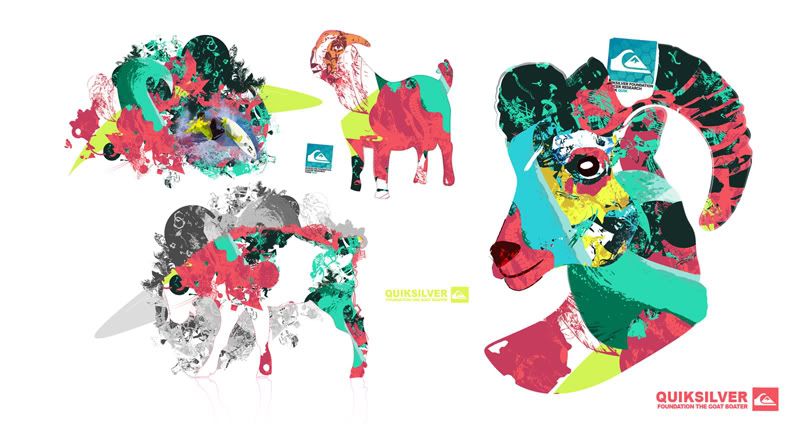
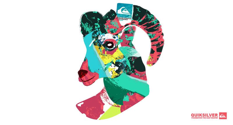
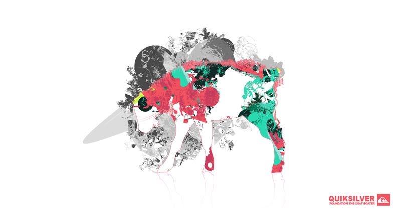
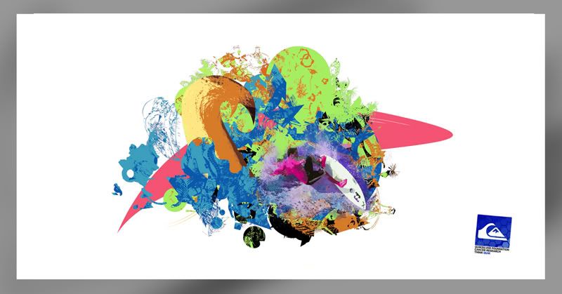
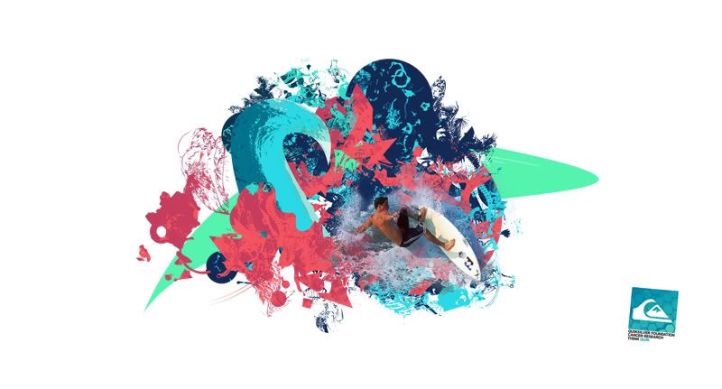
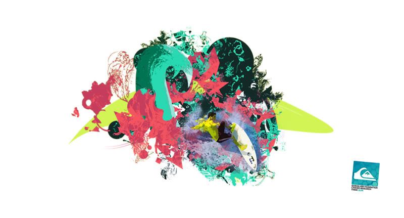
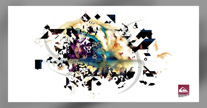
The seperate posters that are not used for promotion but for sale and event dressing. These posters will be displayed around the event with the possibility of buying them as means to donate to charity.

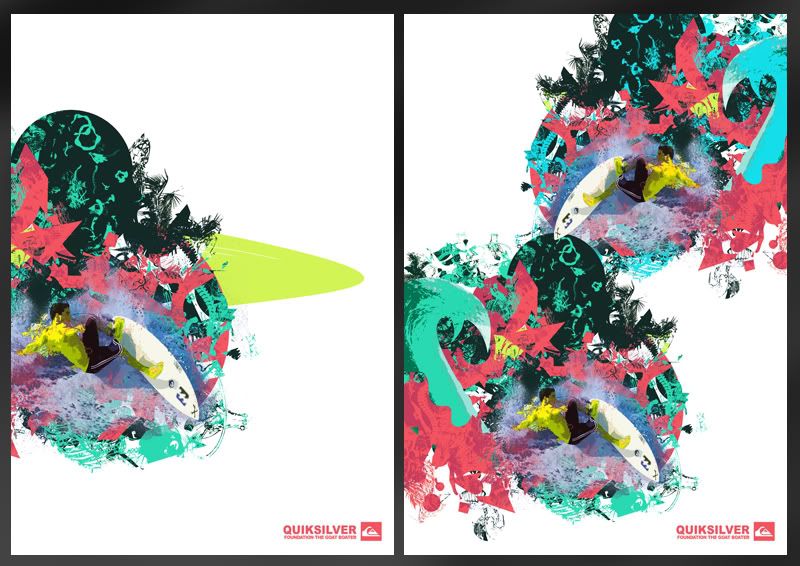
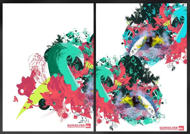
There's lots of variations to each poster, some of which I've chosen to not to upload as theres literally too many. The ones I have put together can be seen below. I'll later pick 5 of these which will be used and taken forward to print or further development if needed.
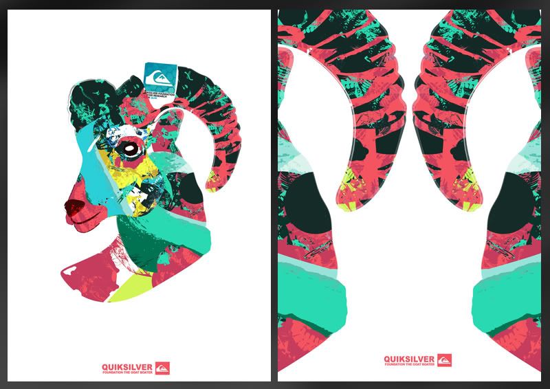
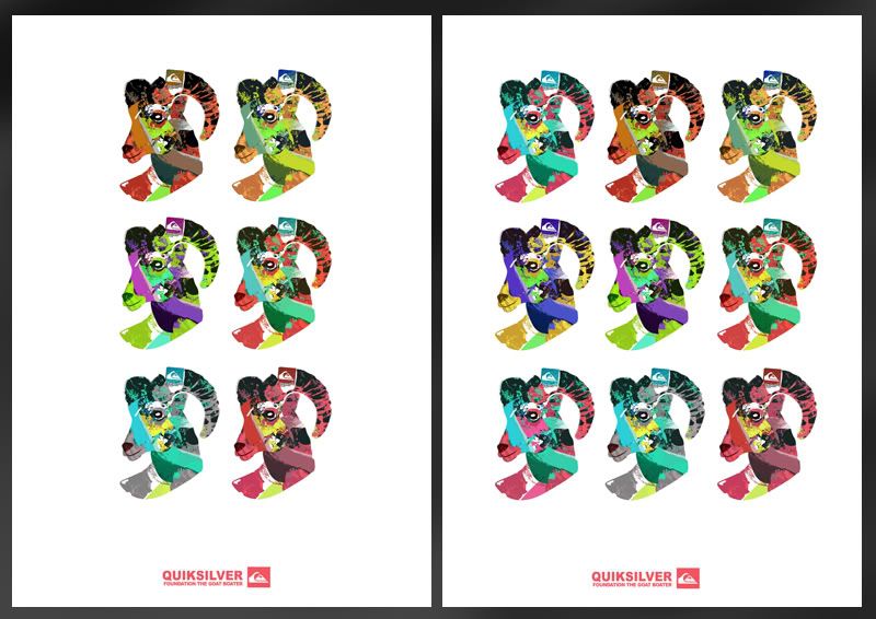
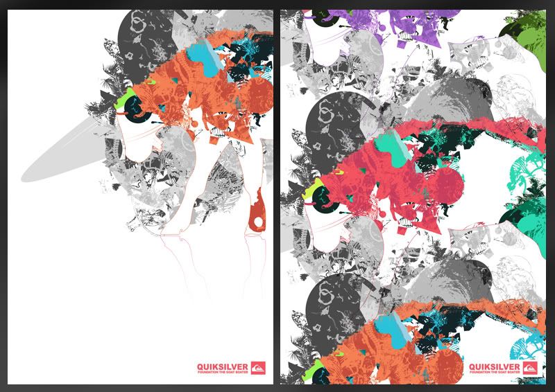
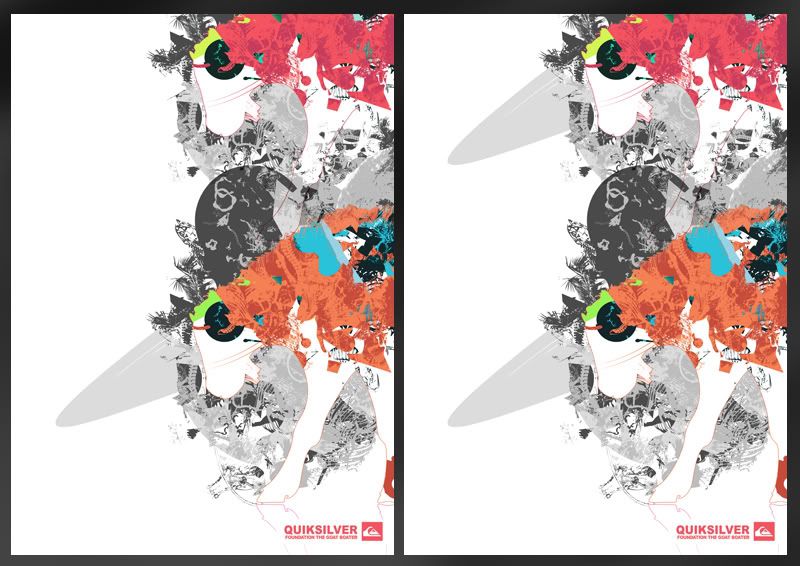
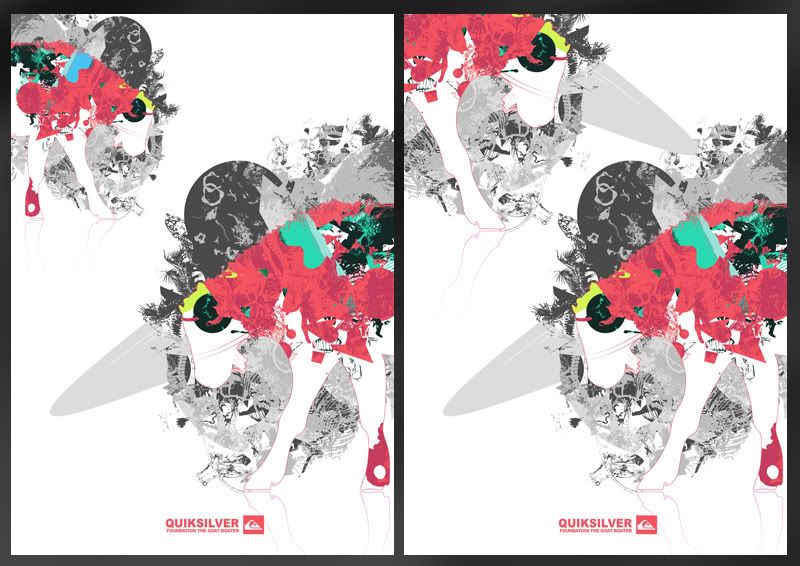
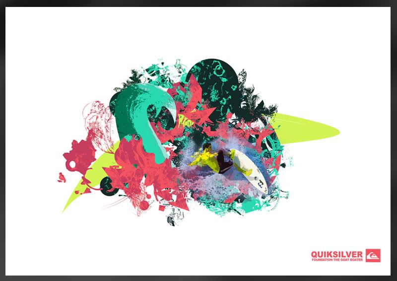


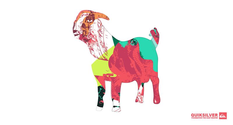
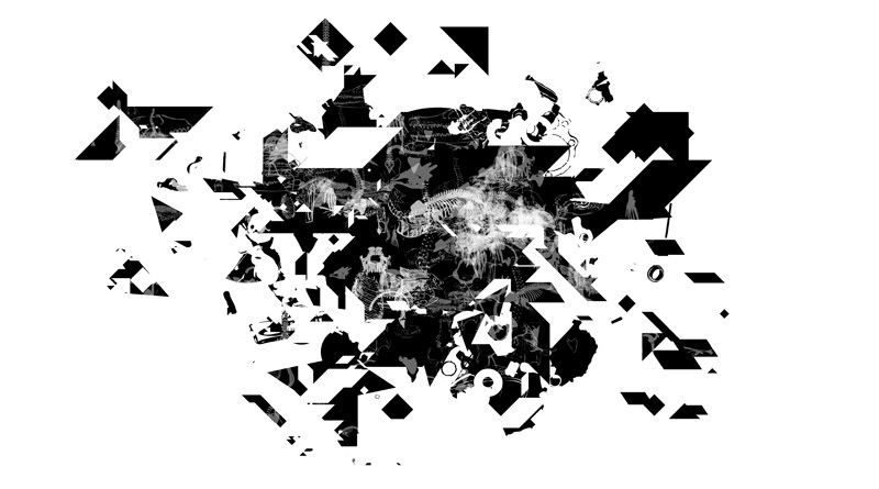
Bery clear that this image just isn't working with the others so it's getting thrown out:
Poster Design II

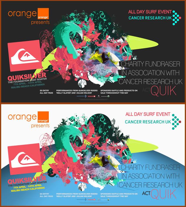
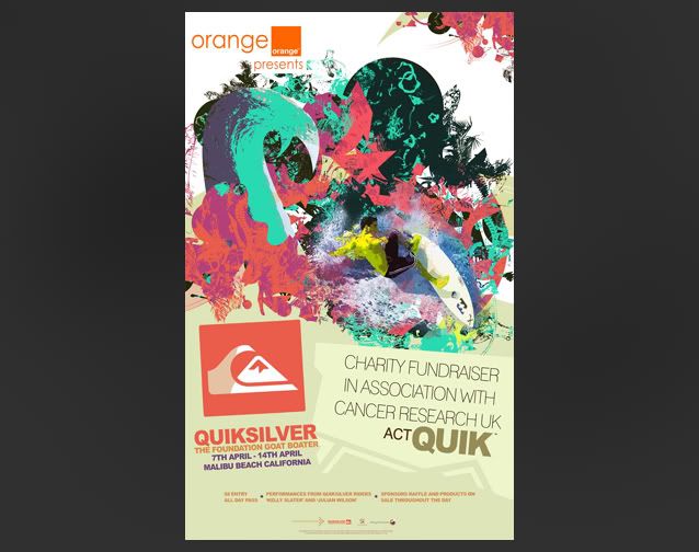
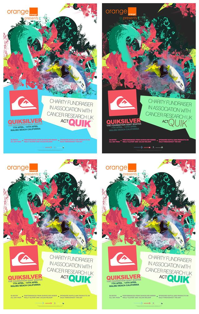
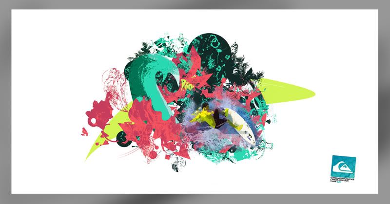
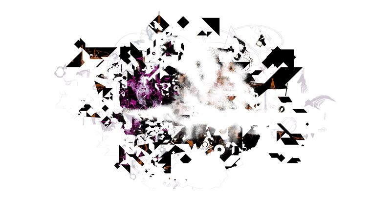
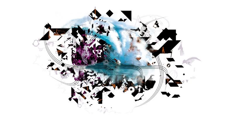
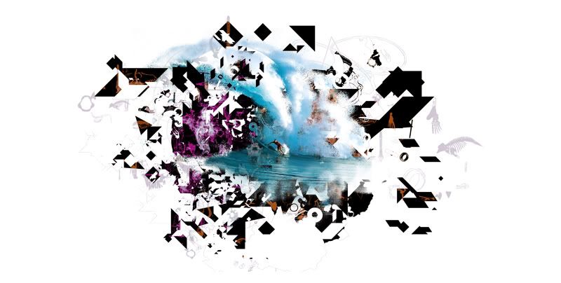
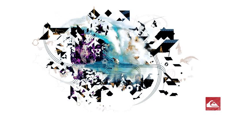
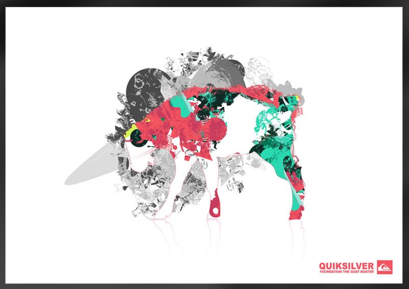
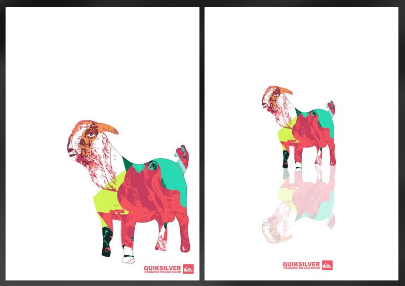
As the poster would ideally be placed in numerous areas I knew a portrait version wouldnt be enough. I think in general, the landscape version is a lot more effective. Probably mainly to fact that you can see more of the main image and theres a lot more space for text, making the poster look a little less crowded.

An issue I came across regarding colour was the blue section at the bottom. Ideally this would have been baige to match the portrait version. The problem was that with this one the surfcae area of that.. baige was too big. In my opinion it made the poster loose its impact. However using the blue really helped to make the image pop, a lot more than baige..


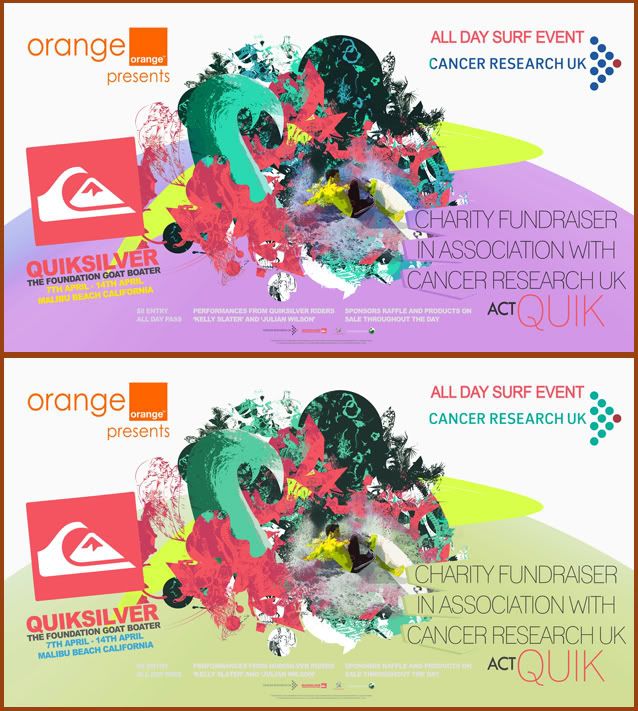
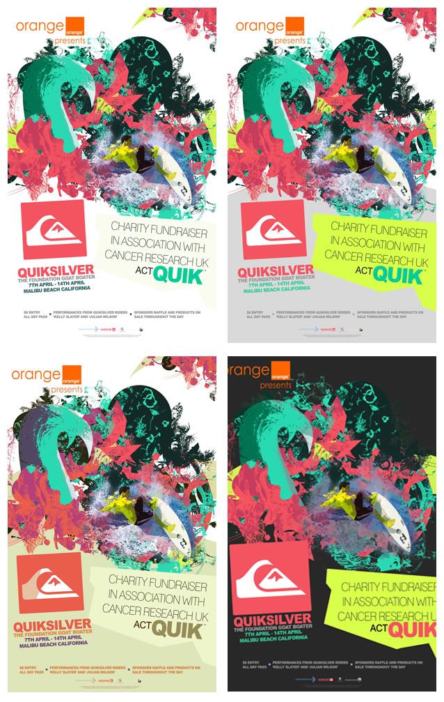
Other Colour Tests


Poster Design

When looking at some of the work I'd done before I found it hard to find a strong title image. I obviously couln't use the Goat Images as the main item because it would leave the viewer thinking I was advertising cattle.. clearly not the case.

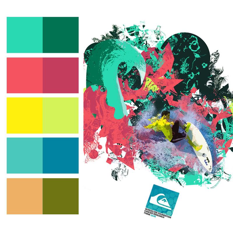
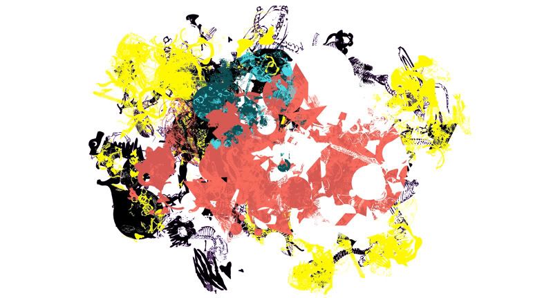
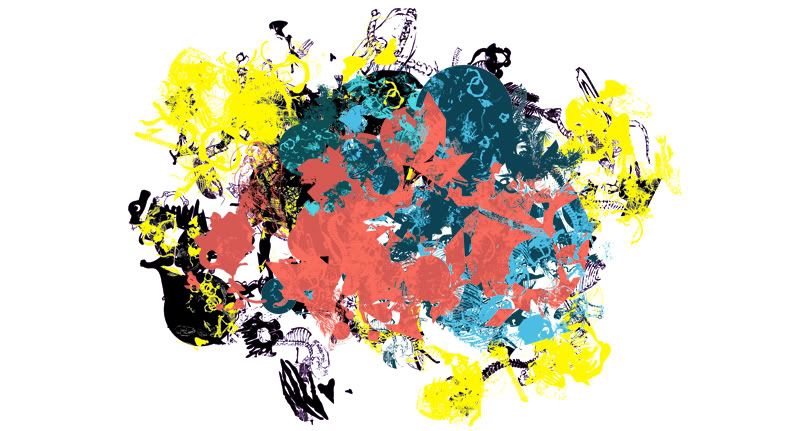
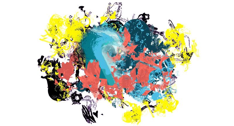
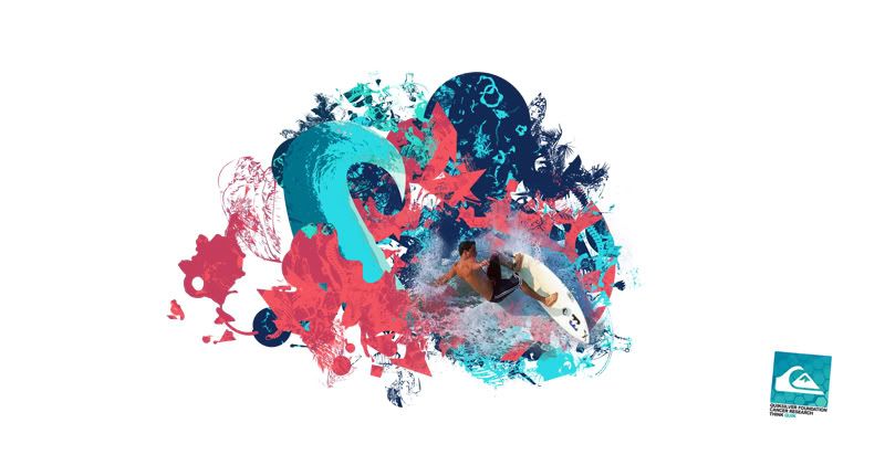
Lots of development gone into this one today thoughand I'll upload the developing work at a later stage. Found it hard to find a colour scheme that ran with the coral palette that wasn't too busy. The pallete I've got works well in highlighting details in the busy design but when used as large blocks of colour, its not as successful. To help tone down the image I did lot of experimentation into colour to find a more subtle but still effective solution, or at least in my opinion for now.


Sunday, 14 November 2010

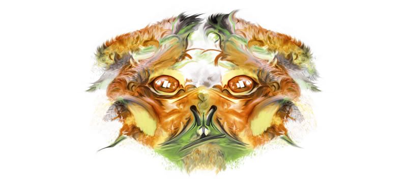
Ideas - Possible Logo - "Goat Boater"

Research

Basically I wanted to combine some of the design ideas I've being playing around with to the events title, The Goat Boater. To do this I thought it best to start getting some reference images to start working over and try to build a base for how I wanted them to look.

I've stuck with the same colour palette previously chosen as these came out best in testing and were maintained throughout for consistancy.

3 Main ideas below, there are some VERY initial ideas that I'm a little reluctant to put on as they're really quite terrible. Should also point out these are just initial ideas for now:


Friday, 12 November 2010

Confirmed Colour Palette

This is the colour palette I'll be working with from now on. The bottom two may not get used, they're more shades of the above. Using this palete however should support the consistancy of the events design.

Possible Product Range POSTER

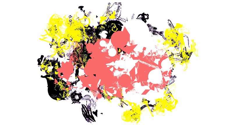
Second Idea, a little more basic, probably more effective in impact but still a tad busy.. The colour scheme on this however is something I really think is working. The pallete itself is based around the colours of coral and I've also tried to make the shapes reflect.

Out of all the colour tests so far, these really do seem to be complimenting each other well. They're relevant to the idea of water sport and are bright, drawing attention from the viewer.


Colour Variant that wasn't so successful :


Process


Thursday, 11 November 2010

Possible Product Range POSTER


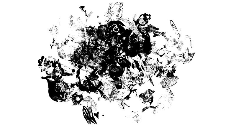
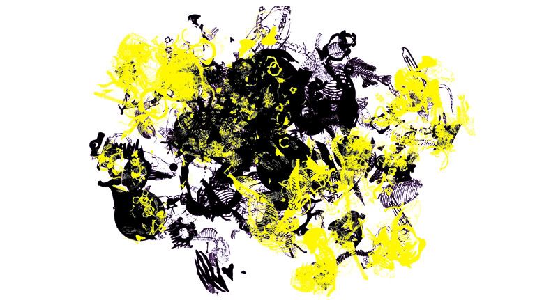
Feel like I'm starting to get somewhere with my design development now. As mentioned before it's tricky when working with an established brand to not look like your ripping off the exhisting style. I hope what's starting to show with this is the blend between the current style and my own take on top of that.

Liking the style though, something that I'll develop across some of the other products, see how it works in context etc..


Process


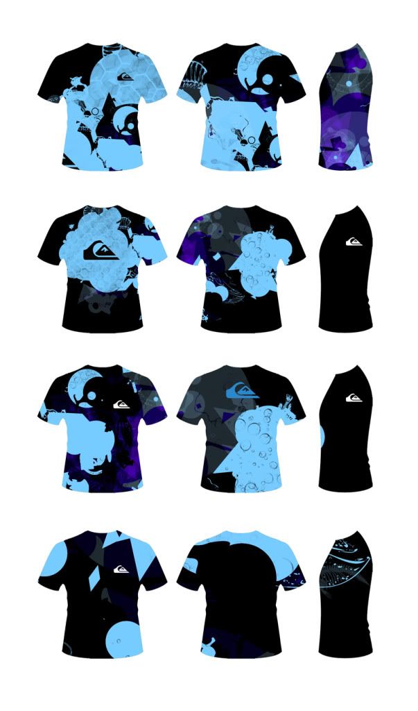
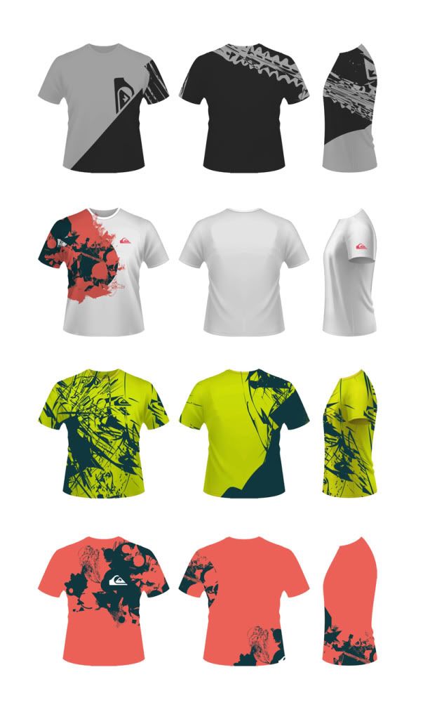
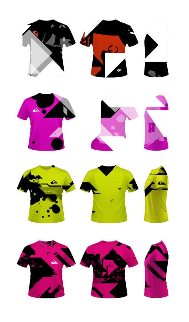
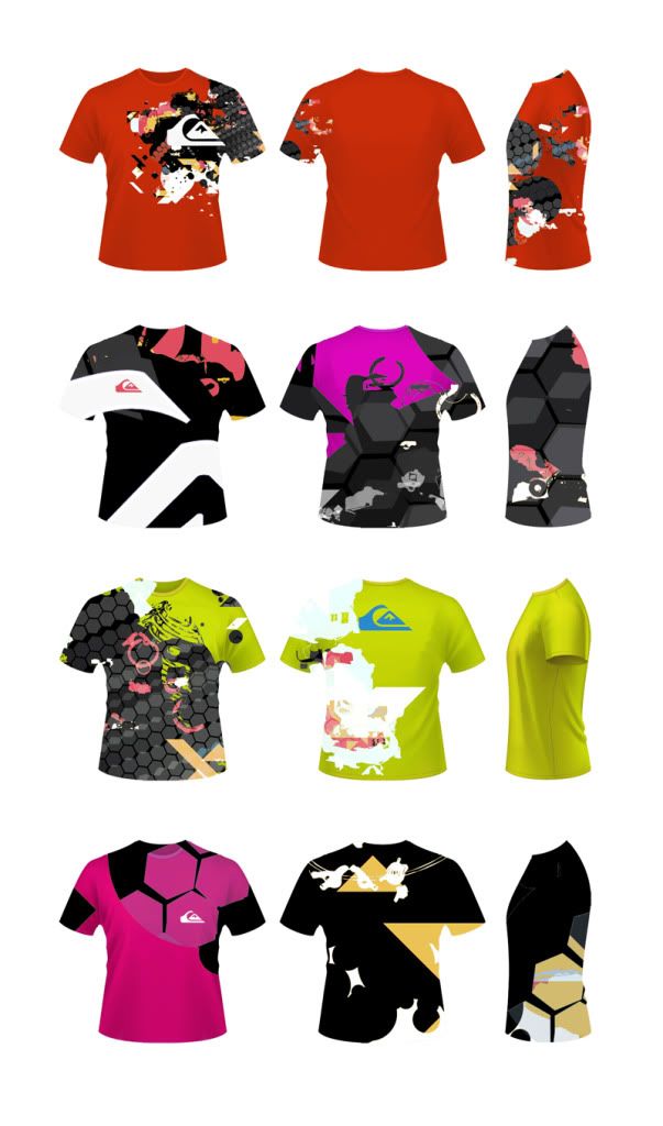
Product Range Shirts Tests

Here are some Quik designs working with vectors again. Not all of these have really being successful. I personally prefer the blue designs below although they do look a little like rash shirts (heat insulators for cold water surfing)

Second to these I also think the lime green images are also working slightly better. I reckon it's the vibrant colouring that is really making the designs stand out a little more. These designs are all full size prints that wrap around the T. This is mostly seen on more expensive products so this may have to be sacrificed to meet costing.


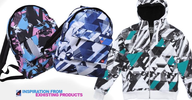
The product above are taken from my secondary research into the QS product range. Used as inspiration to my own ideas above..

Friday, 5 November 2010

Design Feedback

I conducted a ‘Quik’ questionnaire to 38 of my friends based on the initial design work. The feedback I received was that the digital paint idea wasn’t working and that I should continue to develop the vector based work.

It’s a shame really but as I personally prefer digital paint but I have to agree that in relation to the brand it is pretty out of place. I will however try blend in some other mediums to further develop the vectors.

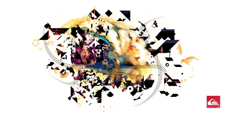
The issue that I’ve come across is that I have all these shapes that sort of relate to the idea of modern trends with some beach refs such as the bones vectors but nothing really shouts Quiksilver to me. Going to have to develop this a little more, maybe try an incorporate the surf feel into the work and also run some tests at incorporating the charity.

Tuesday, 2 November 2010

Design Test

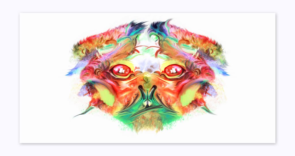
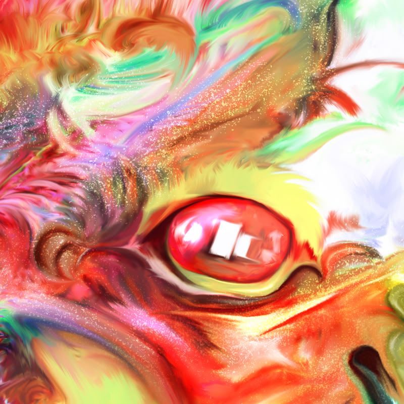
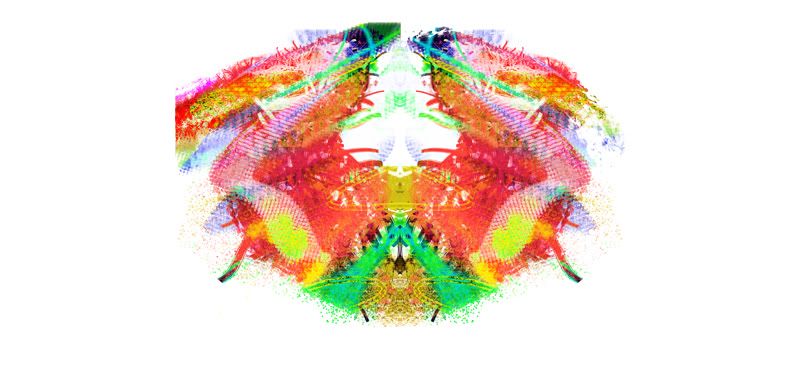
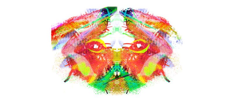
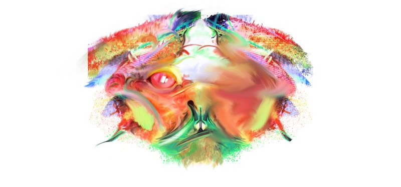
Moving away from vector work, a more traditionaly style? PS paint anyway.. Need to decide on a style that works best with the brand. I like this as a test piece but in all this probably isnt Quicksilver


Colour Vary


Process


Tuesday, 19 October 2010

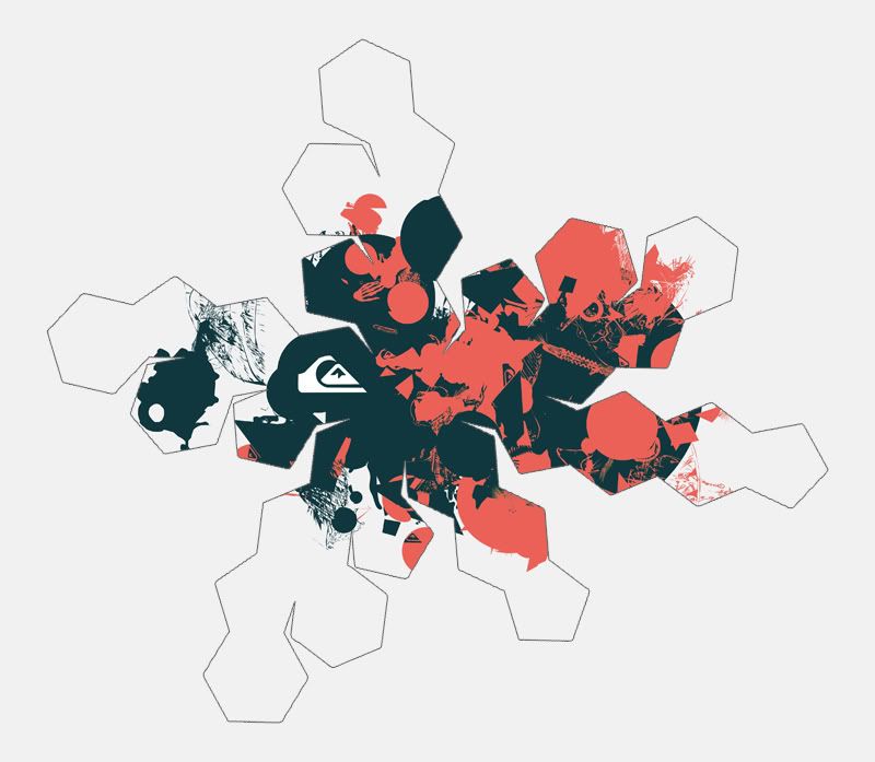
How can Nets be interesting... Continued from DC

Possible Design
Truncated Icosahedron