With the final piece I wanted to make something that contrasted ideas. During my research I picked up on a quote from a graphic design agency. The idea that trends and fashions are constantly moving and coming in and out of vogue, but maybe something that’s truly in vogue was something that contrasted the past and current.
With the design I tried to draw up a very glossy, well polished figure, symbolising the glamour and desirability that I would associate vogue to. With the quote in mind I then wanted to brake it up by contrasting it against a rough worm background.
Overall I am pleased with the design (shame it didn’t even get a single vote mind) however if I were to revisit the work I may tone out the background as its got a lot of contrast which seems to pull the viewers eyes more that the figure itself.
Total Pageviews
Saturday, 27 February 2010
Friday, 26 February 2010
Don't Panic Vouge Final Image
Tuesday, 23 February 2010
Don't Panic Vogue
This is a live breif for the 'Don't Panic', student promotions company. The brief is to design an A2 format poster based on the theme 'vogue'.
To begin with we all came up with lists of 30 words related to the theme, and then drew them as simple ideas...
Magazine
Photoshoot
Catwalk
Statement
Fashion
Style
Elite
Glamour
Accessories
Colour
Designers
Labels
Glitter
Clothes
Highly polished
Tall
Makeup
Trend
Adverts
Diet
Glossy
Cover model
Article
Editor
Cult
Worldwide
Media
Consumer
Money
Fame
The four words I've chose to use as a base for my designs are:
Glamour
Glossy
Fame
Style
Any initial work from this point will be based around the idea of these words....
Wednesday, 17 February 2010
End Of Module Evaluation- OUGD102
1. What skills have you developed through this module and how effectively do you think you have applied them?
I believe that I have learnt how to work with an idea and successfully push and develop it to a product, which got me thinking more and more about the possibilities. I’ve also further developed skills into researching and categorizing which acted as the main foundation for my collection 100 brief.
2. What approaches to/methods of research have you developed and how have they informed your design development process?
Collecting and categorising information and imagery was the only thing driving the last brief. I found that through a clear organised list I was able to structure and clearly identify my findings. The sorting of this information was essential to the final make.
3. What strengths can you identify in your work and how have/will you capitalise on these?
I think the main strength throughout this module was 100 brief. Although the image had to speed up towards the end I was really pleased with the paint effect at the start of the timeline. I found that given the time I was able to develop some more skills in Photoshop painting and try a few different techniques within the program.
I think the work done in Photoshop will aid later briefs, as I can take any initial ideas and begin to develop them further in PS.
4. What weaknesses can you identify in your work and how will you address these more fully?
Time has been a big issue with this module. Especially with the collection 100 project, as it took a very long time to find that initial idea. This is definitely something I’ll have to work on and look at ways to get that idea out there quicker.
5. Identify five things that you will do differently next time and what do you expect to gain from doing these?
Possibly look at testing more initial ideas/variations
Print out things as I go. Found that you can spend too much time on details and find that they cant even be seen when it comes to print!
Looking into creating a hard back cover. Time was an issue and there was a few issue to covering the timeline due to an oversight in its design.
Try different materials to see strengths and weaknesses appropriate to intended use.
Work more on blogs and sketchbook work. Stop seeing the end product as main target.
6.
Attendance 5
Punctuality 4
Motivation 4
Commitment 4
Quantity of work produced 4
Contribution to the group 3
Thursday, 11 February 2010
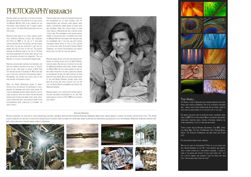
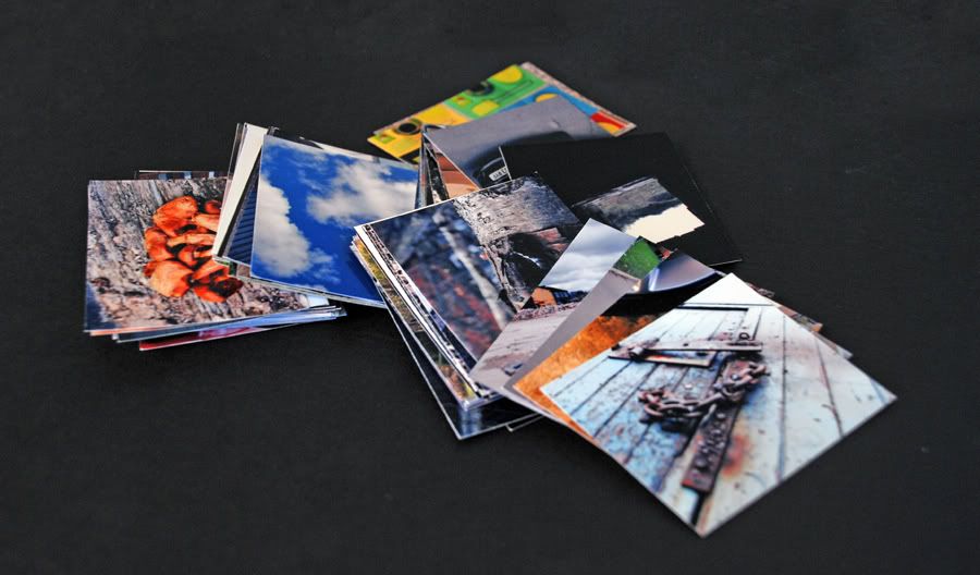
Collection 100 Photography
Subscribe to:
Comments (Atom)


