Total Pageviews

Friday 30 October 2009

Visual Vocabulary IDENTS

For this lesson we finally moved away from the ten by ten squares and moved away from 2D altogether. The week prior to the task we were told to collect a range of small to large boxes, large being roughly the size of a shoe box.

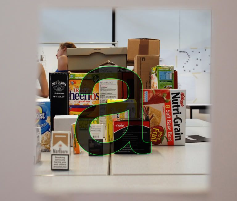
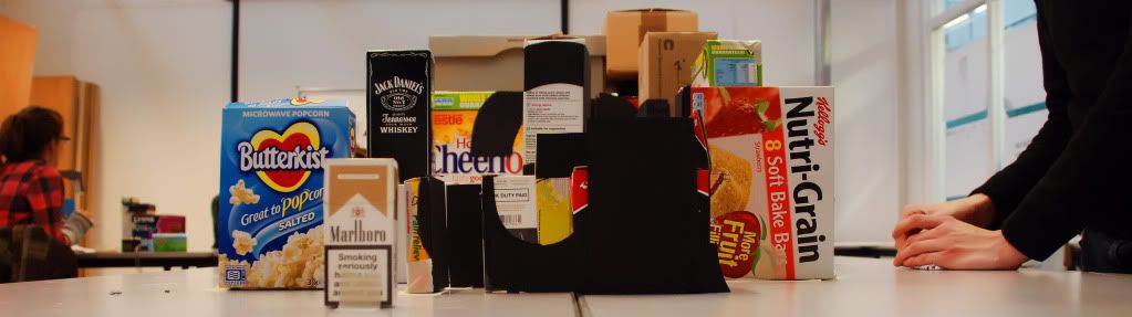
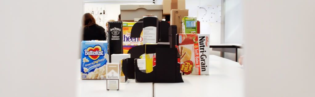
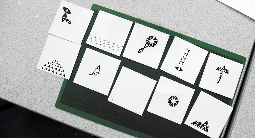
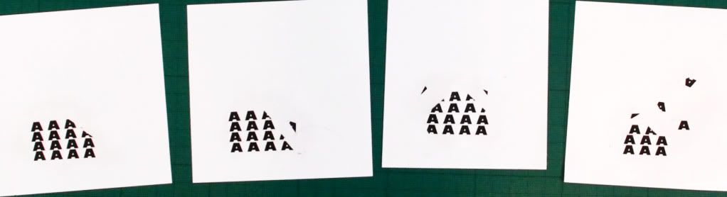
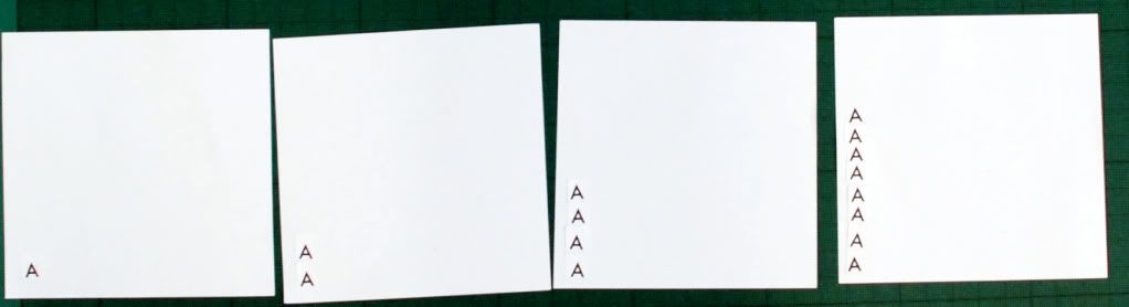
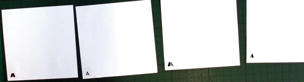
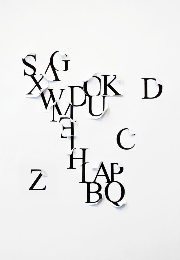
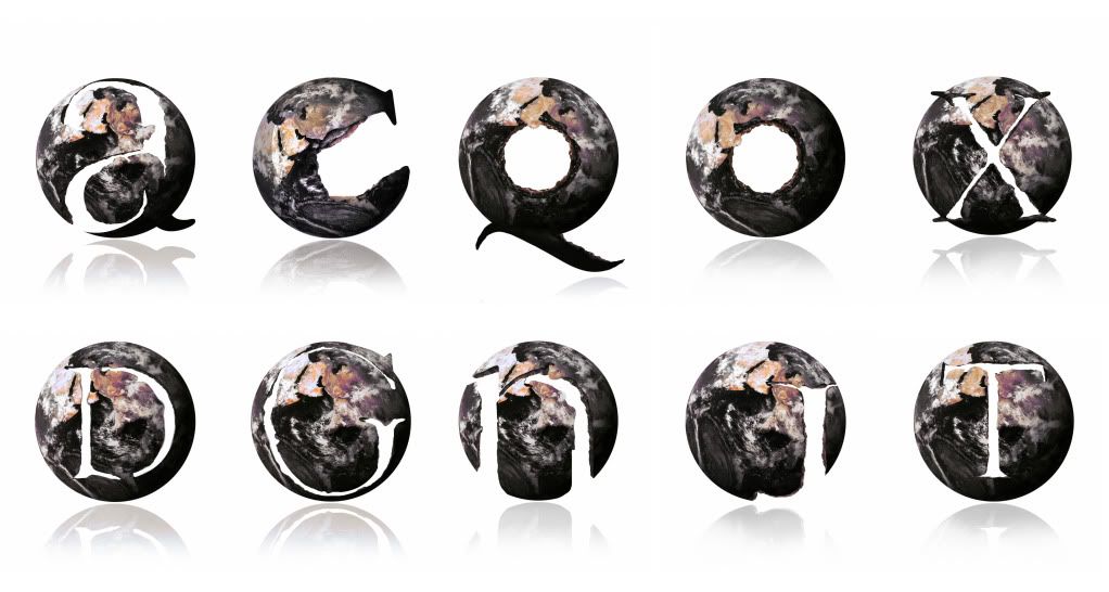
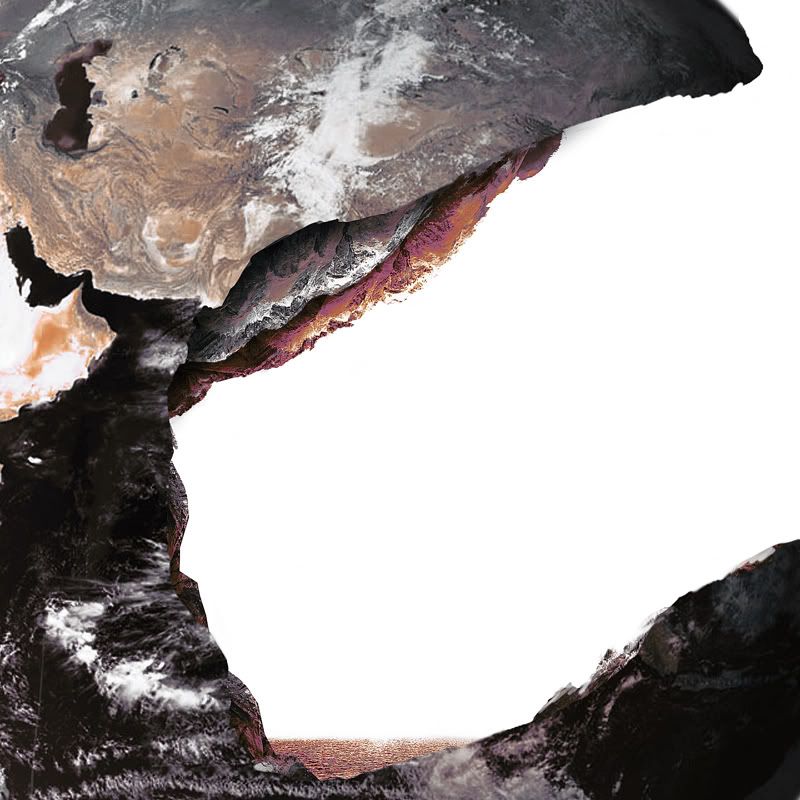
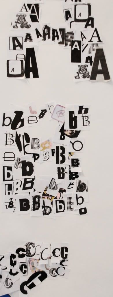
The idea behind the task was to create a letter form that would be visible only at certain angles, much like the Channel 4 indent adds in which the camera pans over at one point the ‘4’ is risible. We were briefed on the general idea of the task, formed into our groups and chose the ‘a’ to work with.

Initially we arranged the boxed but were having trouble figuring out how we would plan out the letter. I had an idea of kind of cheating a little through taking a picture through the viewfinder and putting a letter over the top in Photoshop. This way you could clearly see where certain lines would cross certain points and it made it much easier.

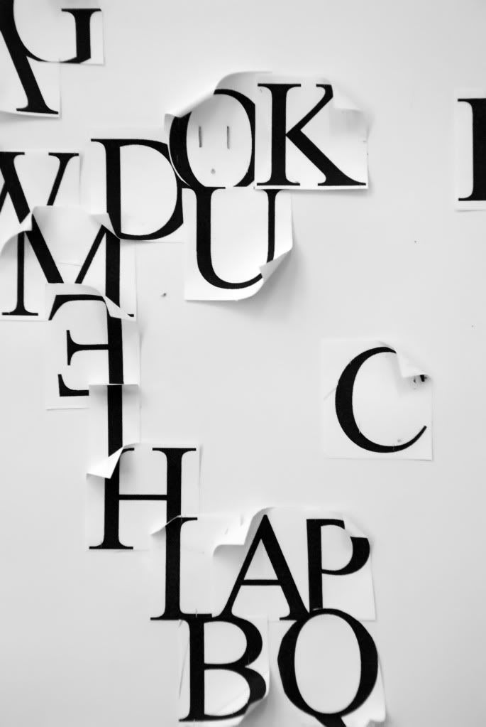
We started shaping the letter using black card around a Helvetica font. There was still a few problems with getting the scale right and we were still struggling a little even though we had the template. Overall I think the image worked well though and we all liked the outcome.

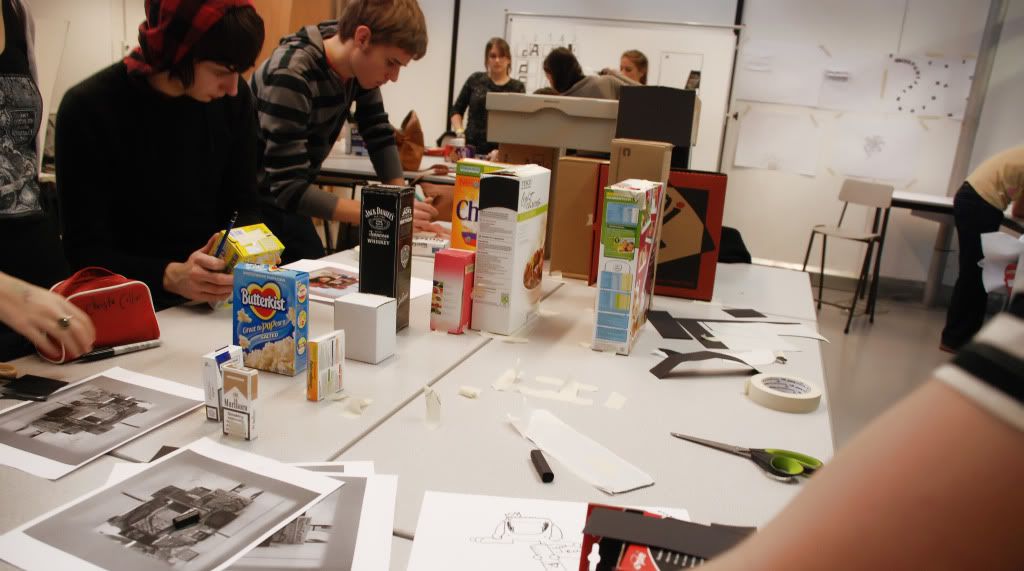
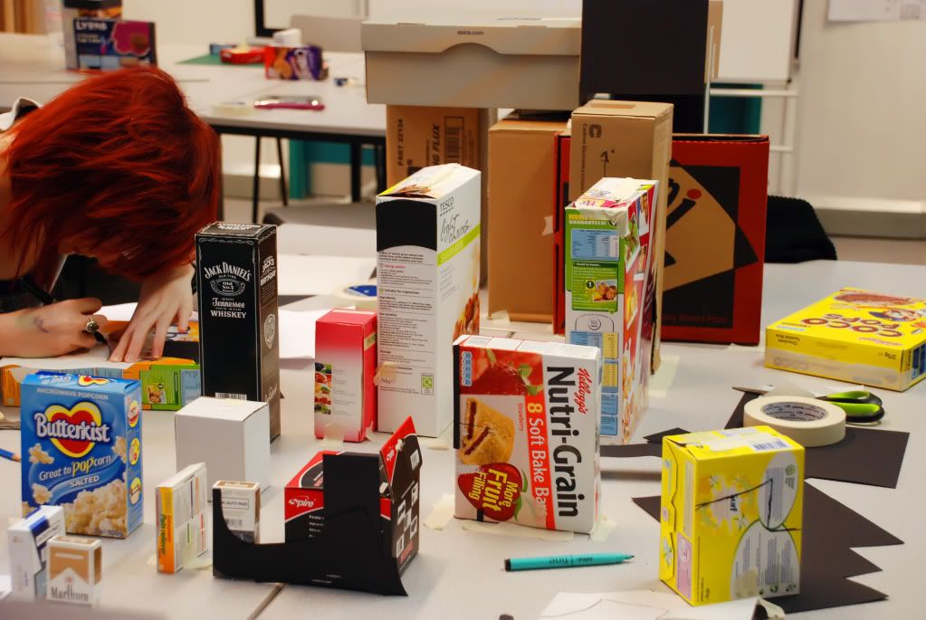
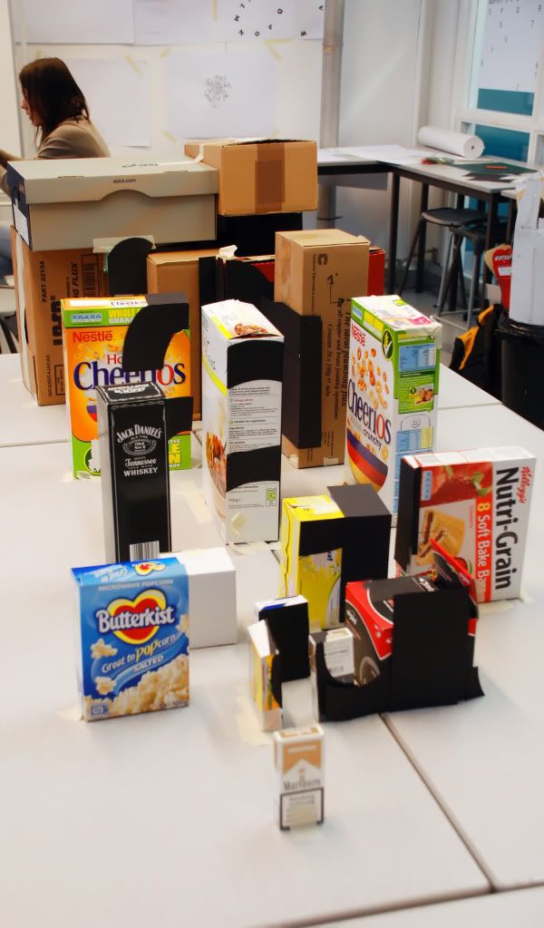
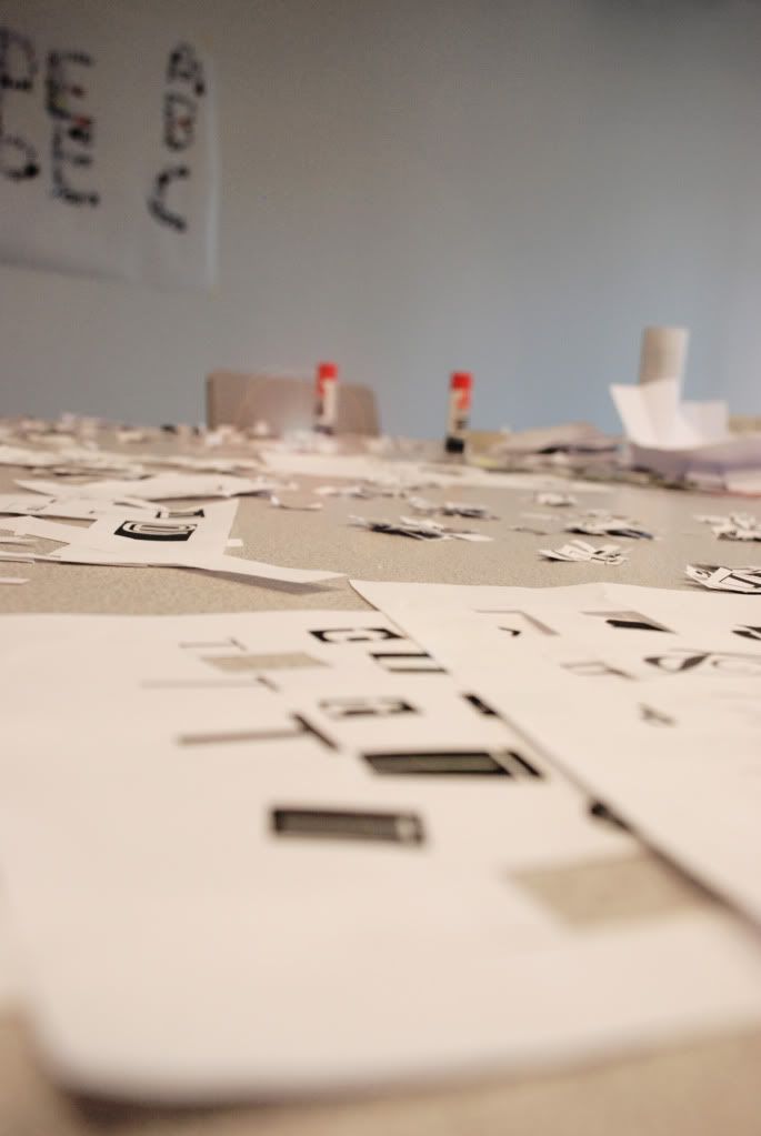
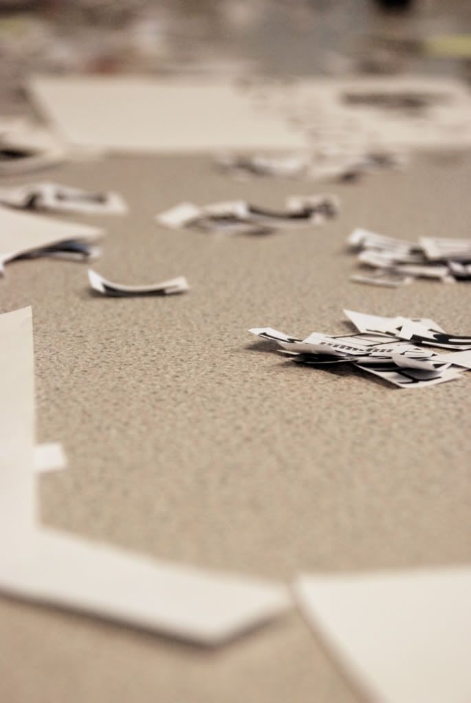
Below are a few Photos taken of the process and you can see how the design is broken up over the scale.


Visual Vocabulary

Once again we were creating 10x10 images based around a given word, this time ‘scale’. We each created a set of designs that visually communicated the word and then this time, swapped four designs with another member of the class. We were then given the chance to further develop each other’s ideas, 3 more for each letter.

I found it pretty interesting to not only see other people’s interpretations but then being able to put in my input as well. I think in general I’m also finding these sessions more and more useful each time as it’s getting me to almost think as type as image and the line between the two is starting to become a little blurry. I’ve never really experimented with type in ways like this before and it’s definitely making me more aware and open to the possibilities within typography.

Below is my final 4 images


And here is the whole groups work

Visual Vocabulary

For this task we were given ten words in which to visually communicate through image. The ideas were created on 10cm2 pieces and we were given five minutes to work on each word before moving on. Because of the lack of time these were real quick fire responses and as such some did work better than others.

From left to right we have ‘link’. For this image I tried to make the letters look like a linked chain. Next image is ‘finish’ in the form of a chequered line and then ‘closed’ which I tried to make look like a key hole. Then there’s positive in the shape of an explanation mark which doesn’t really work but I was struggling to think of anything else and then there’s ‘above’ in the shape of an arrow. The bottom row we have, form, difference, scale and loop.

Sunday 18 October 2009

Soup - Jack's Font

Alphabet Soup Part Two
This brief was based on a font that visually represented our partner chosen from the randomiser. I was paired up with Jack and we were each given a short questionnaire to complete based on our personalities.

What stood out the most from Jack’s answers were music and the superpower of flight. I began to look into some of these areas, mainly on Wikipedia and other Internet sources. Jacks most admired people were artists such as Jimi Hendrix and his prized possession were his drums. From the research I found, Hendrix’s prized guitar was a Fender Stratocaster. I began outlining these shapes along with the drums and superpower to give me a range of lines that I could later include in the type.

When it came to getting these shapes onto a typeface, I wanted to make them look consistent. Initially they were lots of experimenting to see where shapes work best and I them moved on to making them all look consistent. I also tried around a few fill effects to see how it affected the style of the design. I found that the breaking away font had a nice effect in keeping with the wing design.

With a good range of research and initial to developed designs I took the work into Photoshop. The reason for this was just the ease of being able to try things quickly and test other possibilities that I could of missed on paper. With the final idea sorted, I completed the letter forms on an A1 sheet, printed it and traced it back in Indian ink to meet the requirements.

The end outcome was a really crisp detailed sheet. The only issue is that literally all of the detail escapes the image from a distance so this is only really effective up close. Making some of the features bolder could resolve this but I think that’s driving away too much from the original idea.


Sunday 11 October 2009

Visual Vocabulary

With this lesson we had to create four representations of each word we were given. The given word was spread across a series of four to visually communicate the idea. The words in order of image are:

1. Compress
2. Dissect
3. Duplicate
4. Hybrid
5. Edit


As an extension from this we were then given the word LAYER to try and create a final image. It was a little bit of a struggle at first but I then thought about the idea of layering the letters on top of each other to give the effect that all the lines are continuing. I liked the effect, here’s the image below.


Alphabet Soup LAYER

This brief consisted of the creation of tern letterforms based on an existing typeface. Each was to be manipulated around our given word from the randomiser, mine being ‘Layer’.

I started off by looking into all the different types of layers out there. This ranged from layers of rock, oceanic, atmospheric and then foods and music ect. After trying a few different styles and approaches I decided on the idea of breaking down layers of rock and earth. The concept was that the letterforms could appear to be stamped out from the planet leaving a shattered, breaking effect, allowing the viewer to see the individual layers of the earth.

The problem with creating more than two or three layers was that the area of white became smaller. This then started to make it more difficult to make out some of the forms, so the design had to be simplified a little to aid legibility.

I started out by sketching out some initial ideas onto paper and then re-scanning them back into Photoshop for development. I also came across an image of the earth which saved me attempting to paint the globe which given the time scale, could have looked a little tacky.

The designs themselves consist of the earth stock image, an image of the Alps and ocean. The rocks were manipulated and painted back over to give the layering effect with a small volcanic pool at the bottom. I was space, we wouldn’t really have a sitting pool but none of these were trying to be accurate.


Alphabet Soup Introduction

Over the summer we set the task of collecting numerous letterforms from varied sources. I’d collected newspaper and magazine cuttings alongside a vast log of printed fonts from my PC. This task was to start organising this collection into one easy to view catalogue. We were paired off into groups of 3 to combine what each of us had.