
This brief was based on a font that visually represented our partner chosen from the randomiser. I was paired up with Jack and we were each given a short questionnaire to complete based on our personalities.
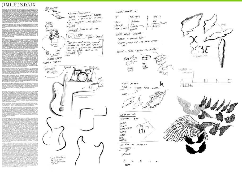
What stood out the most from Jack’s answers were music and the superpower of flight. I began to look into some of these areas, mainly on Wikipedia and other Internet sources. Jacks most admired people were artists such as Jimi Hendrix and his prized possession were his drums. From the research I found, Hendrix’s prized guitar was a Fender Stratocaster. I began outlining these shapes along with the drums and superpower to give me a range of lines that I could later include in the type.
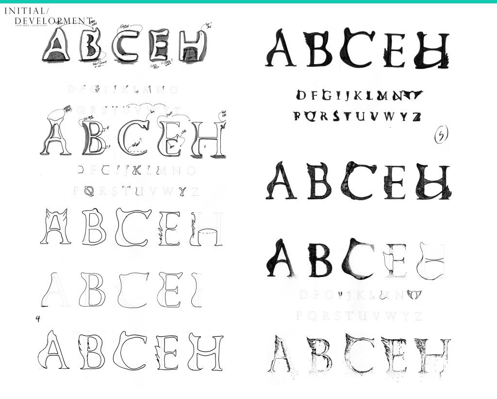
When it came to getting these shapes onto a typeface, I wanted to make them look consistent. Initially they were lots of experimenting to see where shapes work best and I them moved on to making them all look consistent. I also tried around a few fill effects to see how it affected the style of the design. I found that the breaking away font had a nice effect in keeping with the wing design.
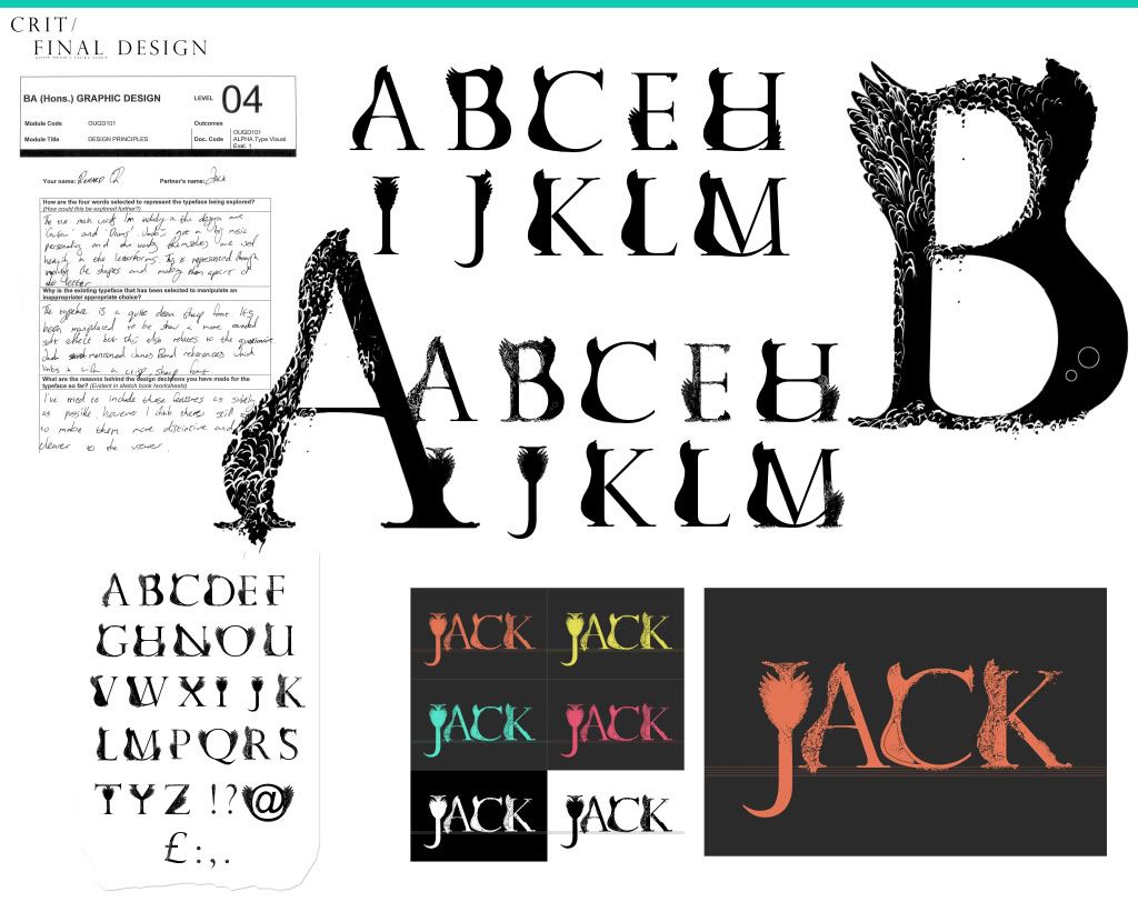
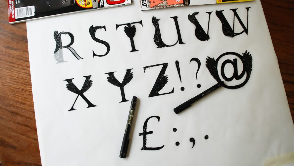
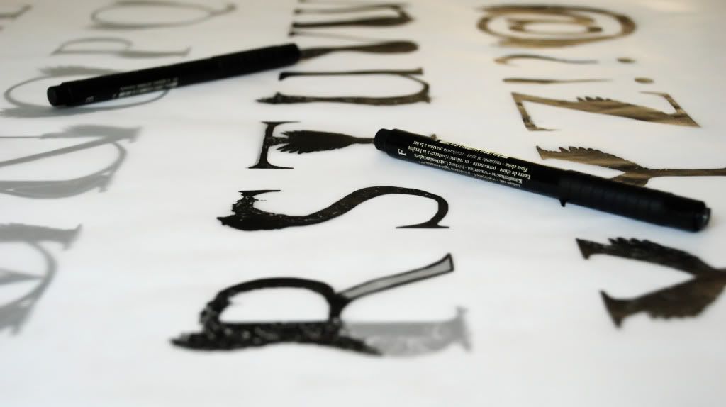
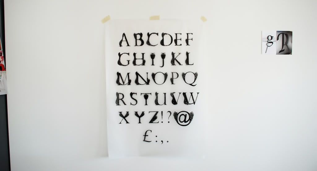
With a good range of research and initial to developed designs I took the work into Photoshop. The reason for this was just the ease of being able to try things quickly and test other possibilities that I could of missed on paper. With the final idea sorted, I completed the letter forms on an A1 sheet, printed it and traced it back in Indian ink to meet the requirements.
The end outcome was a really crisp detailed sheet. The only issue is that literally all of the detail escapes the image from a distance so this is only really effective up close. Making some of the features bolder could resolve this but I think that’s driving away too much from the original idea.
No comments:
Post a Comment