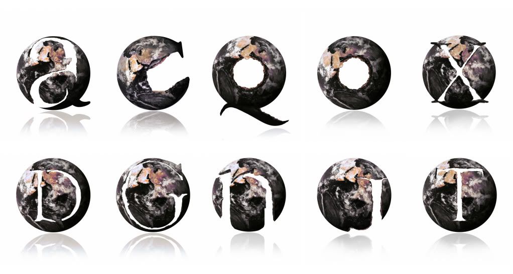
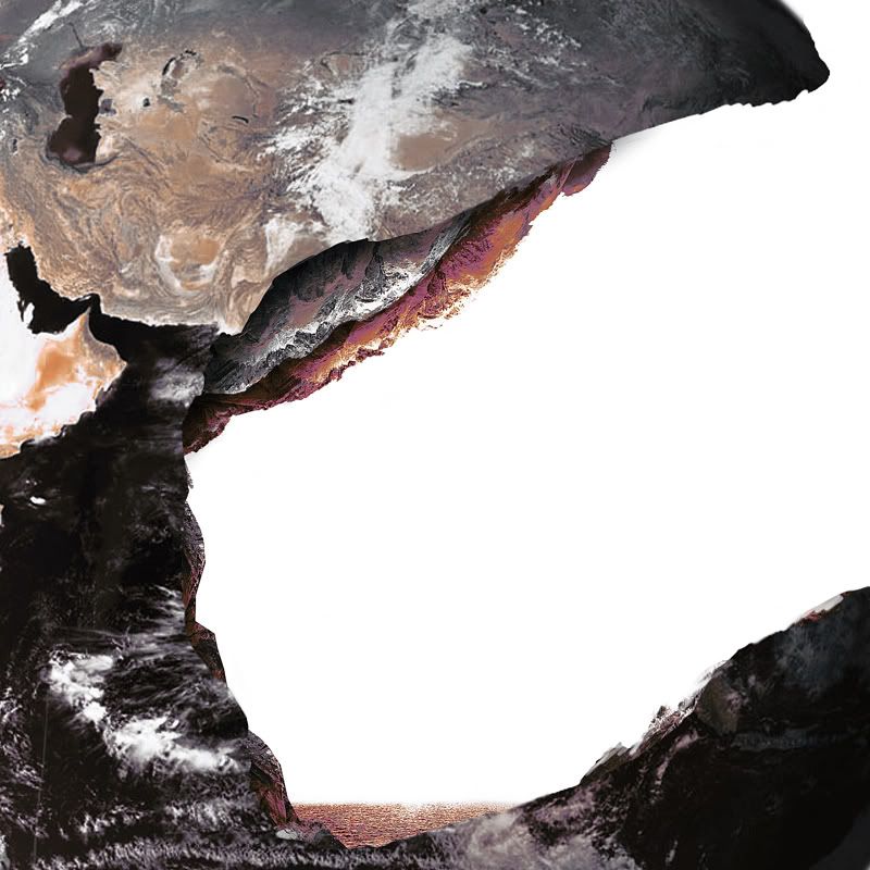
I started off by looking into all the different types of layers out there. This ranged from layers of rock, oceanic, atmospheric and then foods and music ect. After trying a few different styles and approaches I decided on the idea of breaking down layers of rock and earth. The concept was that the letterforms could appear to be stamped out from the planet leaving a shattered, breaking effect, allowing the viewer to see the individual layers of the earth.
The problem with creating more than two or three layers was that the area of white became smaller. This then started to make it more difficult to make out some of the forms, so the design had to be simplified a little to aid legibility.
I started out by sketching out some initial ideas onto paper and then re-scanning them back into Photoshop for development. I also came across an image of the earth which saved me attempting to paint the globe which given the time scale, could have looked a little tacky.
The designs themselves consist of the earth stock image, an image of the Alps and ocean. The rocks were manipulated and painted back over to give the layering effect with a small volcanic pool at the bottom. I was space, we wouldn’t really have a sitting pool but none of these were trying to be accurate.


No comments:
Post a Comment