
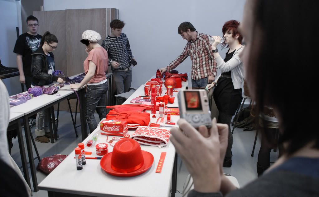
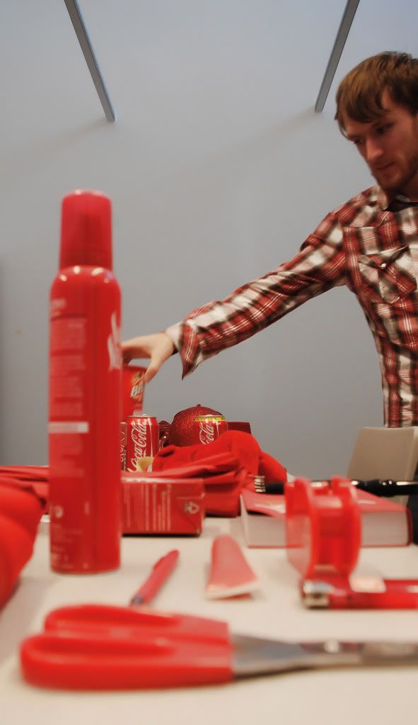
We were each told to collect ten objects of a certain single colour, mine being red. Prior to some practical work we looked at the wide range of colour types such as subtractive and additive colours. Subtractive colours are the mixing of colours, the more you add, the dark, muggier the colour gets. Additive at the opposite end, works on the idea of the colour getting lighter.
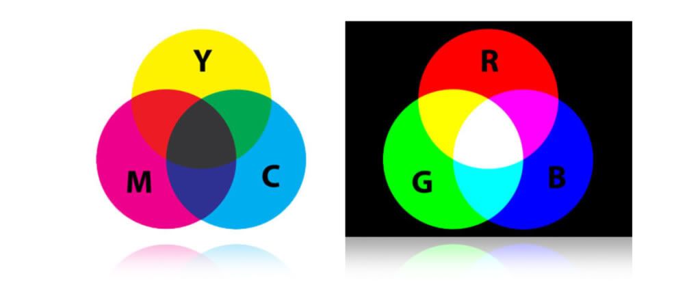
The graph below explains it a bit better. On the left we have CYMK, K being the middle section showing subtractive and RGB on the right showing additive. What’s clear is RGB is visible in both. Televisions/Monitors, cameras and scanners are all based on RGB, where printing paint mixing for example use subtractive colours.
We also looked at how we perceive colour. We were shown a block of red colour, which appeared to be a vibrant red, and then another tone of red was shown with more saturation making the first block appear darker. This was done numerous times to the point in which the shades started to look like different colours all together, orange and brown. It was an interested task and linked back to what Fred was saying at the start of the session, you can’t trust colour!
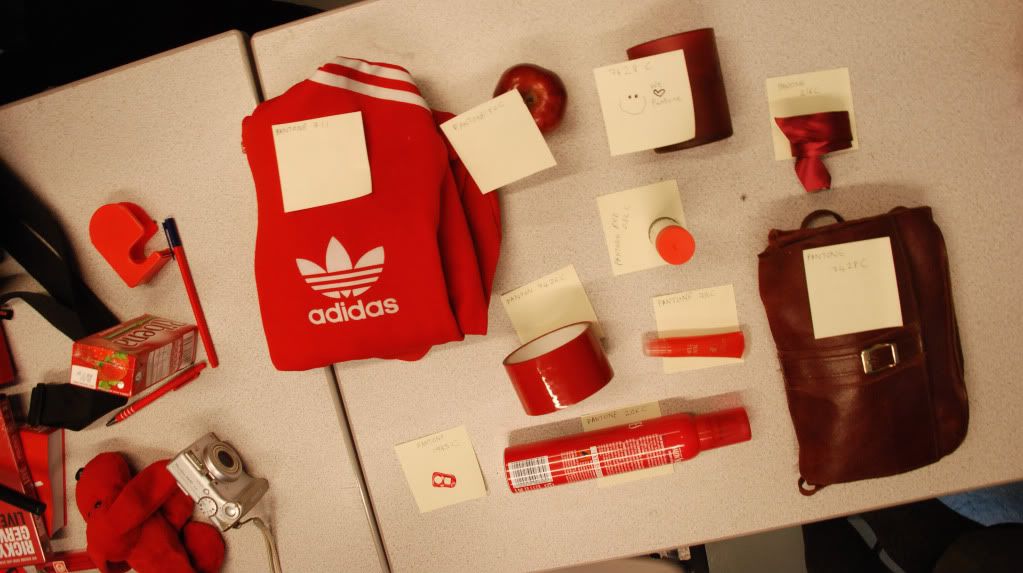
With the practical side, we each joined into our groups giving us a wide range of collected objects. We were then set the task of categorising our objects. We decided to put them in order of light to dark, from the brightest shades of red through to the darker tones working with tint and luminance.
Here are some images below:
From this we were then given a brief introduction into Pantone Charts. The colours are printed on varied mediums and a unique colour code is given to each which can be used in nearly all professional software packages. I really can’t believe how much these things cost. I don’t doubt that in industry this will be an invaluable tool but this is probably why it warrants the price tag. Four hundred pounds for what’s basically a Dulux flip chart with some colour codes.
I didn’t actually want to touch these baring in mind “if you bend one page, your buying a new set” so for the next task I avoided flicking through the swatches at all. Knowing my luck it would have probably set on fire or something ridiculous like that. With the Pantones we selected 10 objects and tried to match each colour as close as possible using the chart.
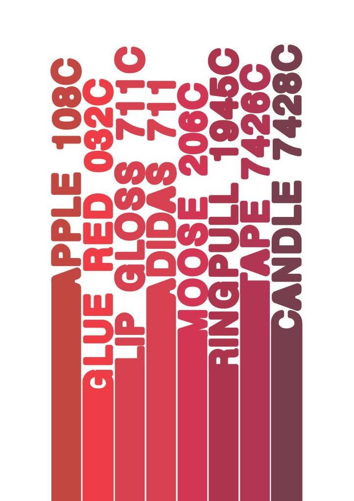
As an extension from this I put each colour and sorted them in HUE/TINT. What I found is that even some of the brightest shades of red appear almost orangey compared to other objects and they move further down the HUE. Likewise some of the deep reds are very much purple.
Below an image of the objects against the colour comparison:
_________________________________________________
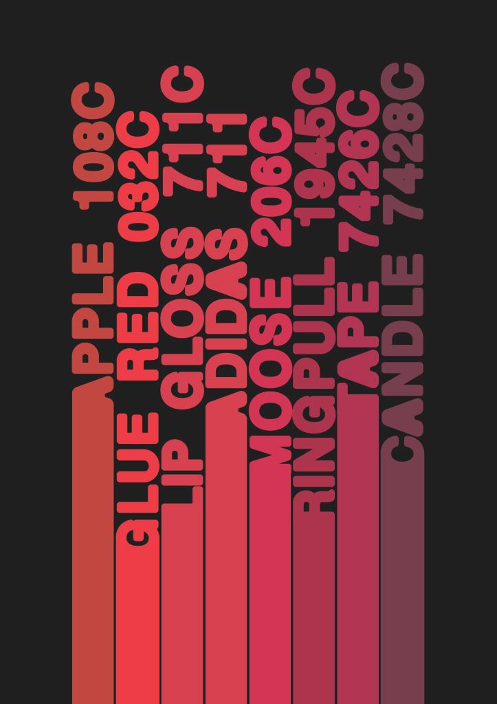
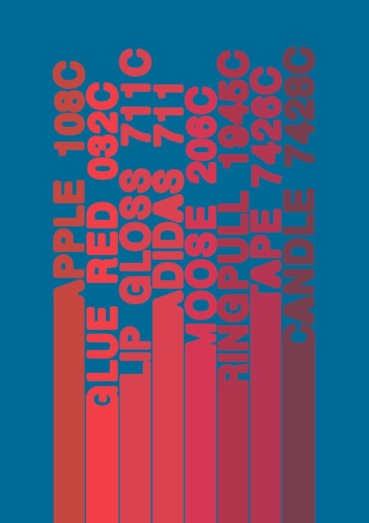
I’ve tried the sheet in a few different colours just to show how it can be harder to perceive when you get colour wrong. This is similar to a slide Fred showed us on how it can be nearly impossible to make out items with wrong colour and that’s why colour is so important within design.
No comments:
Post a Comment