I started by looking at the team, drivers and Ross Brawn. I’m not really going to talk about my findings as it’s all in the research anyway but I then moved on to a closer look at Jenson Button in particular.
The main deliverable for this brief was to compile a clear and concise body of research. What I found, was that whilst gathering this research, I was getting buried in paper and started to lose clarity in the information. With all the information I had, I was then struggling to then find the more important and relevant points.
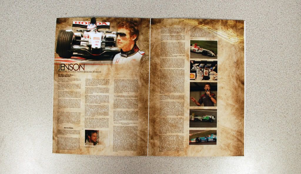
To solve this I started looking at layout and how I could present the research in an easier to view form. I started thinking about how we like to see large pieces of information. I then thought it would be a nice idea to make a short magazine based item, with a few pages to cover all the research.
There were six pages in all, so it wasn’t the biggest book, yet it had more than enough room for all the relevant points. I did find this an interesting test as I’d never tried to make a book or magazine before, and it made me think about how the pages would order together as well, what with the first page also being the last ect.
When it came to the design I was originally basing it on a newspaper theme. In doing this, everything was becoming a little tiring and I didn’t really want to just rip off an already existing style so I thought I’d make my own. I still wanted the pages to have a nice paper texture, so I set to make a nice gritty, almost grunge effect with some brushes until I was happy.
I wanted to keep the information clear and readable but try to make the pages look interesting as well. After a lot of tests with tonnes of various layers and effects, I decided upon the chosen theme and carried it throughout the book. I’ve tried to keep the pages simple and hopefully to the point. I wanted to the inside to concentrate more on the focal point of the brief than having busy backgrounds that would no doubt detract from the information.
Overall I think I was able to gather all the relevant information concerning my article. All the points I can see being useful, have all been looked into, and presented in an easier to view format. The main thing I would have probably liked to have changed would be Jenson’s race stat tables towards the back. They do the job, but are pretty horrible to look at.
I printed a few test pieces and printed a full a3 copy when I got back to college. Few pictures below:
Photoshop’s Before Print:
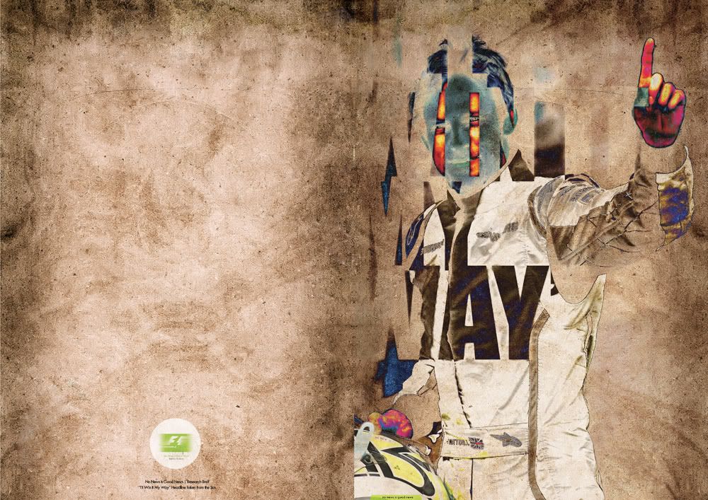
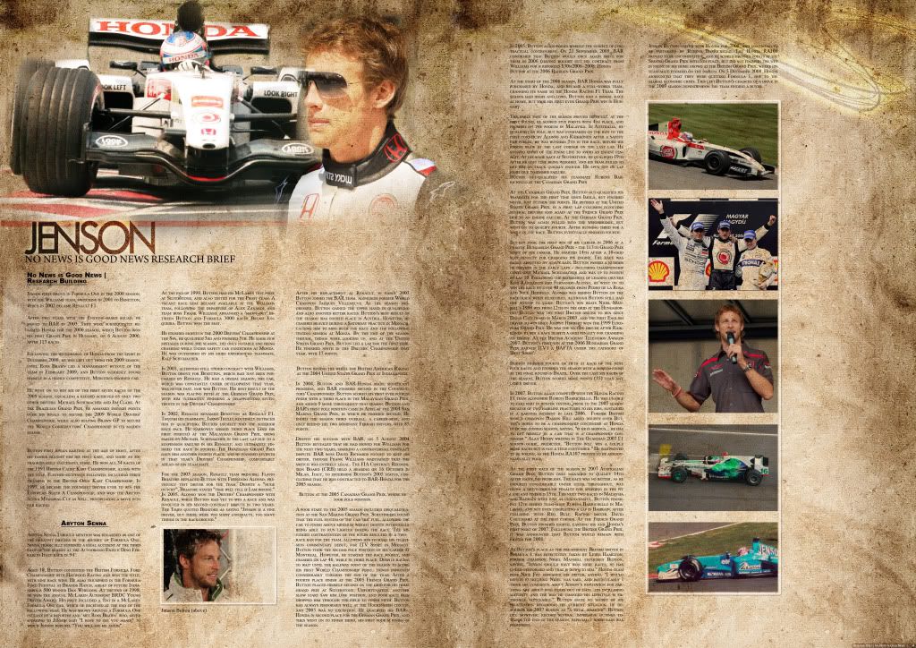
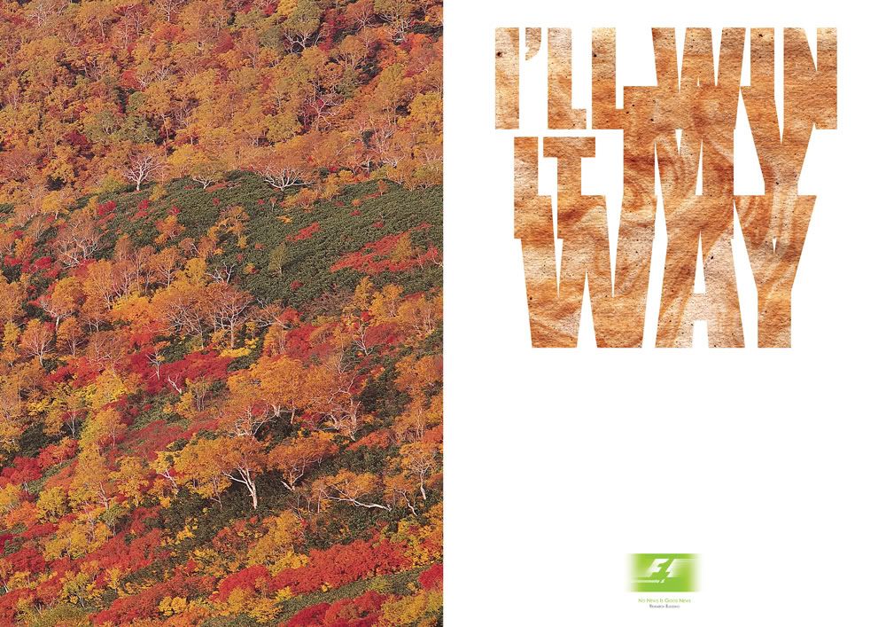
FINAL Prints
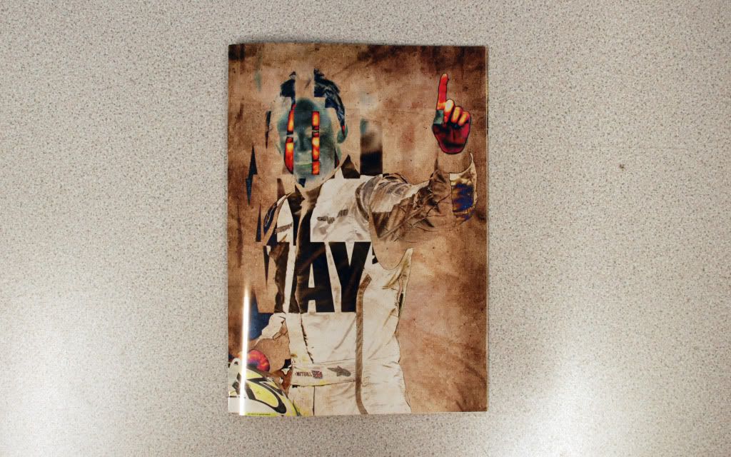
No news is good news: Message & Interpretation
To put the research to some use, we then began designing a set of 3 posters, 2:1 format, with a two colour, plus stock restriction.
I started to look at my research and began to review my findings. For me, Jenson’s wasn’t just the only winner in all of this, there was also Brawn. Jenson’s had never been the best driver, the reason he won this year was purely down to Ross Brawn and what he brought to the car and the team. For this reason I wanted to make the poster more about the Brawn team rather than just the drivers.
It was hard to decide which way to go with this. You’d usually find that they’re all good drivers but they’d need a good car and a good team to win, this is what Brawn did for Jenson. It’s was hard to decide if was appropriate to make statements without considering the target audience and where these posters would be displayed.
To start off the design process we began to create symbols and ideas based around the previous brief. We were then given a short amount of time to quickly fire out an idea for development. I personally prefer a little time to think over an idea and mull over a few possibilities in my head before progressing. Because of this the initial sketches were a little week and didn’t really have anything to them. Design wise it wasn’t while a couple of hours later and the following day that things started moving in the right direction.
Whilst looking at text, they were a lot of possibilities. There were lots of issues that could be communicated such as Jenson’s driving ability over the capability of the car, the progression of Jenson’s career, and the success of the Brawn Team in general could have also been looked at.
One of the things that can be easy to forget is that the initial research was compiled before Jenson actually won the grand prix. So because of this, it would be wrong to include statements about the win, and I purposely mentioned very little about the result at the end of my research.
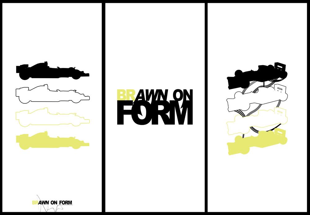
With this in mind, it was more appropriate to use the chosen statement ‘Brawn on Form’. I liked the play on words and it could still suggest a team win, making it still appropriate and relevant as a poster. The one clear message from the research is that Brawn has been very much on form this year, and they proved that throughout the season.
When it came to putting this onto paper the brief did state to keep them simple and to the point. To do this I began by incorporating some of the symbols that would relate to F1 such as the cars, trophies, chequered lines and racing style fonts. The two colour restriction was made rather easy in the sense that I could use the Brawn GP colour scheme of green and black on a white stock. This was an obvious choice as its instantly recognised as an F1 trademark when shown alongside the sport symbols.
The bad side to the restriction on colour was that the posters had to be mainly block colour leaving no room for photos or more complex images. Although, the posters had to have a cohesive effect anyway, so a two-colour theme helped aid the consistency.
The text poster is made from an Arial Black font with a low tracking and slightly smaller scale. The reason behind this was to emulate the current style of Brawns logo. This is further reinforced with the use of non- italicized lettering on the first two letters. ‘BR’ was also changed in colour to bring out the BR Racing side of things. The downside to this, and its only something you can see when it’s printed, is that, from a distance the yellow begins to slightly merge with the white. This then seems to accentuate the words “awn on” which doesn’t work, at all. If this were to be re-visited this would defiantly be something to be looked into.
To add a little more interest to the poster I did a quick test of adding some old styled racing flicks that can be seem on a lot of racing imagery. The addition of this did seem to make a big difference and stopped it from looking a little flat and boring. I did question this with a few people in the studio and the general idea was that it did boost the aesthetic, so I decided to keep it on the final design.
When it came to text and image I obviously wanted to continue the tag line of ‘brawn on form’. I still wanted to make this visible but not to dominate the image; we already have that in the text poster so having a bold text image twice seemed a little pointless. I decided to break in down a little and subtly add it at the bottom of the page.
For the image side of the poster I looked back on the symbols created in the previous session and began to test numerous shapes and items. The more successful symbol was by far the formula one trace. It was far more clearer and to the point than some of the other objects. I was trying out ideas with trophies and helmets but these were far too vague to instantly suggest F1. I included a total of four cars in the design. During the research, I discovered than teams generally run two main and two support vehicles. I wanted to incorporate this by having two solid shapes to suggest those main cars and two outlines to show supports. Aesthetically, I think this gave the image a nice balance. I also think that, compared to some of the other experiments this idea was giving a much more formal and professional finish which intern reinforced the ideas behind the Brawn image.
For the image poster I wanted to keep with the car theme without just re-using the image. I did look into other areas, as can be seen in the development pages, however I feel keeping the car symbol maintained the consistent look. To relate back to the lines that were used in the text poster I started to look at the use of lines again. I added these to try and give a sense of movement and generally improve the aesthetics of the poster. The lines could also represent tyre markings or a racetrack look.
As a set I was please with the outcome. I think the main let down with the posters is that they’re not as high impact compared to others. I think this was mainly due to the fact that I was working with solid colour and didn’t work with opacity. I think if this entire project I could maybe use opacity to try and aid the impact I need, and should have had with this project. However, I do think the posters hold a sleek finish and believe the imagery and text that has been used, does reflect the bran team and there current design themes.
_________________________
Here are my final designs for the brief. The work was printed 2:1 on satin paper and presented to the group. Feedback sheets are visible in the PDD section of this blog.

No comments:
Post a Comment