
The brief was to create a mail out that would have to be sent to ten recipients to who it would be appropriate. We would have to decide if we were, informing, persuading or advertising. I was struggling with this at first as I couldn’t decide why or who you’d be informing when it comes to “Brawn on Form”. I started to look at why you would be communicating that Brawn had a good season and what the point of promoting this would be. This was when I decided to down the route of Sponsorship.
I then went back and did some further research into F1 sponsorship to find the benefits of sponsoring and who is currently sponsoring F1. I also looked at some of the more detailed bits such as the sponsors estimated revenues and reviewed the percentages, figures and returns. From all of this information I was then able to get an idea of who would be my mailing list would be.
The mail out had to be based around an a6 envelope. The first designs I worked on was to make a new net. I wanted to make the net big enough to fit the information on whilst still being interesting and creative. I started testing a few ideas for making the side panels fold out which then give me a large area to work with. I obviously waned to develop the design whilst also keep the look of the original posters. To do this I thought I’d develop the original car symbols. I started to look at adding more line art in illustrator but it wasn’t really working. To solve this I thought I’d go back to usual style of work and start drawing in Photoshop using opacities this time. Using the opacity really opened up a few more possibilities in what could be done with the image.
At this point, I then started to get some feedback that would lead into the design of the mail out. The dimensions of the chosen net were just running over by around 40mm. This meant that if I wanted to use to larger panels and still keep the mandatory scale I’d be printing on a larger, more costly paper size. Some of the feedback reflected on my own thoughts that if the aim is to get multi-million pound sponsorship, costing shouldn’t be an issue. I completely agree with this however 10 double sided a2 sheets, was far from viable.
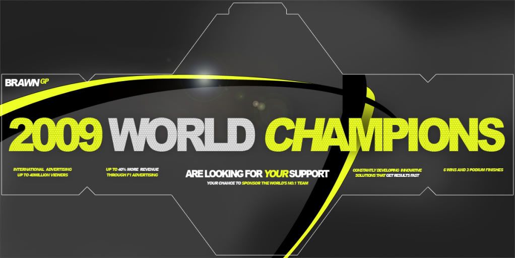
As the green colouring didn’t work so well on white background, I started to look at darker shades of grey to give it more impact. I also wanted to carry on the use of lines so drew up some bold lines in the brawn colouring, green and black.
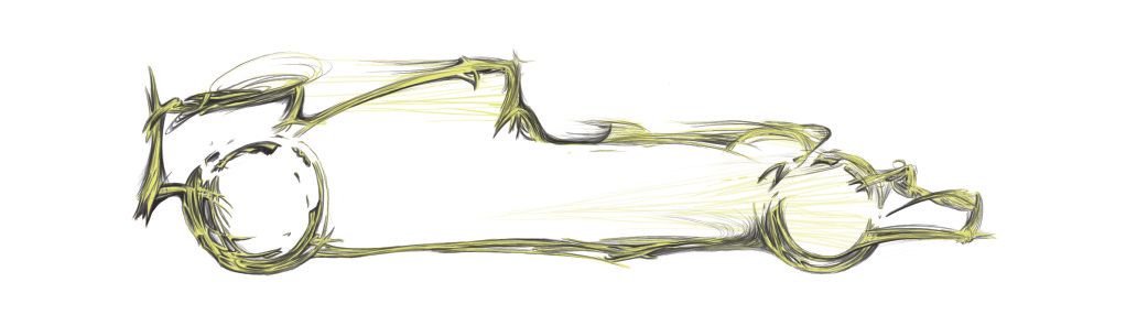
When it came to content, I soon realised nothing on posters was really relevant in the new designs. Even the sketch of the car was starting to loose place in the design and was late discarded from the design altogether. To give a greater impact I thought I’d continue the bold brawn text and spread it across the width of the mail out. I tried a few ideas with the design by adding more and more, but this was slowly cluttering and cheapening the design. It was also drawing away from the simplicity of the posters, so I stripped it back which made it clearer to the message and less noisy. Small captions of information were also added beneath each panel promoting the benefits of F1 sponsorship and the Brawn team.
I printed 2 final sheets on the double A2 sheets. I was pleased with the outcome although there were a few issues with the material. The paper was matt which marked really easily and looked pretty terrible when it was. When the material was folded it also split and cracked leaving lots of white lines, which could also peal. Now, this wasn’t very god but I was told this would happen with any material and matt was the only medium for double sided printing anyway, leaving very little for me to do. The other eight finals cad to printed at a smaller scale onto standard printer-paper. The cost involved with a full was far too high and in the end this was the only option.
As a complete piece of work it was far more successful than the posters. I think this was mainly due to the use of colour contrast between the black and yellow, which really brought out the vibrancy. The feedback I received in the final critique suggested that the general design of mail out went well. Points behind items such as the chequered text and the lens flare asked why they were there, were they needed? Aside from saying that the image looked a little flat, and these gave a bit more added interest, I find it hard to really justify a good enough reason. Feedback during the design itself also suggested that it was a definite improvement, so I tend to go with what I think works towards the design.
FINAL DESIGN
CAR SKETCH
No comments:
Post a Comment