
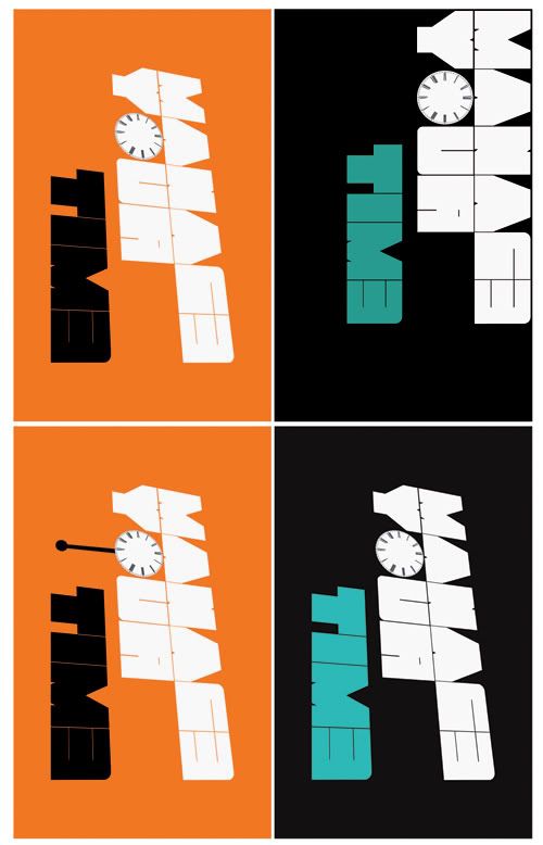
The first image is basically the concept for the poster. I've carried through the same font as previous and added the suggestion of time with the letter 'o'. The second image has a change in angle to add more interest and make it look less flat and dull. After this I started to experiment a little more with colour to make it 'pop' more. And finally I have a failed attempt at emphasizing the time idea by trying to add a pendulum. I know.. it looks bad.
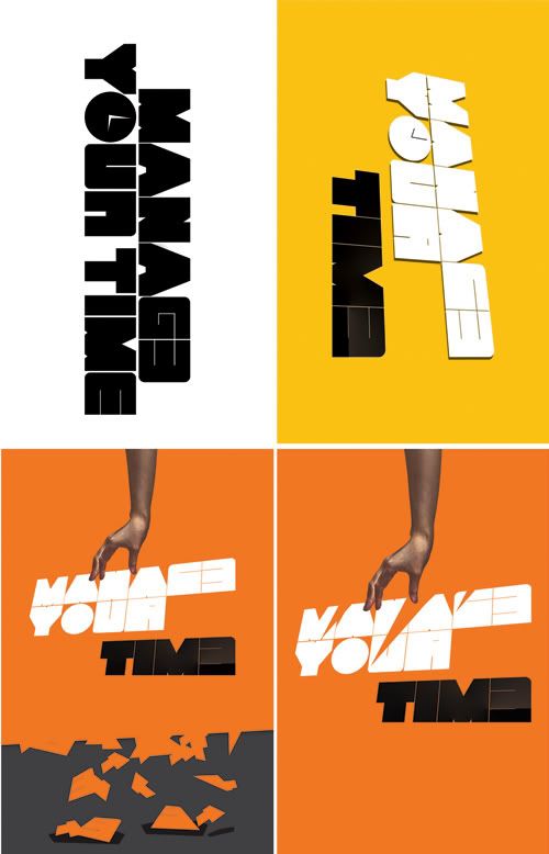
SImplified version in yellow with a slight fade on the E to drawn they eye more to the word time. Also tried to add in a hand to make it look like someone was literally organizing the letters to give the appearance of 'management'/ time management etc.
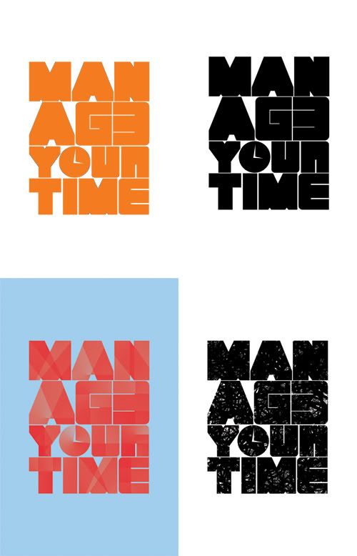
This page shows another attempt at making a poster. I was getting frustrated at the previous design and didn't like the look of it at all. The newer version tries a different layout and style but eventually decided I was wasting my time with a poster. Who would have this in there room?? Wasn't included in the end as I thought it would spoil the finish of the other pieces (which I was happy with)
No comments:
Post a Comment