
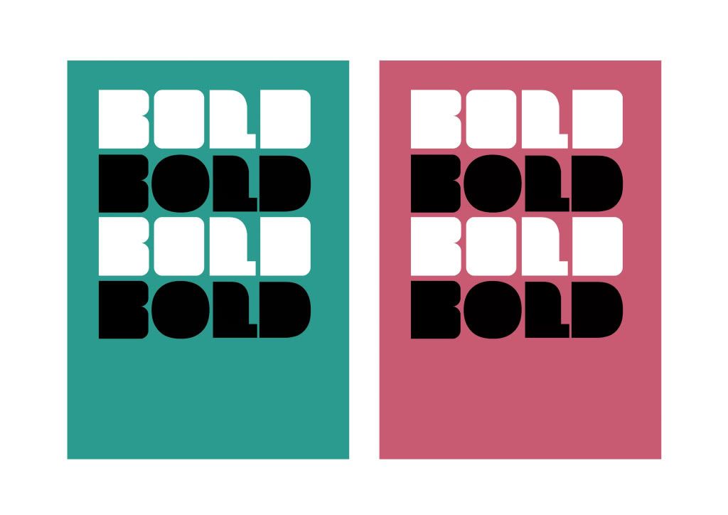
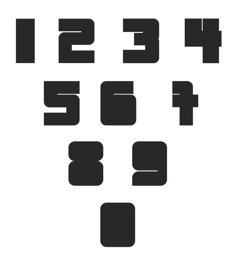
The reason I’ve gone for such a thick heavy type is that I wanted to reinforce the idea that time management is a very bold and serious issue. This is also the reason why I didn’t go for a fancy, swirly type. Plus, from looking through the research, this type of font is graphically relevant. It’s being used a lot recently and it’s current with graphic design trends, which should appeal to the target audience.
ALL MY IMAGES ARE STILL BEING CROPPED?? - CAN SEE FULL VIEWS IF YOU CLICK THEM
No comments:
Post a Comment