Throughout this module I have started to develop a greater understanding of my personal design practice and interests. More so with OUGD203 part two I enjoyed being able to choose my own brief. It was a good exercise in finding what I wanted to design and what I wanted from a brief, however not something that I would ever be able to do in industry.
I have started to further develop my understanding of illustration, animation, character design, web design and interactive design. I have found many challenges within these areas and having the chance to properly tackle them within this module has been an excellent experience.
Another skill I have developed is the ability to work in a creative partnership and work alongside a colleague to develop a concept and deliver a visually consistent product. I also feel that my documentation skills have improved a lot over the past few months as I have been making good use of web apps like issuu to clearly show my design process. Something that I probably failed on within this module was the effectiveness in thorough documentation. I feel I recorded lots of work through imagery although not so much in terms of critical analysis and annotation. This is mainly due to me constantly working on screen with development instead of analysing what I already had.
I feel that the projects I have undertaken during the module have been successful in delivering effective solutions the problems set. The YCN brief offered an excellent opportunity to get my work out into the world and I believe this helped my engage with the brief. Sega brief did prove troublesome at first as it was very open, but after the brief workshop I feel we managed to narrow our ideas and focus on an interesting direction that solved the problem.
The Inmortuum brief I set for myself was really open however I feel I needed this as I wanted to develop some skills across a wider area. Animation was a subject I was dying to get back to as it was a process I found to be actually really engaging. The short cut video sequences were fairly basic but what I worked with more so than the previous projects was a real focus on sound and how it can be used to involve the viewer and be timed to match video footage.
Unlike previous project I feel I managed my time quiet well. I think it’s mostly down to the fact that I actually was enjoying the briefs. I started concepting ideas from day one and there was little room for distraction or procrastination as in some other projects because it was areas I was probably more comfortable in, enabling me to just get on with it.
An area I feel I could improve upon in future projects is blogging consistently as I produce work. I found myself uploading images but then leaving the annotation for later in the week, which had me spending time typing it up or forgetting altogether.
This module has been very engaging and I am excited for future self-directed briefs however I feel what I should start doing is doing briefs I do NOT want to do in order to remove myself from those comfort zones and actually find breadth for me to progress and develop as a designer.

Friday, 27 May 2011
Thursday, 26 May 2011
Wednesday, 25 May 2011
Final Design Work 25|05|11
Video Tailer / TV Spots
Extended Trailer
TV Spots
One
Two
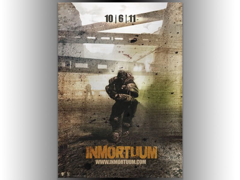
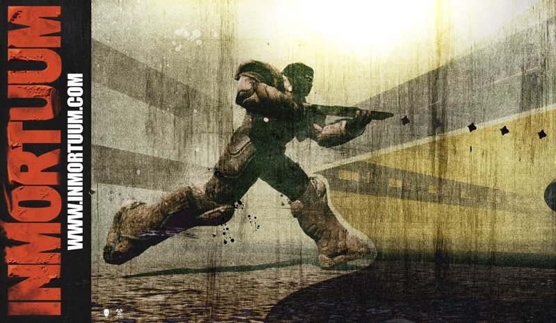
Posters
One
Two
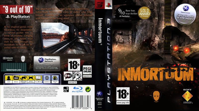
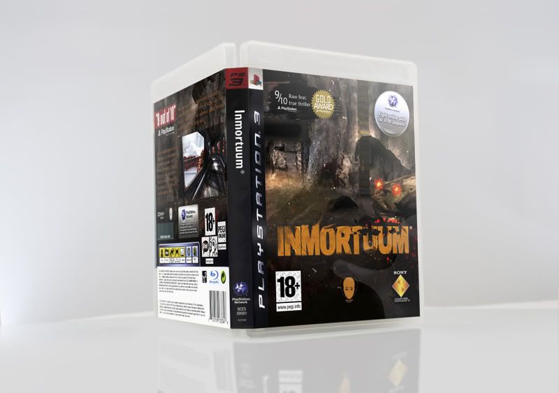
Packaging
Special Limited Run Art Sleeve
Special Edition Film Cells
Merchandise
Logos
Inmortuum Type
Branding for Production Company
Extended Trailer
TV Spots
One
Two
Posters
One

Two

Packaging


Special Limited Run Art Sleeve

Special Edition Film Cells


Merchandise

Logos
Inmortuum Type

Branding for Production Company

Tuesday, 24 May 2011
Poster One | REVISIONS
Felt like the previous poster had lost consistancy with the latest work so I revisited it and heres the result.

Thursday, 19 May 2011
DESIGNS 19|05| Prior To Crit
Teasers
In Progress
GAME COVER | PS3
POSTERS | ONE

POSTER TWO IN PROGRESS
PROMOTIONAL DISPLAY WORK | POSSIBLE FILM CELLS FOR SPECIAL ED CASE


MERCH | Shirts
CORPORATE LOGO | HEAD SWINGS DESIGN
Wednesday, 18 May 2011


On Screen Development - Poster
This is the on the creation and on going development of the poster image posted above. I figured that I was always probably loosing marks as my development was never well documented but until now I never really saw a way of capturing it.
5 Hours 50 comprssed to 5 minutes


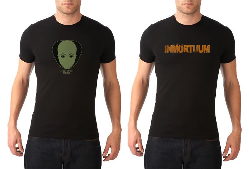
Merchandice Shirt'age


Merchandise which could be included as part of a special edition gaming package or sold in stores and/or online.
Designs include Inmortuum text, printed one of these for myself! Looks very nice :D Also included is the Head Swing design which is more aimed towards corporate promotion. A shirt that would be more suited to events and promotional events.
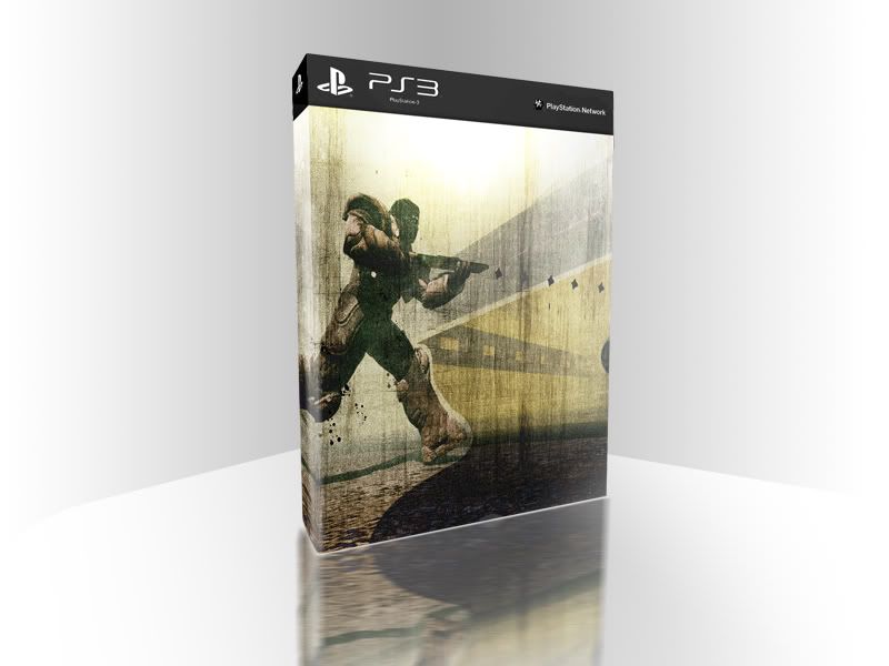
PS3 - Inmortuum Game Case

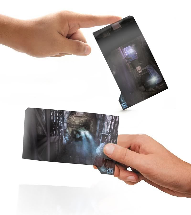
Idea that me and the client decided against


FINAL
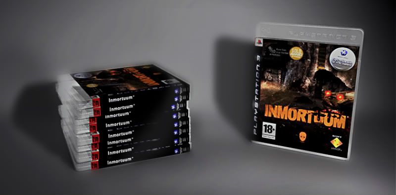
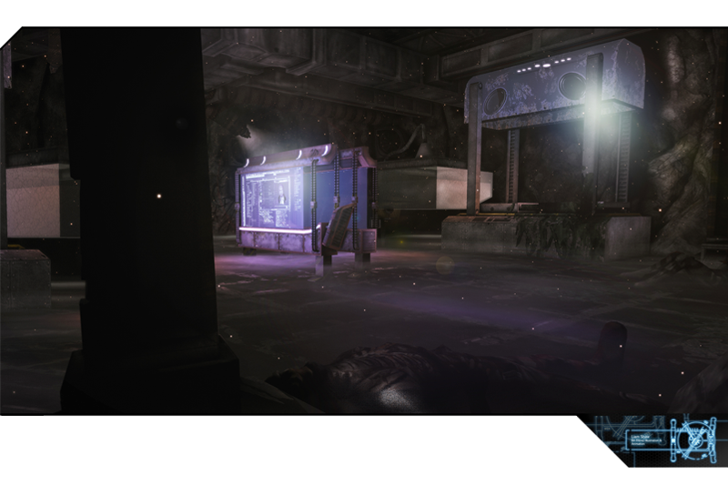
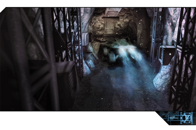
Creating the packaging was soon developed after the type. I wanted to continue themes displayed in the type experiment with how well it could work with image. Unfortunately there was a few tests with multiple screen shots which were not documented here however they were consulted with the client.
Tuesday, 17 May 2011
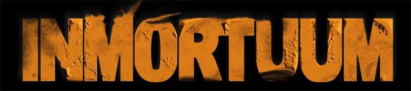
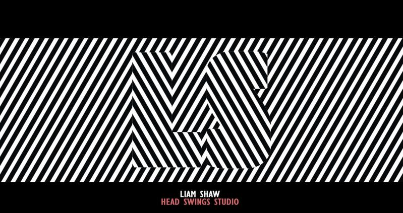
Inmortuum Title Type


The theme for Inmortuum type was thoroughly discussed with the client. He wanted to have something solid with a big impact on the viewer. Colour options to be bright yet serious. The basis of the test level I was given to play around with was mostly set in a canyon backdrop. From discussions with the client I later found that this was much repeated throughout the game and that the landscape was a big part of the game play.
From this I started looking at heavy weighted fonts such as Arial Black, Impact etc and began experimenting with spacing and leading. Arial black was the font which was developed and masked off with grunge brushes. The layer was then given a bevel, something that I’d usually avoid as I normally dislike the effect however I wanted to have more control with how the lumps extruded.
Light wisps were added to the top of the title to appear like dust was breezing off, helping reinforce the idea of grit. The client was very pleased with the title and the only changed that were made was within colour which was changed from a low saturated red to a more vibrant orange.
Logo Development / Branding
Initial Idea.. clearly forgot I was studying graphic design at this point. Not the best.
Idea Two - working on the idea of an 'LSD' idea for Liam Shaw Design. Use of a 'trippy' style. Also turned out to be utter shite. I mean, not working well.
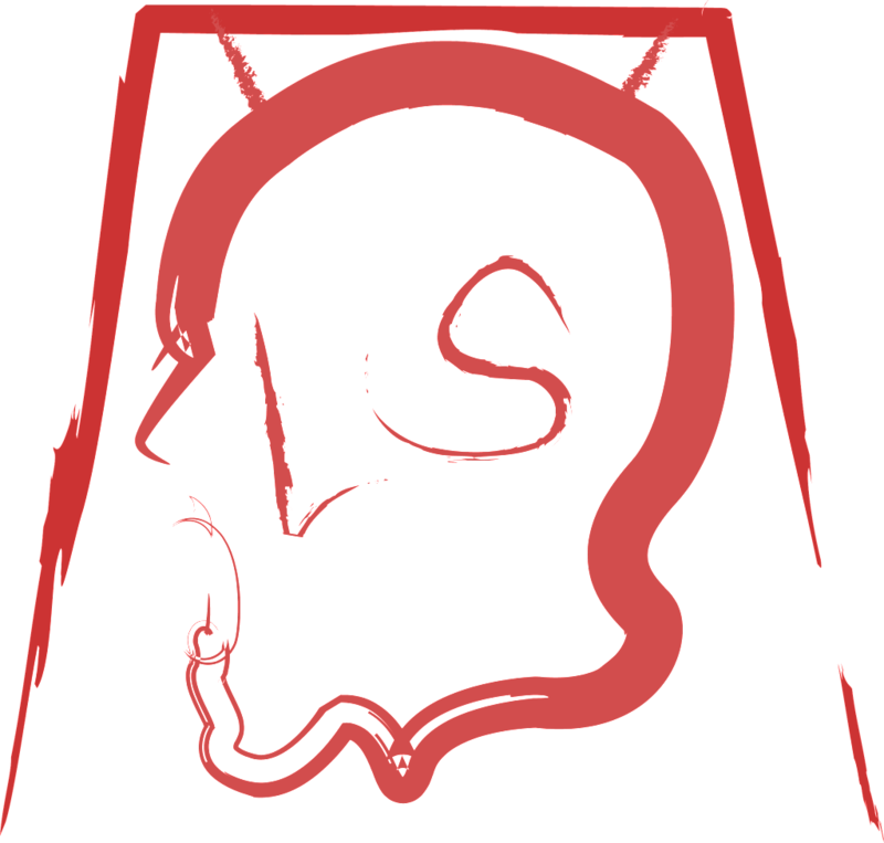
Idea Three - One which was developed
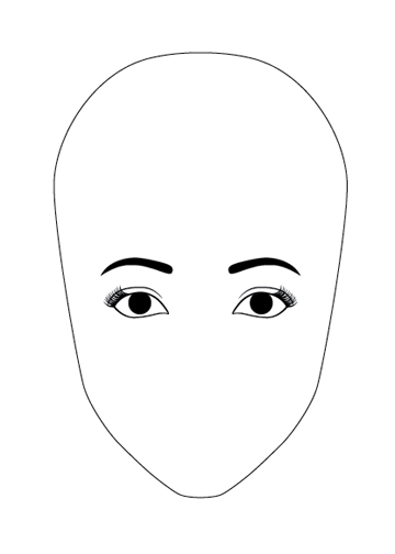
Final Design
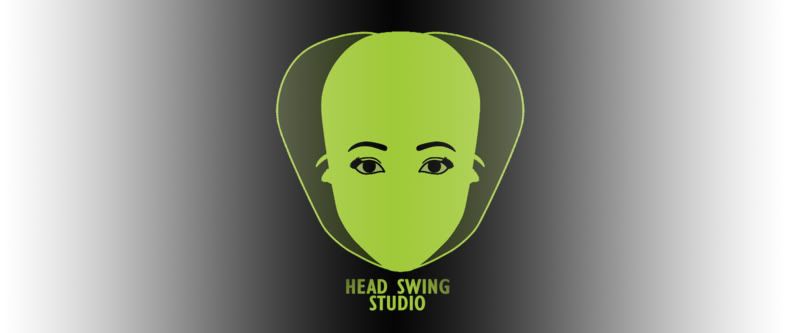
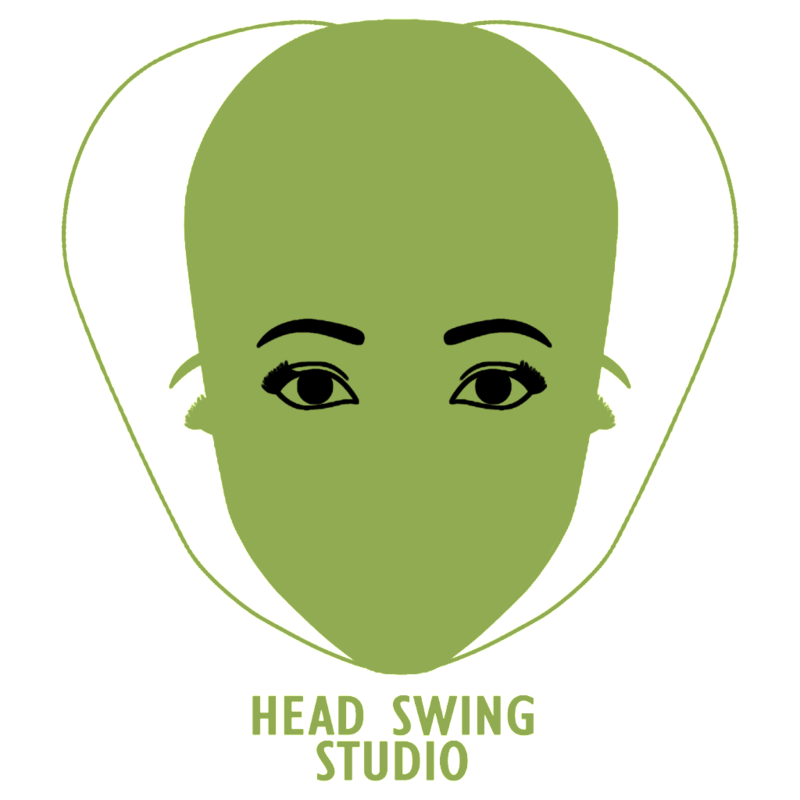
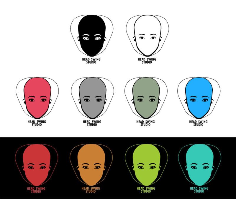
Head Swing Studio is actually an anagram of ‘Liam Shaw Design’, my friend who has created the game. However I wouldn’t have chosen this name simply for this reason. It’s a quirky name that isn’t complicated to say, it’s quite catchy and evokes a sense of movement in the name and image.
The logo in constructed of three outlines of a head, one central and two other either side depicting motion. A range of colour ways and styles was created as shown and it was decided by the client that green was the best choice.

Idea Two - working on the idea of an 'LSD' idea for Liam Shaw Design. Use of a 'trippy' style. Also turned out to be utter shite. I mean, not working well.

Idea Three - One which was developed


Final Design
Head Swing Studio is actually an anagram of ‘Liam Shaw Design’, my friend who has created the game. However I wouldn’t have chosen this name simply for this reason. It’s a quirky name that isn’t complicated to say, it’s quite catchy and evokes a sense of movement in the name and image.
The logo in constructed of three outlines of a head, one central and two other either side depicting motion. A range of colour ways and styles was created as shown and it was decided by the client that green was the best choice.
Subscribe to:
Comments (Atom)