INITIAL IDEAS - NO DEVELOPMENT
Total Pageviews
Tuesday, 14 December 2010
Sunday, 12 December 2010
Wednesday, 8 December 2010
First After Effect Render
After a few days of watching Lynda.com tutorials and trying a few things out I started on this today. Took around 6 hours which was a little mental, mostly because I was faffing around a lot. I did learn a few new things about effects with this however. How to render in different formats, adding of audio and various effect related transitions and presets.
Not related at all in terms of being used for the breif as I'm aware it goes against the critera. This was simply a test for me learn some new techs in after effects.
Not related at all in terms of being used for the breif as I'm aware it goes against the critera. This was simply a test for me learn some new techs in after effects.
First After Effect from Richy Robinson on Vimeo.
Tuesday, 23 November 2010
OUGD 201 EVALUATION
Evaluation…
QuikSilver foundation is a charitable organisation running fundraisers for health and youth charities. The problem I addressed with the foundation was that QS’s current form of fundraising is not something well known. The events that have been run in the past tend to be small functions and individual challenges such as ‘Paddle to Live’.
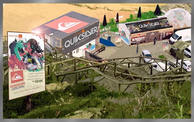
Incorporating Quiksilver’s Sponsored surf team I’ve proposed a charitable fund raising event. The event is a pay on entry day where you’d be able to view QS’s surfers whilst also being able to purchase low value products as means of donation throughout the day. The events title, Goat Boater is a derogatory term used in the early 80’s onwards, meaning ‘New Surf’.
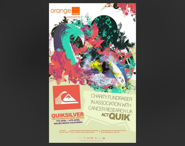
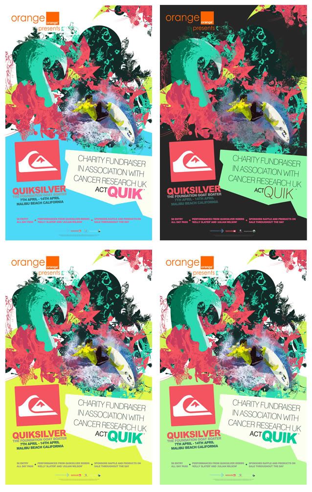
An identity was formed around the image of goats and the colour palette was taken from colours of coral and the ocean. To promote the event posters were made using the same coral colours seen in the ‘Goat Boater’ identity. It’s intended purpose would to be shown around the city acting as a method of awareness to the day. This is a large format product intended to show impact through bold shape and colouring. I’d say the poster is sufficient in it’s effectiveness however for me there was always something missing. I initially struggled to find a strong colour to use for the bottom of the page as most clashed against others or drew attention away from the central image.
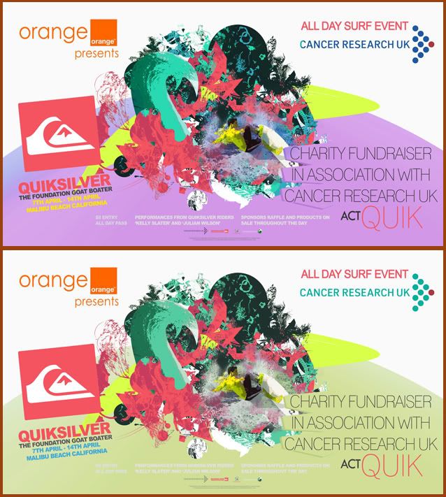
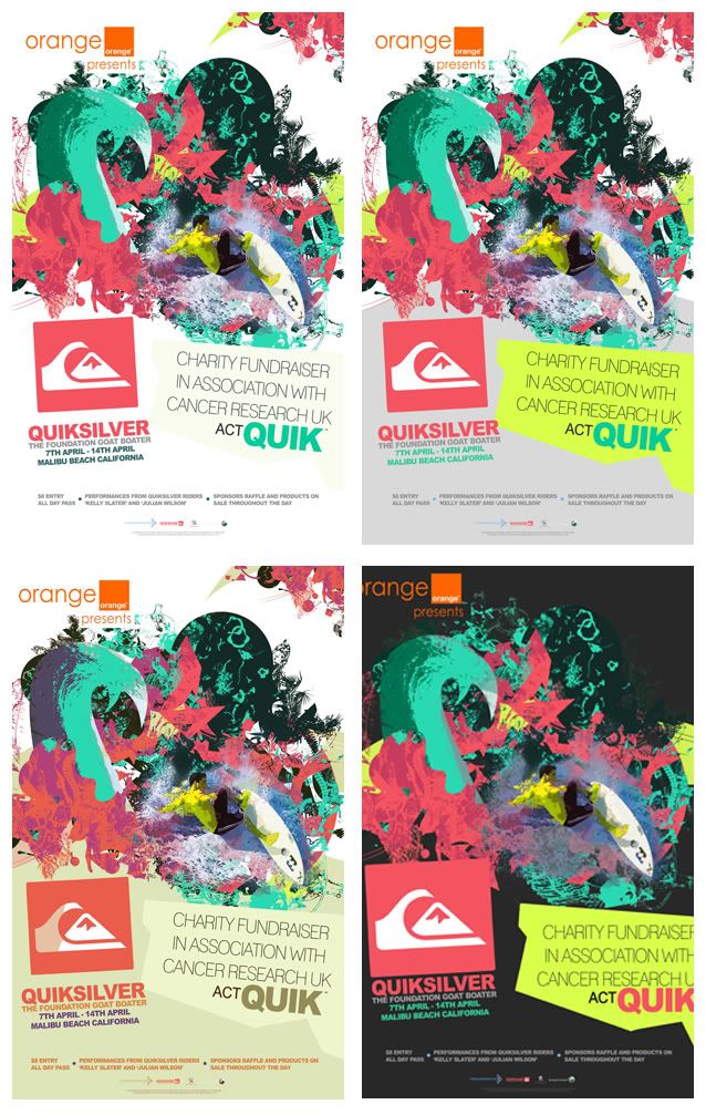
Alongside the poster we have the smaller A6 Leaflet intended to be distributed around location. This could be included and or printed in relevant magazines to gain maximum awareness to the event and cause. The flyer uses a slightly different colour palette to the poster. With the flyer I went for a much milder colour in comparison to the blue as seen on the poster. I think this probably is a better colour choice but when tested on the landscape poster it didn’t work at all as there was simply too much of a dull colour.
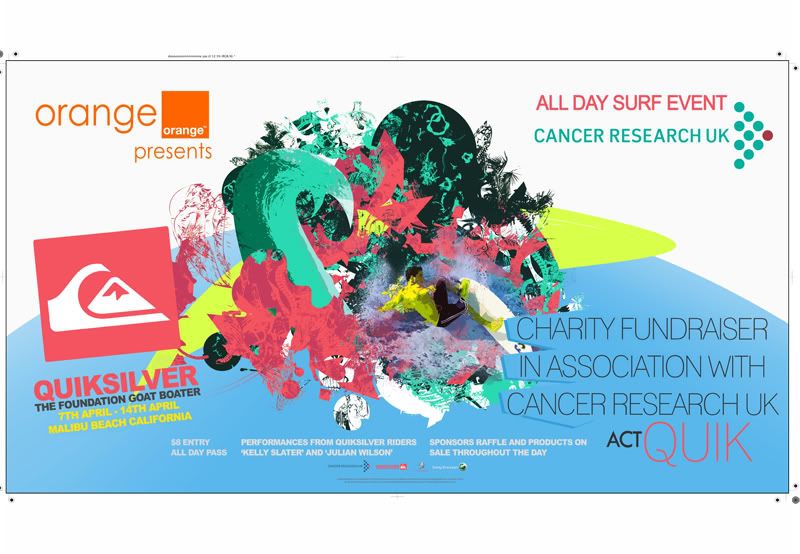
The banner is completely different to the other design work and intends to create a more striking point, something that could not be as so easily achieved with the GB’ colour palette.. The banner’s intended use was for location dressing and to display the relevant sponsors so it needed to stand out so it very clearly underlined the event, GOAT BOATER, and all the relevant sponsors that were to be involved in that event.
As far as products were concerned, I believe I did a fairly decent job. My main goal for this project was to make design that little bit more interesting. The problem I originally identified with existing charitable products was that they didn’t really serve purpose or had no real functionality. I wanted the viewer to look at the design and take it from something flat to 3D in there own interpretation. This way I believed it would make it more personal and hopefully make it something they’d want to keep.
A range of products that supported this idea were soon produced such as Quik Cards, and Quik Fold, named using the first part of the branding name, QuikSilver. All the products are aimed at youth market and upwards, so the idea of them being able to be creative with the work was something I felt was really important, and that physical interaction might hopefully make it seem more valuable and not throwaway.
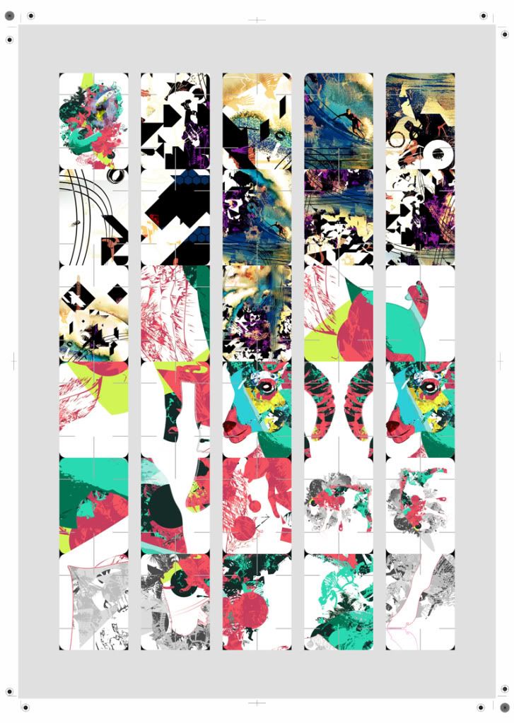
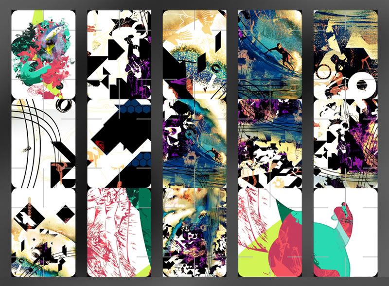
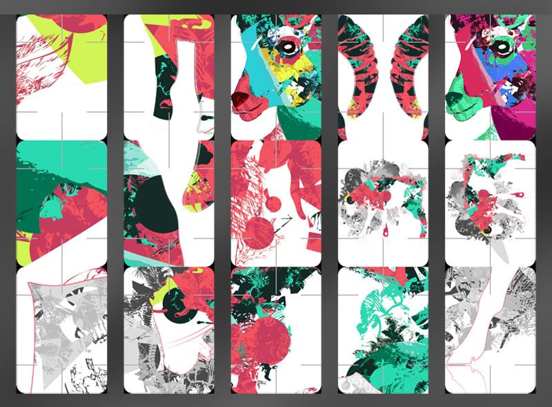
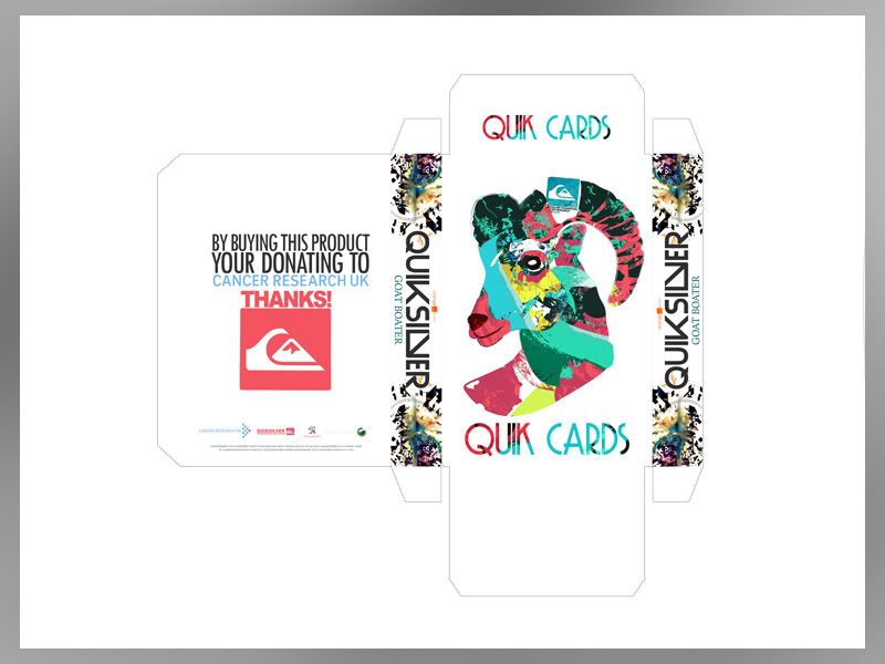
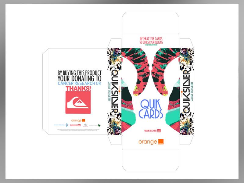
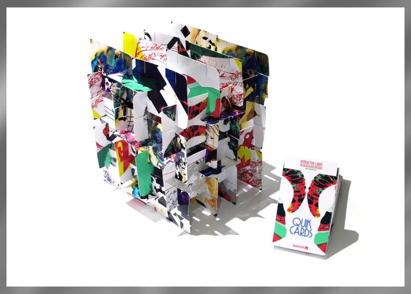
‘Quik Cards’ are packaged as a set of 50 cards. The cards are pre-cut so that they can be taken from 2D to 3D in an infinite amount of ways. The designs are based around sections of the previous poster art and other new pieces designed around the idea of surf culture, through shape and colour.
‘Quik Fold’ The idea behind this was the want to take an image off the page and make something interactive that the user could engage with. The Quik Fold works from a net which would be printed to the reverse of all the posters in the GB’ range. The posters would perforated so that can be easily popped out from the sheet and ‘Quikly’ made.
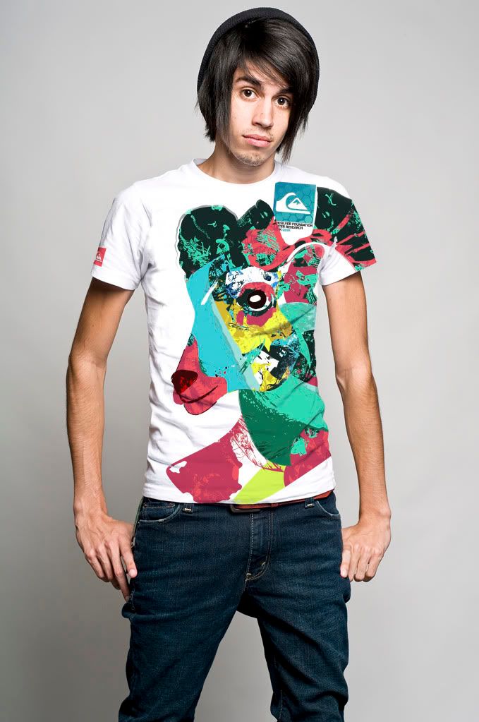
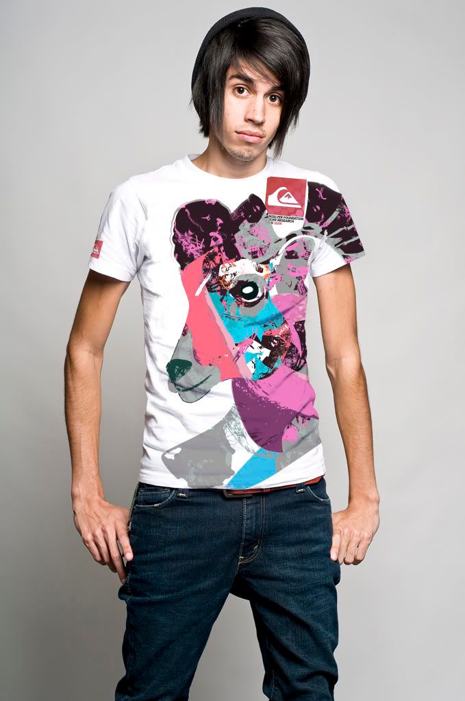
Branching off from this I also made a unisex T Shirt supported by a further 3 Quik designs. The Goat Boater colour palette was slightly altered to adhere to the unisex needs of the products; however it still retains the branding and identity of the event.
The shirt was something that I wanted to create from the start. Quiksilver’s branding awareness is largely achieved through its range of apparel, so clothing was something I wanted to get right. The issue with clothing in relevance to the idea behind the event was costing. I could have easily gone off and produced a range of 10 shirts to be sold at the event but why would I, would they sell? What needed to be addressed was the context. This is a charitable event so the product range shouldn’t necessarily go to the extent of an entire range as this is unrealistic. To narrow this down, the unisex shirt made perfect sense as it could be something that can be batch produced in a range of sizes and we don’t need to make 50 of each etc. The shirt features the main branding being the Goat Boater logo in simple soft colours.
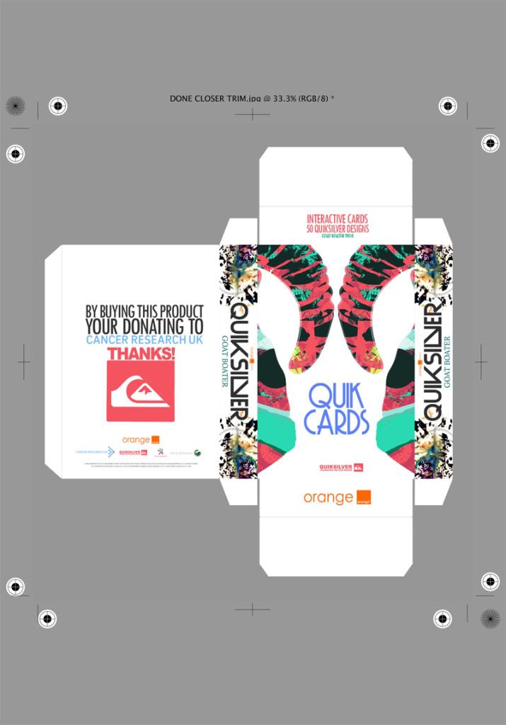
Quik Cards - The Make & Packaging
The nets that package the Quik Cards.‘Quik Cards’ are packaged as a set of 50 cards. The cards are pre-cut so that they can be taken from 2D to 3D in an infinite amount of ways. The designs are based around sections of the existing poster art and other new pieces designed around the idea of surf culture, through shape and colour.
Origional Idea, Didnt really work once it was made up so I went back to PhotoShop..
Final
Built up model using 48 cards -
Origional Idea, Didnt really work once it was made up so I went back to PhotoShop..

Final

Built up model using 48 cards -

Monday, 22 November 2010
Clothing Part II
Development from the previous work. This time I tried to focus more on the Goat Boater branding by using one of the logo images. Although I still think the brighter more attractive colours work best as an item of clothing I think the final result has worked quite well.
To make production and costing a little more easier I decided to change the colouring slightly so that it may appeal more to both girls and boys alike. A uni sex product seems to make much more sense, both in costing and manufacturing.
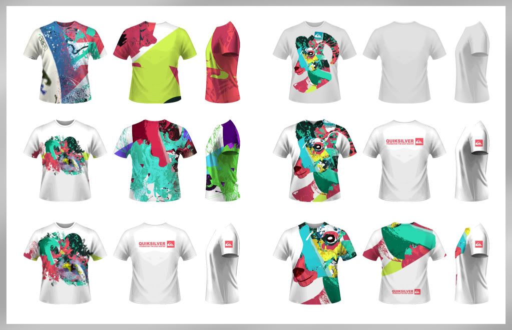
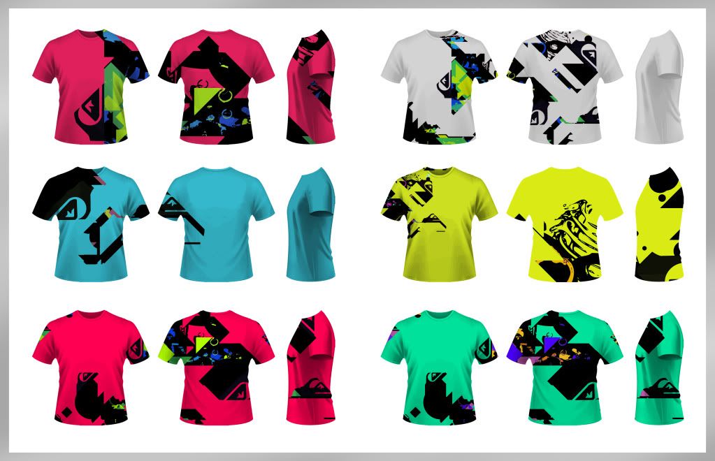
To make production and costing a little more easier I decided to change the colouring slightly so that it may appeal more to both girls and boys alike. A uni sex product seems to make much more sense, both in costing and manufacturing.


Tuesday, 16 November 2010
Vinyl Skins for Surfboards
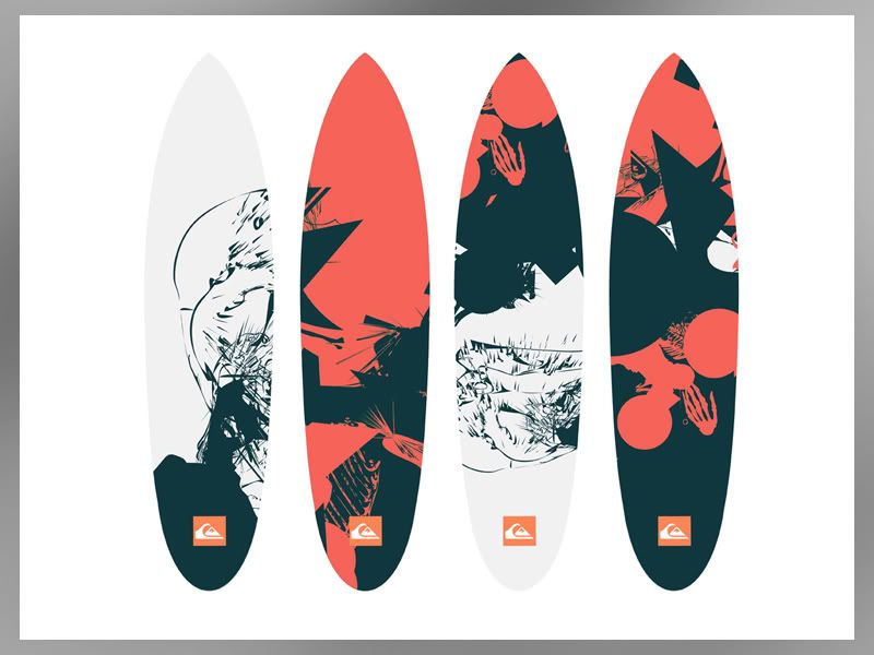
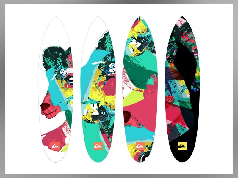
These are the skins that could be sold at the event. The designs are based around the exhisting material shown previously. The colour palletes are the same and I've tried to make the design as current and in keeping with QS themes as possible, whilst obviously putting my own spin on what I see as the brand.
The idea of a skin is actually something completly new for surf boards. There may be a reason for this however with the affects of water and adhesive. But on the other hand you can get waterpoof/colourfast vinyl and have been able for years.
My thoughts on this though, was that instead of replacing the entire boards at 500 quid a shot, you could buy a skin at the tenth the cost and completly update the look of your board. An idea at least, whether it would work in context is debateable..
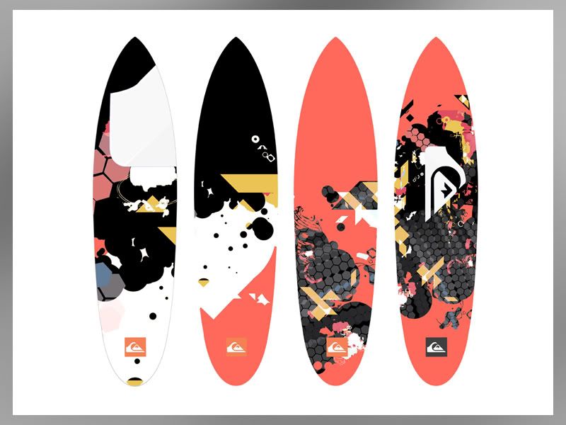
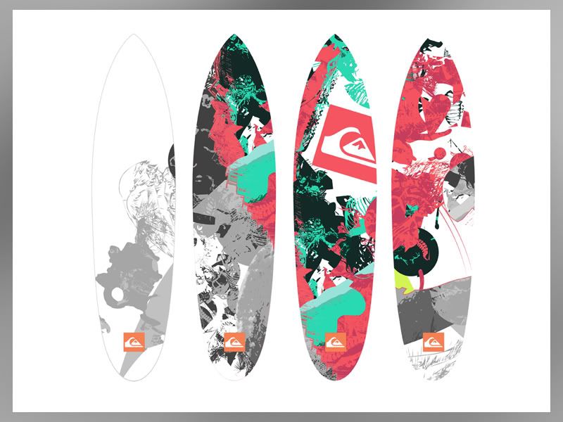
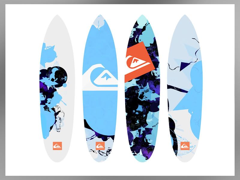
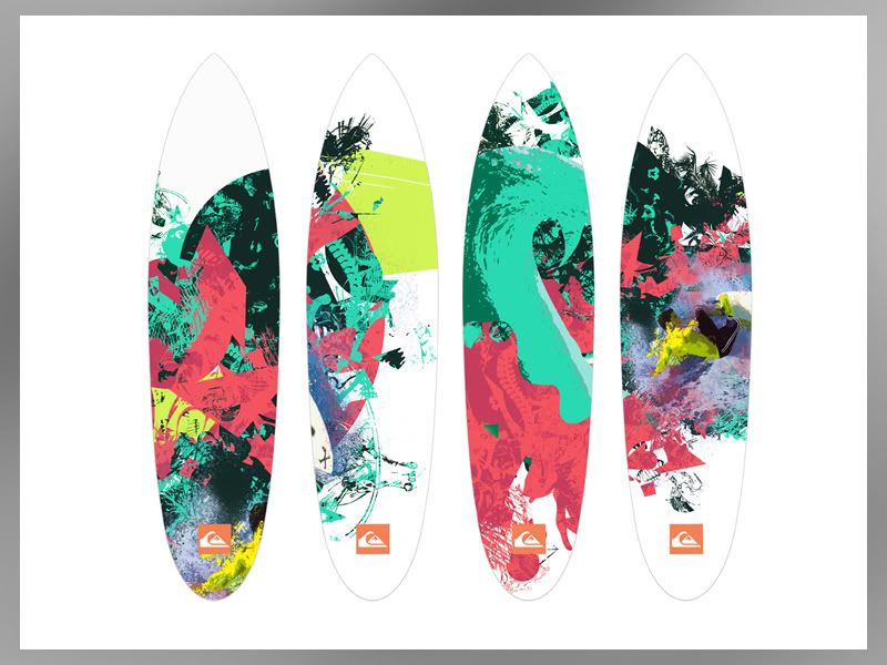
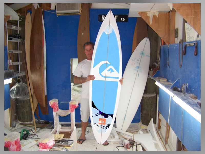
Just an idea for one of the designs in context, help get a sense of scale etc:
The idea of a skin is actually something completly new for surf boards. There may be a reason for this however with the affects of water and adhesive. But on the other hand you can get waterpoof/colourfast vinyl and have been able for years.
My thoughts on this though, was that instead of replacing the entire boards at 500 quid a shot, you could buy a skin at the tenth the cost and completly update the look of your board. An idea at least, whether it would work in context is debateable..


Just an idea for one of the designs in context, help get a sense of scale etc:

Quik Cards
Banner Design
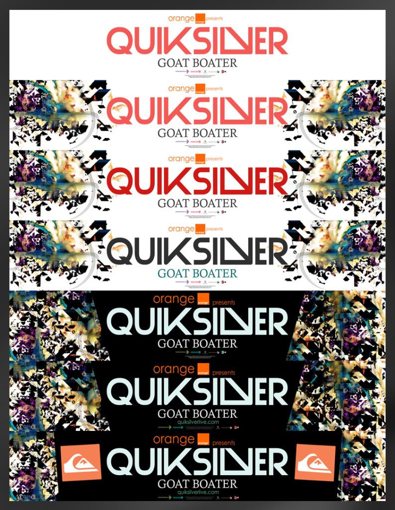
Below is the design for the banner to be displayed around the event. The banner brings the first real introduction of type into the designs. I chose to make the font quite modern in design and in keeping with past styles. QS' doesn't really have a set font that they use throughout and is regulary changed and updated. For me this was perfect as it left me to try a few possible ideas.

Other possible ideas/development

Other possible ideas/development

Monday, 15 November 2010
Poster Design III
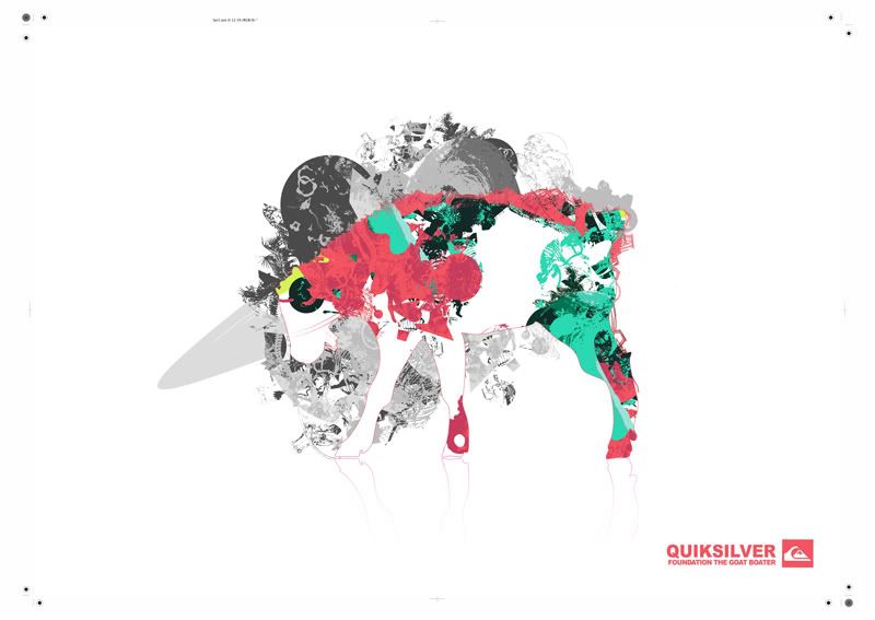
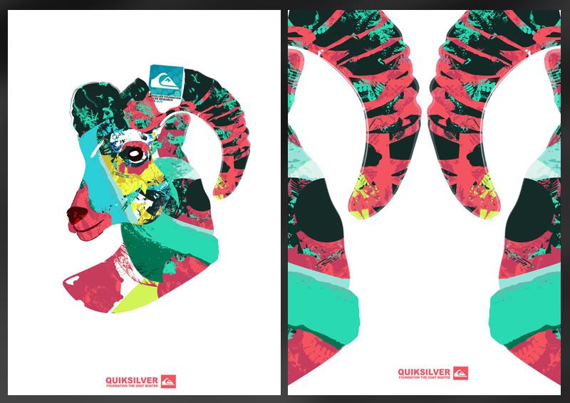
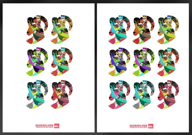
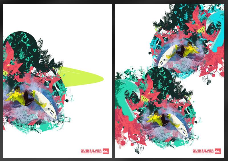
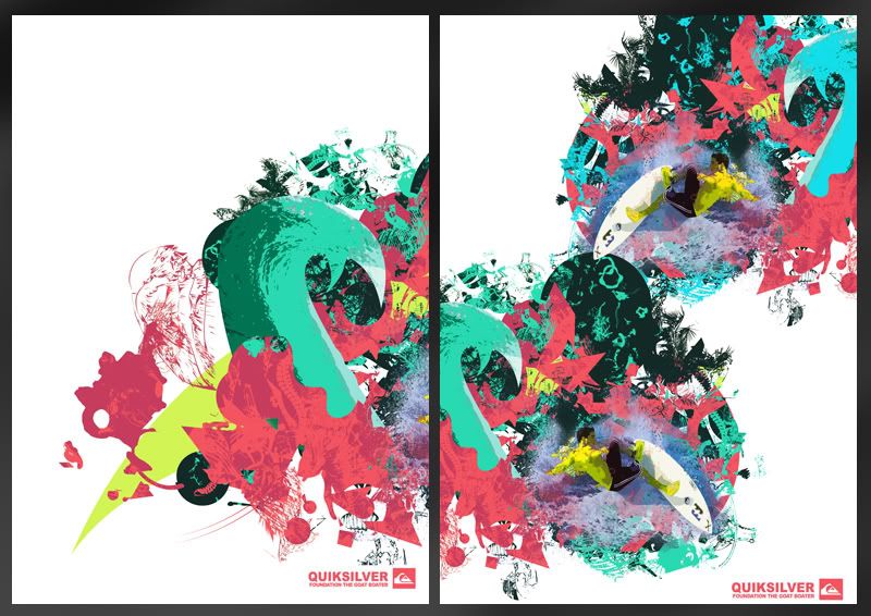
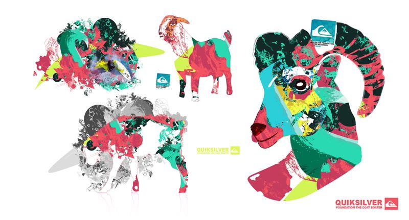
The seperate posters that are not used for promotion but for sale and event dressing. These posters will be displayed around the event with the possibility of buying them as means to donate to charity.
There's lots of variations to each poster, some of which I've chosen to not to upload as theres literally too many. The ones I have put together can be seen below. I'll later pick 5 of these which will be used and taken forward to print or further development if needed.
Bery clear that this image just isn't working with the others so it's getting thrown out:
There's lots of variations to each poster, some of which I've chosen to not to upload as theres literally too many. The ones I have put together can be seen below. I'll later pick 5 of these which will be used and taken forward to print or further development if needed.


Bery clear that this image just isn't working with the others so it's getting thrown out:

Poster Design II
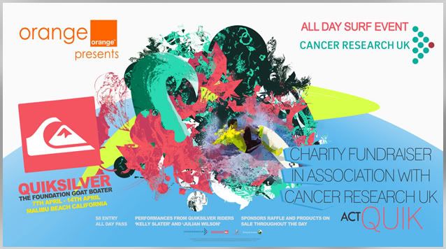
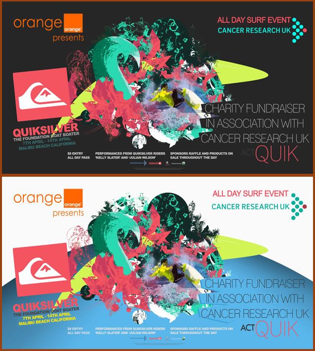
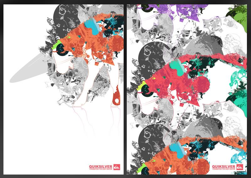
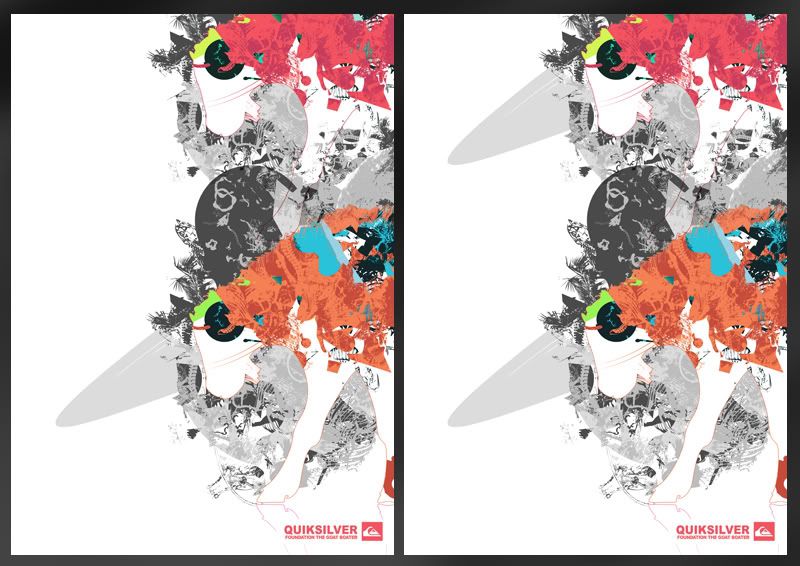
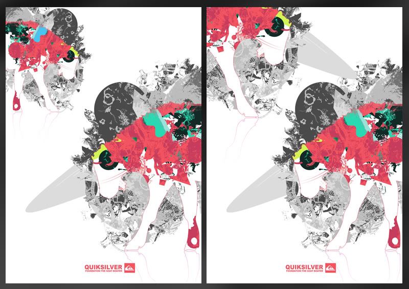
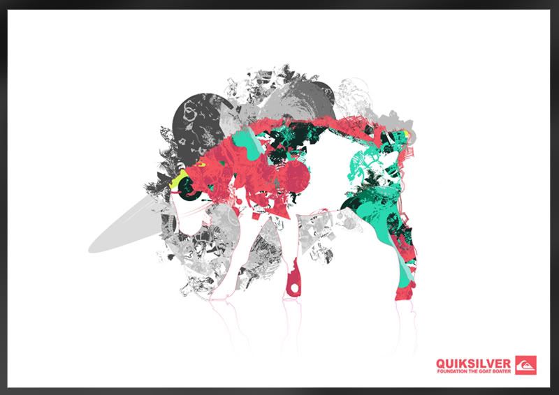
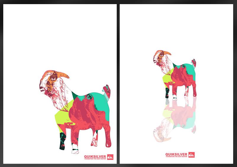
As the poster would ideally be placed in numerous areas I knew a portrait version wouldnt be enough. I think in general, the landscape version is a lot more effective. Probably mainly to fact that you can see more of the main image and theres a lot more space for text, making the poster look a little less crowded.
An issue I came across regarding colour was the blue section at the bottom. Ideally this would have been baige to match the portrait version. The problem was that with this one the surfcae area of that.. baige was too big. In my opinion it made the poster loose its impact. However using the blue really helped to make the image pop, a lot more than baige..
An issue I came across regarding colour was the blue section at the bottom. Ideally this would have been baige to match the portrait version. The problem was that with this one the surfcae area of that.. baige was too big. In my opinion it made the poster loose its impact. However using the blue really helped to make the image pop, a lot more than baige..
Poster Design
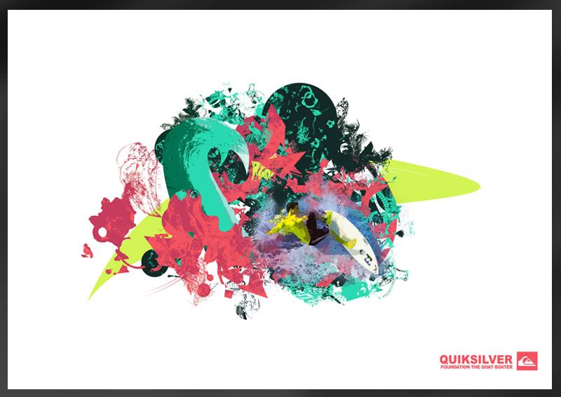
When looking at some of the work I'd done before I found it hard to find a strong title image. I obviously couln't use the Goat Images as the main item because it would leave the viewer thinking I was advertising cattle.. clearly not the case.
Lots of development gone into this one today thoughand I'll upload the developing work at a later stage. Found it hard to find a colour scheme that ran with the coral palette that wasn't too busy. The pallete I've got works well in highlighting details in the busy design but when used as large blocks of colour, its not as successful. To help tone down the image I did lot of experimentation into colour to find a more subtle but still effective solution, or at least in my opinion for now.
Lots of development gone into this one today thoughand I'll upload the developing work at a later stage. Found it hard to find a colour scheme that ran with the coral palette that wasn't too busy. The pallete I've got works well in highlighting details in the busy design but when used as large blocks of colour, its not as successful. To help tone down the image I did lot of experimentation into colour to find a more subtle but still effective solution, or at least in my opinion for now.
Sunday, 14 November 2010
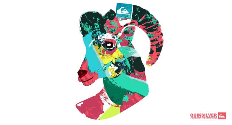
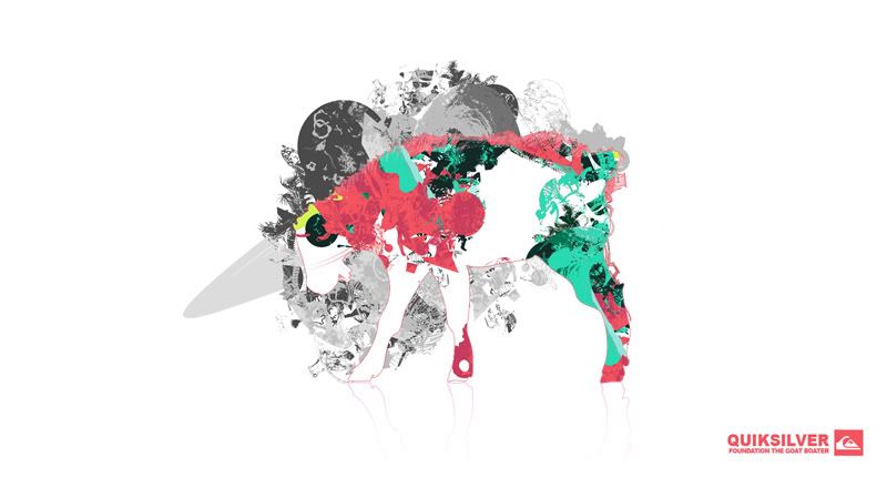
Ideas - Possible Logo - "Goat Boater"
Research
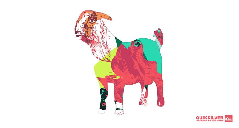
Basically I wanted to combine some of the design ideas I've being playing around with to the events title, The Goat Boater. To do this I thought it best to start getting some reference images to start working over and try to build a base for how I wanted them to look.
I've stuck with the same colour palette previously chosen as these came out best in testing and were maintained throughout for consistancy.
3 Main ideas below, there are some VERY initial ideas that I'm a little reluctant to put on as they're really quite terrible. Should also point out these are just initial ideas for now:


Friday, 12 November 2010
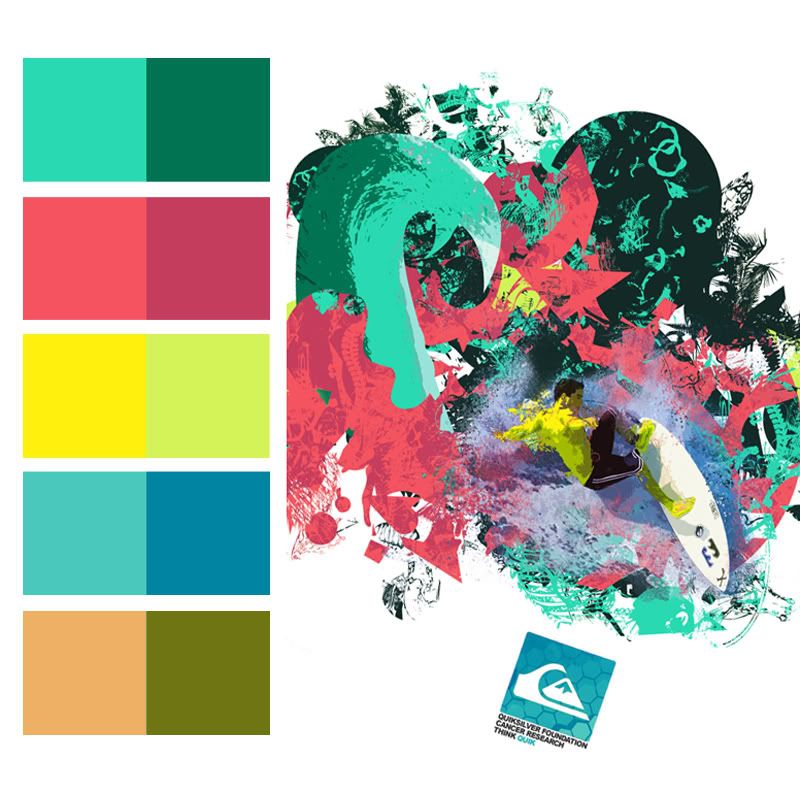
Confirmed Colour Palette
Possible Product Range POSTER
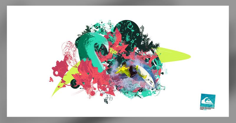
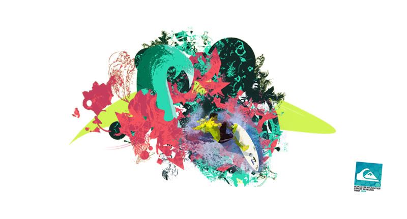
Second Idea, a little more basic, probably more effective in impact but still a tad busy.. The colour scheme on this however is something I really think is working. The pallete itself is based around the colours of coral and I've also tried to make the shapes reflect.
Out of all the colour tests so far, these really do seem to be complimenting each other well. They're relevant to the idea of water sport and are bright, drawing attention from the viewer.
Colour Variant that wasn't so successful :
Process
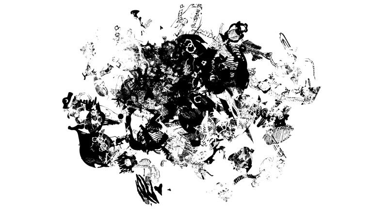
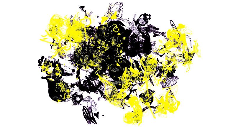
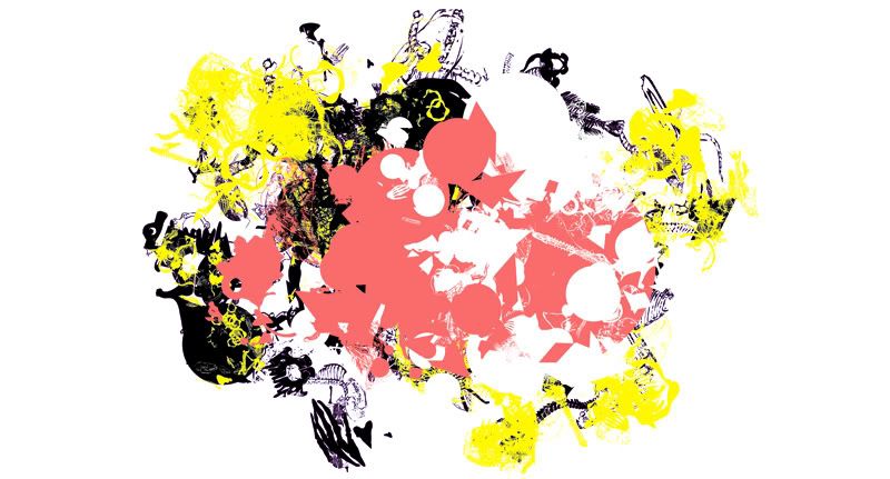
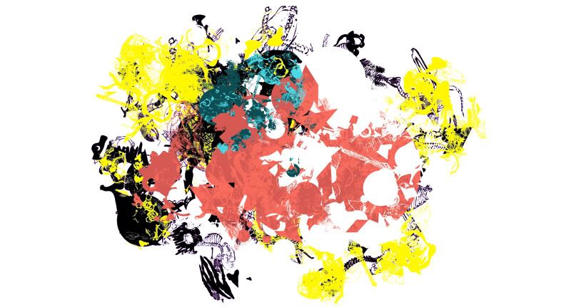
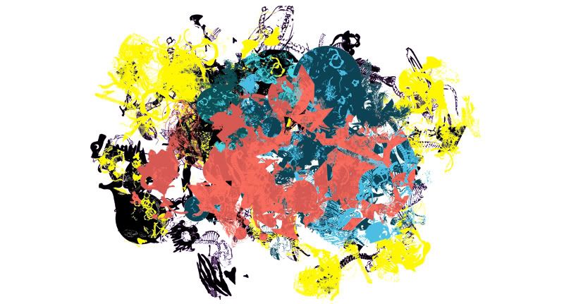
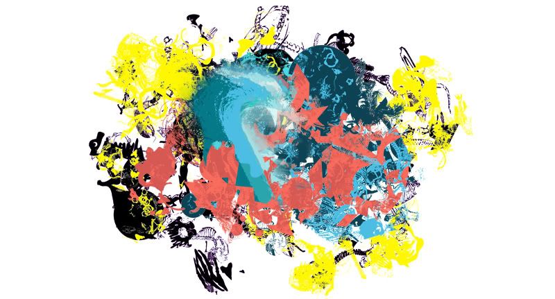
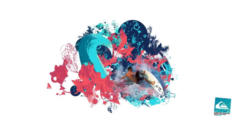
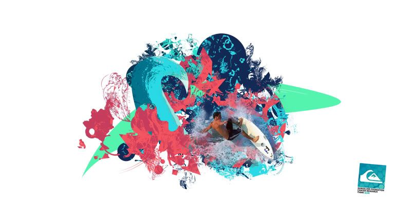
Out of all the colour tests so far, these really do seem to be complimenting each other well. They're relevant to the idea of water sport and are bright, drawing attention from the viewer.

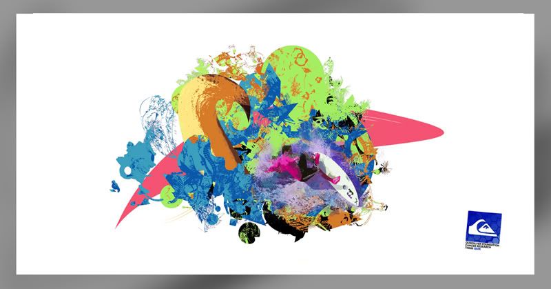
Colour Variant that wasn't so successful :

Process


Subscribe to:
Comments (Atom)

