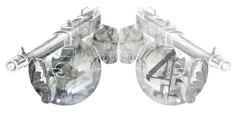
The chosen subject for this brief was Top Ten Gangster Films. The reason for choosing this subject was that I wanted a dark gritty base to form the video on, gangsters being a good start.
The research I was looking into at the time was titles from Tropic Thunder, RocknRolla etc. The visual investigations to AE were more towards Photoshop based files that animate in After Effects. What really captured my eye was ink bleeds and artistic strokes being revealed and painted out, examples such as “Silver Sun Pickups – Swoon”. Other research includes cartoon and comic art animated in a very unclean raw state, hard edges, almost undeveloped however this obviously the intended finish. The advertisement I was looking at were things such as the Cadbury Gorilla advert. What I found most effective about this was the slow build up with the inevitable breakdown of the music. Just when the viewer thinks they understand the pace of video, it’s quickly shifted.
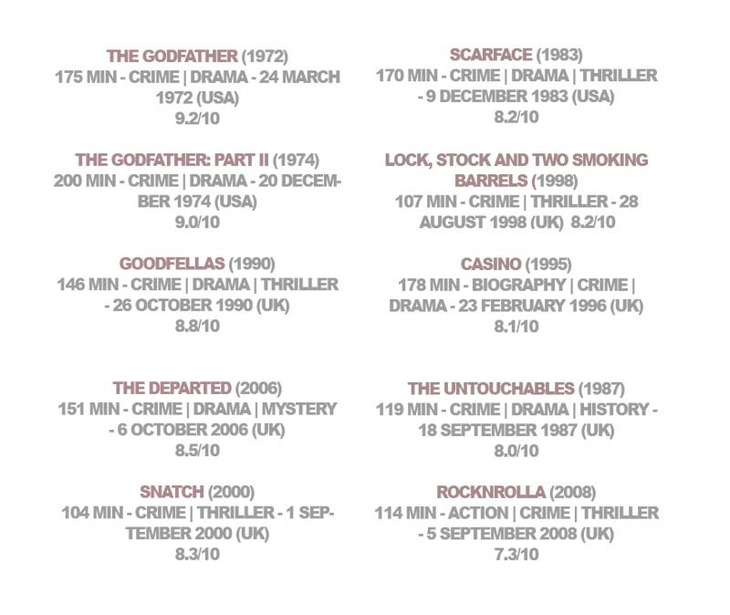
Choosing the title films for the show was researched using websites such as IMDB and Rotten Tomato. I looked at both user opinions and film critiques opinions from various other sites to compile the main list and threw in a few British films on top to make it more relevant to a UK show. The chosen channel for the show was C4. The reason due to the similarity of existing shows shown on that channel and the time of ten pm. Top 10 at 10pm.
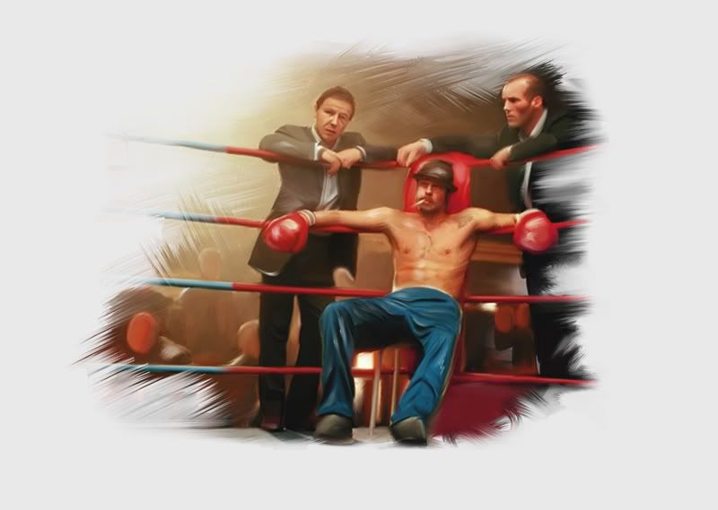
The music I was looking at was Russian/Italian soundtracks taken from various movie soundtracks researched. The chosen soundtrack to run throughout the video was “Ruskies”, a track taken from the 2000 feature film Snatch.
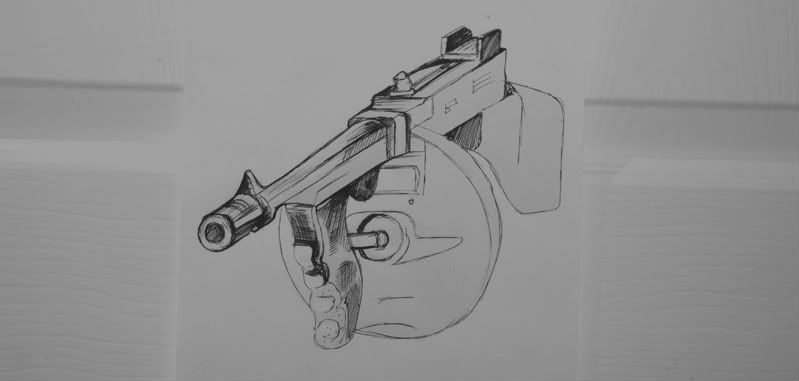
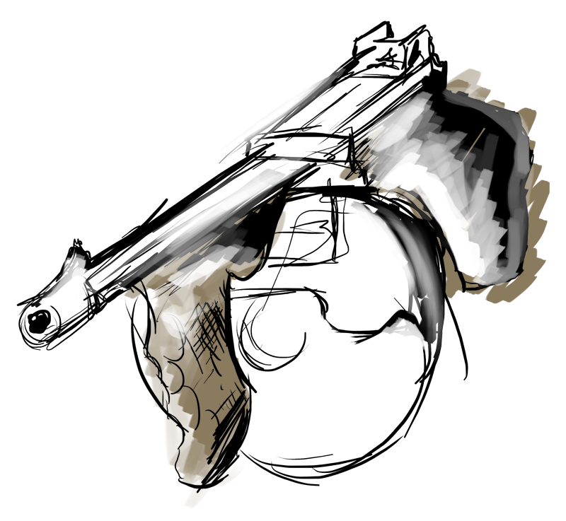
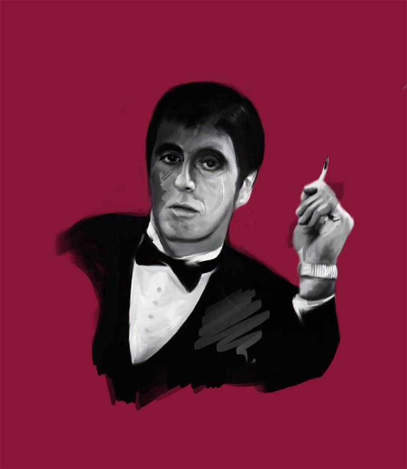
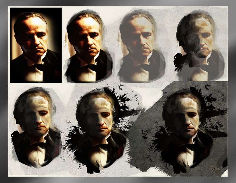
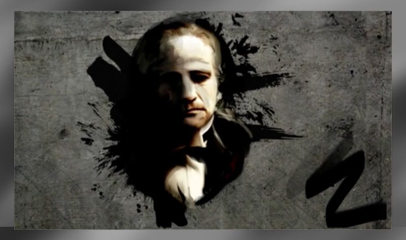
The initial design work was looking painting over existing iconic imagery from a selection of the films. I started off with an image of the Godfather. The image as taken from Google, colour dropped and painted over using a Wacom to achieve an artistic hand drawn effect. When taken to after effects I experimented using various layers with the Vector Paint tool to slowly paint out individual sections of the image to give the effect that it was being drawn up.
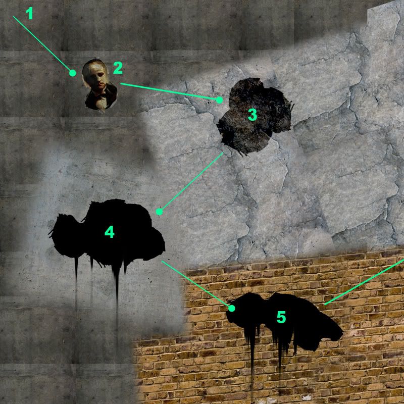
To add some dynamic to the video it was decided that the images would pan around a large textured background. To achieve this I researched some large format texture images of rocks and blended them together using PS. The layers where then parented to the background so that they would stay fixed to the map as the layer moved around.
I was experiencing lot difficulties trying to get the panning to work correcting. Originally I was using all the animated comps in a larger composition, which was parented to the motion of the background. However the complexity of all layers individually animating was causing the file to be almost unworkable.
To get a around this, I enlarged the frame of the original video files (Scarface and Godfather). With a larger background I was then able to mask off the hard edge and have the video file sit softly on the texture background. The comp was then made of 2 videos and the background fixing the running issues and was also a lot easier to work with.
The images are laid out in such as way that they are not centred. Origionally the plan was to incorporate text that would be introduced at the same time as voice over quote. However the text wasn’t really working and the advice from a crit was to loose it altogether as it distracted from the imagery. Could have been developed to work with the video a little better but I don’t think the video is lacking without it.
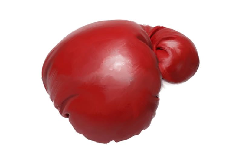
From advice in crits the video was too linear with nothing interesting and nothing unexpected. From this I decided to create a change in mood. The video now took on darker, grittier side just over half way in. The animation of the boxing glove was used to try and lift the flat paintings and make the video seem more interactive/varied.
I also wanted to get more gritty and darker with the audio and look after the mood switch, so the colour gets a much darker tone, which slowly dips up and down to mimic lighting. The power down fade to black also acts a marker from where the mood shifts and a nice synth soundtrack was added, taken from the film Godfather 2.
The main issues I have with my title sequence is that in my eyes it probably works better as a 50 second advert as appose to title sequence. I’m not sure why it feels like this, maybe because there is so much going on? If I had to revisit this, it would be something I’d have to review to adept to create a more fitting sequence as in my opinion, it’s not quite working as a title sequence yet.
Total Pageviews
Showing posts with label OUGD202. Show all posts
Showing posts with label OUGD202. Show all posts
Wednesday, 16 February 2011
Wednesday, 9 February 2011
Tuesday, 8 February 2011
Wednesday, 2 February 2011
Design Development Video
First tests painting Al. Building appearance and use of particles as smoke.
Scaled out version of the map. Speed tests
Use of wiggler on background. Use of panning and parenting.
Development of ident and intergration of music and SFX.
Paint out - Snatch
Up to 30 Seconds, 3 images.
Text, always wanted to incorporate type. Advice from feedback was to keep it largly image based.
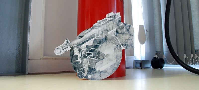
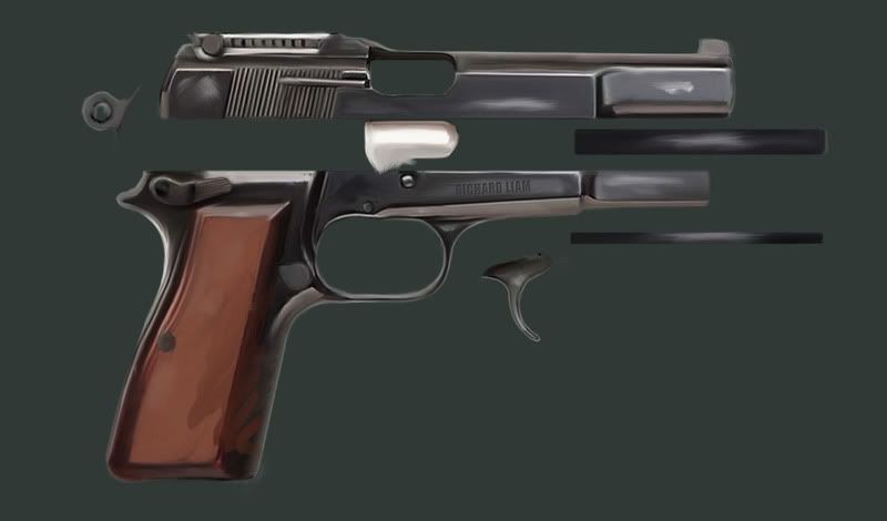
Gun - animation of firing.
New colour idea, bullet following path of background. Shoots onto next screen.
Scrapped idea, wasnt working with theme.
Improved animation and pace. Incorporates better to following scene through use of splatters.
New things. From advice in crits the video was too linear with nothing interesting and nothing unexpected. Decided to create a change in mood. The video now starts to take a darker, grittier side just over half way in. Animation of boxing glove to try and lift the flat paintings and make the video seem more interactive.
The glove wasnt really working on it's own so the shatter of the glass was added to create a little more realism. Sound added later. More direct, sudden switch in the mood as well, adding of heartbeats.
A change in sound, change in look. This video was made whilst experimenting with the look and feel of the film. I wanted it to get more gritty and darker so the colour gets a much darker tone which slowly dips up and down like lighting. The power down fade to black also acts a marker from where the mood shifts and a nice synth soundtrack was added, taken from the film Godfather 2.
Text of some of the featured films scaling in time to the heartbeat.
Design Development Image / Asset
Tuesday, 1 February 2011
Final Test 50s Layout
Few things I need to tidy up especially towards the end as there's a few dead seconds, but for now, basic draft of sequence.
Points to looks at:
Add more paint to the snatch image so where not left looking at a still. Give it reason to be still on screen.
Look at the appearance of the gun, is it working.. not too sure.
Sound effect on gun, put in as a draft but probably need to find something more appropriate.
Look at pace of the text at end.
Get rid of the splatter at the end as it's video material and looks out of place anyway.
Untitled from Richard Robinson on Vimeo.
Points to looks at:
Add more paint to the snatch image so where not left looking at a still. Give it reason to be still on screen.
Look at the appearance of the gun, is it working.. not too sure.
Sound effect on gun, put in as a draft but probably need to find something more appropriate.
Look at pace of the text at end.
Get rid of the splatter at the end as it's video material and looks out of place anyway.
Thursday, 27 January 2011
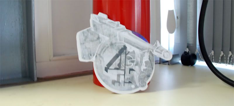
Motion Test With C4 Logo
Been experiencing a lot difficulties trying to get the panning to work correcting. Originally I was using all the animated comps in a larger comp which was parented to the motion of the background. However the complexity of all layers individually animating was causing the file to be almost unworkable.
To get a around this, I enlarged the frame of the original video files (scarface and godfather). With a larger background I was then able to mask off the hard edge and have the video file sit softly on the texture background. The comp is now made of 2 videos and the background fixing the running issues.
DEVELOPMENT
Remove the channel 4 logo after the record scratch sound effect
Sort out the smoke effect. No ones noticing this but the glitch is bugging me
Start incorporating the typography
Probably use the same sweeping SFX. Looks like it will tie in more as part of the soundtrack
Wednesday, 26 January 2011
Tuesday, 25 January 2011
Friday, 21 January 2011
Thursday, 20 January 2011
Boards
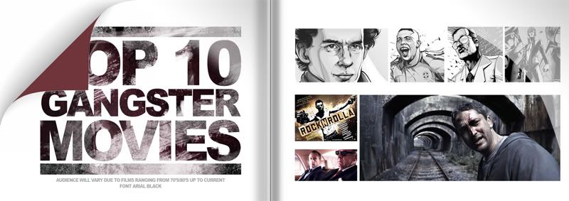
The Style I want to approach with this brief will be largely vector driven art. Animating this movement will be close to impossible within the time given although I could look at animating gradients ands lighting alongside panning and scale methods.
The word shown on this board is vector work by Cristiano Siqueira (www.crisvector.com) also referenced on my design context. The style looks really fresh and current although to avoid simply ripping it off I want to start to develop a similar idea overlaying textures to create a more comic effect.
From the list below, I have chose to go with 'Gangster Films'. The reason for this choice is largely due to how much this will tie into my context. There's a lot of scope for gritty, illustrated design which is a route I can see working quite well for this project.
This will also enable me to start producing some hand drawn work which I can then bring back into illustrator and photoshop to further develop skills in this area.
What I need to do:
The research I will be looking for is to first find my audience, who would be interested in watching the program. This will then underpin the look and feel of the idents and t'sequence. Lot's of studies into existing title sequences
I will then need to find my list, this can be done through film review sites such as rotten tomato and IMDB. The main reviewers will no doubt show the 'classic' gangster films, mostly American. It's difficult to decide whether to throw in some newer films that are more current today but maybe not the 'main' top 10. This can be decided later into the work however but it's something to be thinking about for now.
Below is a list for the possible Ideas for my subject matter:
- Songs/Music artists/Videos
- Wanted list - Product ranges - Cars/Holidays/Watches/Clothing etc
- Crime
- Money - Britains rich list
- Places to work as a designer
- Places to work as a student
- Comics
- Holiday Destination
- Food - Takeaway/Fast Food/Restaurants
- Comedy Film Moments
- Style of film - War/Comedy/Gangster/Family/Action/Thriller/Rom Com Etc
- Stand up comedians
- Christmas Don't List
- New Year Resolutions
Wednesday, 19 January 2011
Tests - Blog Main Page
Continuation of after effets testing. Started working on making an impact video for the main blog page. Could have being anything really as I simply wanted to play around with some lens flaring and particle effects; but I thought it would be good for it to have some purpose as well.
Friday, 14 January 2011
OUGD202 Best/Worst
__________________________________________________________________________________________________________________________
Subscribe to:
Posts (Atom)

