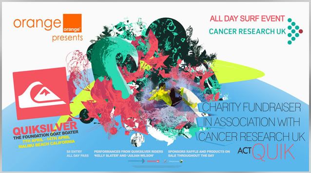
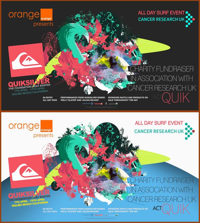
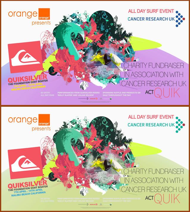
As the poster would ideally be placed in numerous areas I knew a portrait version wouldnt be enough. I think in general, the landscape version is a lot more effective. Probably mainly to fact that you can see more of the main image and theres a lot more space for text, making the poster look a little less crowded.
An issue I came across regarding colour was the blue section at the bottom. Ideally this would have been baige to match the portrait version. The problem was that with this one the surfcae area of that.. baige was too big. In my opinion it made the poster loose its impact. However using the blue really helped to make the image pop, a lot more than baige..


No comments:
Post a Comment