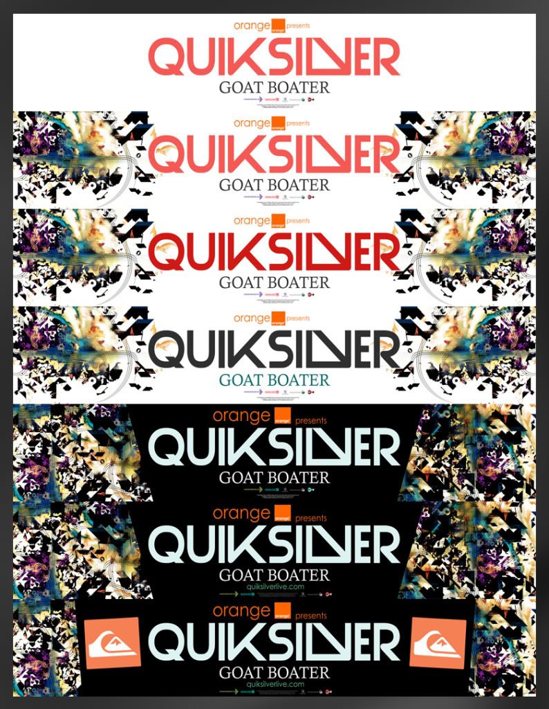
Below is the design for the banner to be displayed around the event. The banner brings the first real introduction of type into the designs. I chose to make the font quite modern in design and in keeping with past styles. QS' doesn't really have a set font that they use throughout and is regulary changed and updated. For me this was perfect as it left me to try a few possible ideas.
 Other possible ideas/development


No comments:
Post a Comment