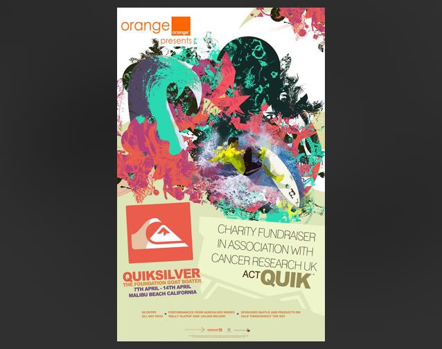
When looking at some of the work I'd done before I found it hard to find a strong title image. I obviously couln't use the Goat Images as the main item because it would leave the viewer thinking I was advertising cattle.. clearly not the case.
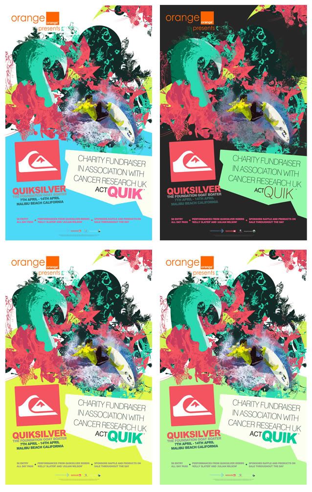
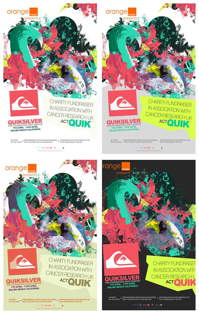
Lots of development gone into this one today thoughand I'll upload the developing work at a later stage. Found it hard to find a colour scheme that ran with the coral palette that wasn't too busy. The pallete I've got works well in highlighting details in the busy design but when used as large blocks of colour, its not as successful. To help tone down the image I did lot of experimentation into colour to find a more subtle but still effective solution, or at least in my opinion for now.


No comments:
Post a Comment