Total Pageviews
Friday, 12 November 2010
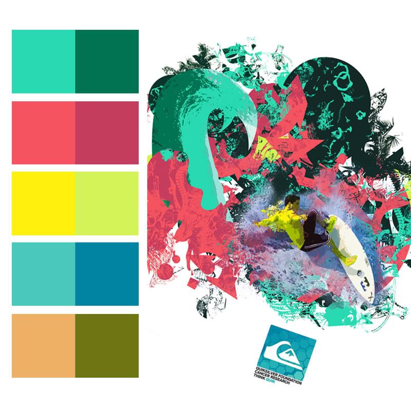
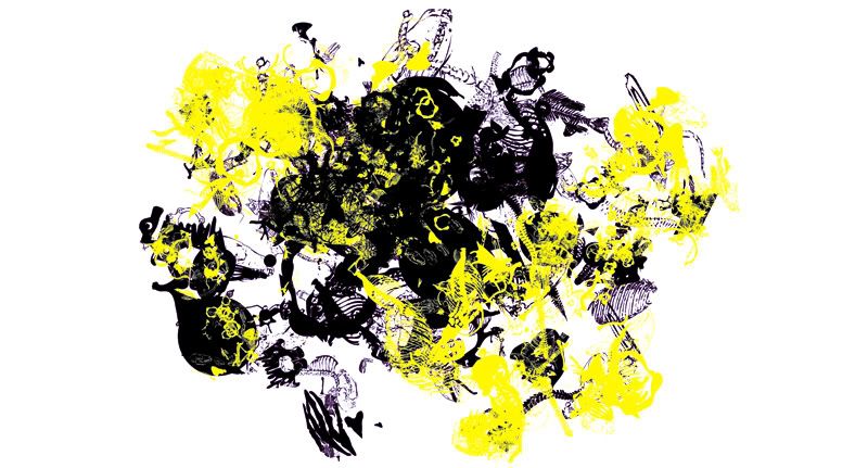
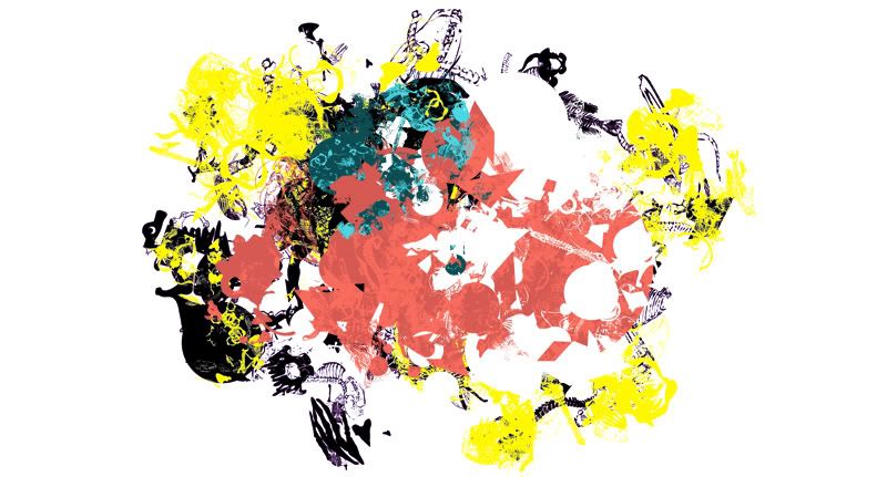
Confirmed Colour Palette

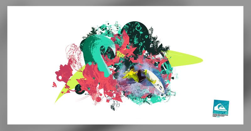
Possible Product Range POSTER
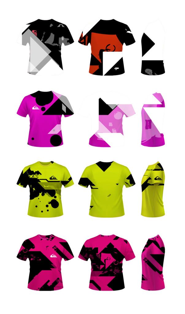
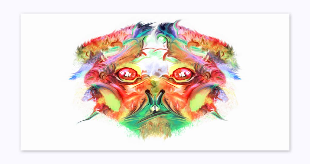
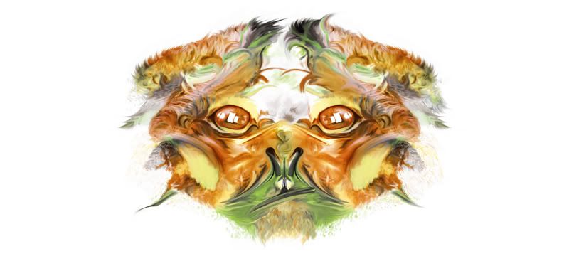
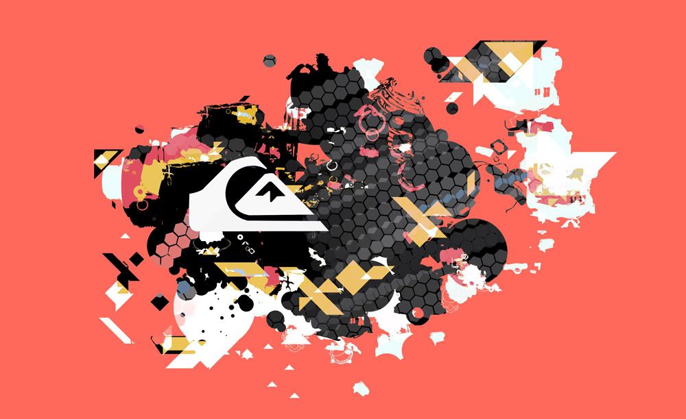
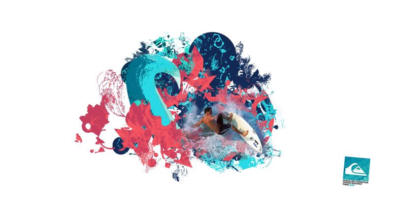
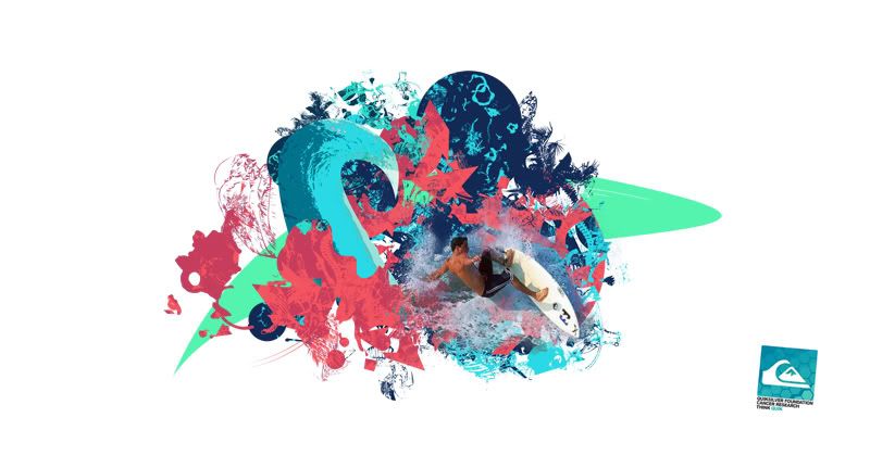
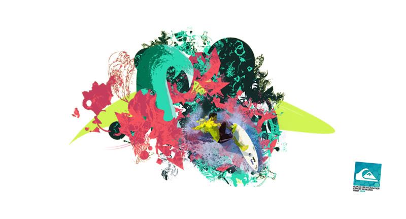
Out of all the colour tests so far, these really do seem to be complimenting each other well. They're relevant to the idea of water sport and are bright, drawing attention from the viewer.
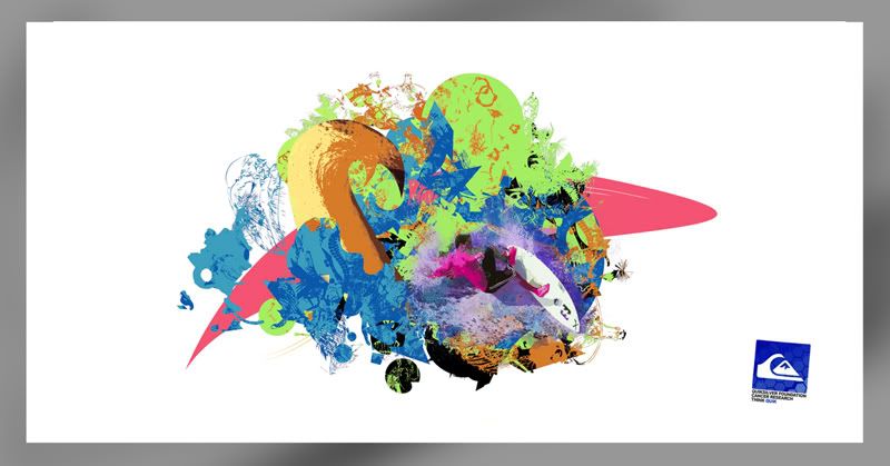
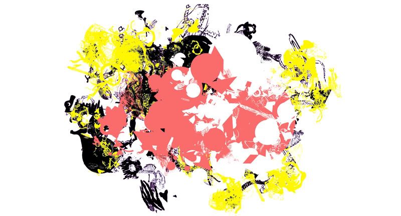
Colour Variant that wasn't so successful :
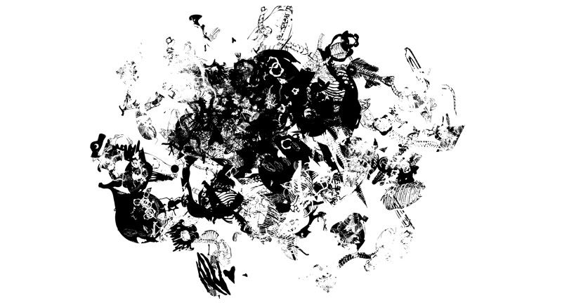
Process


Thursday, 11 November 2010
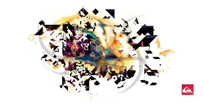
Possible Product Range POSTER
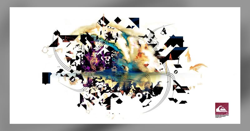
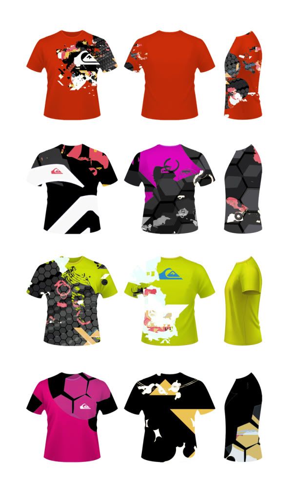
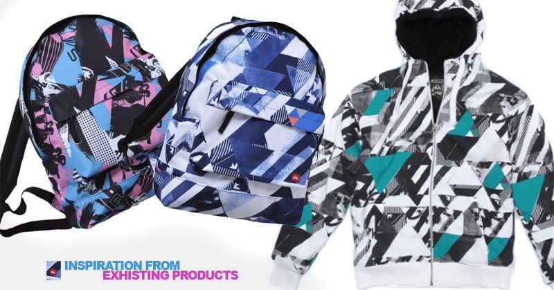
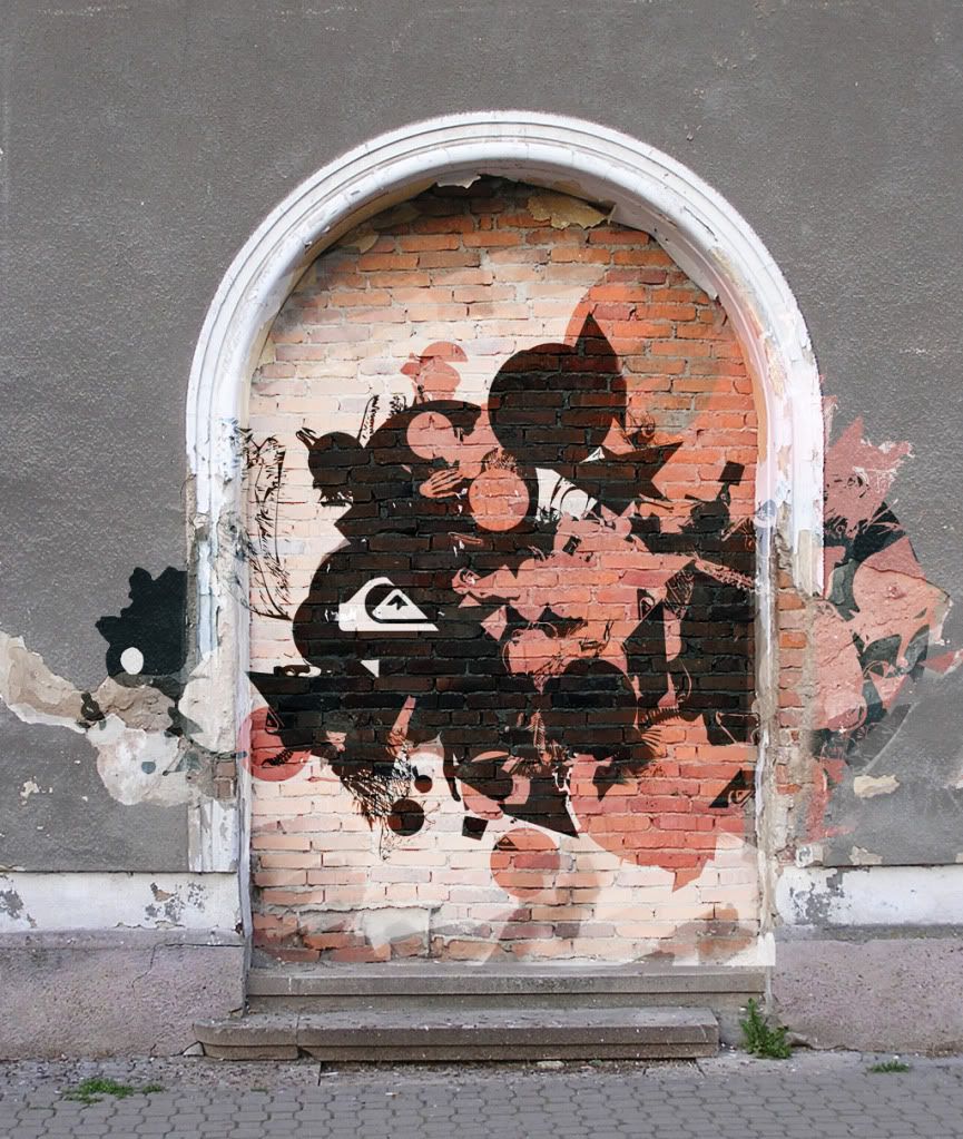
Feel like I'm starting to get somewhere with my design development now. As mentioned before it's tricky when working with an established brand to not look like your ripping off the exhisting style. I hope what's starting to show with this is the blend between the current style and my own take on top of that.
Liking the style though, something that I'll develop across some of the other products, see how it works in context etc..
Process

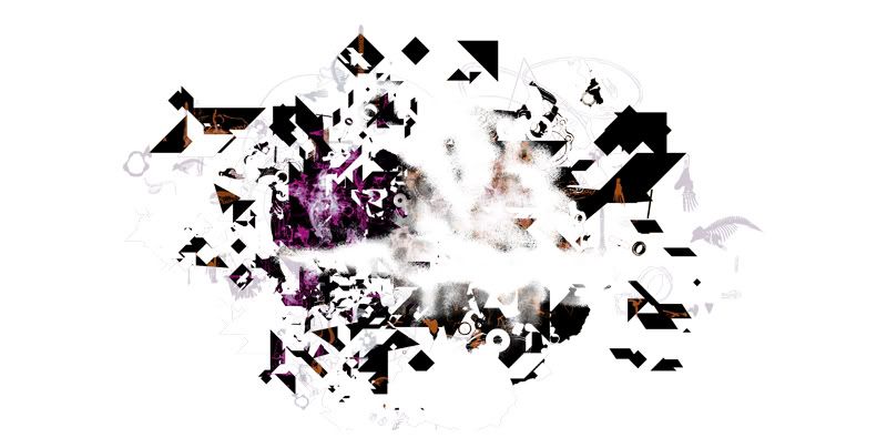
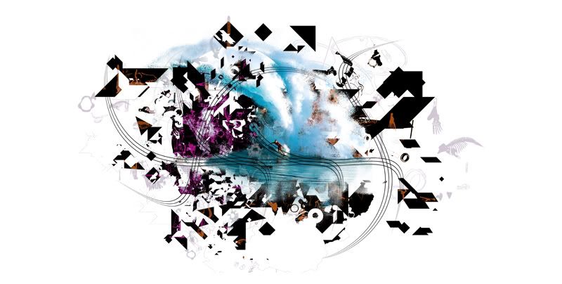
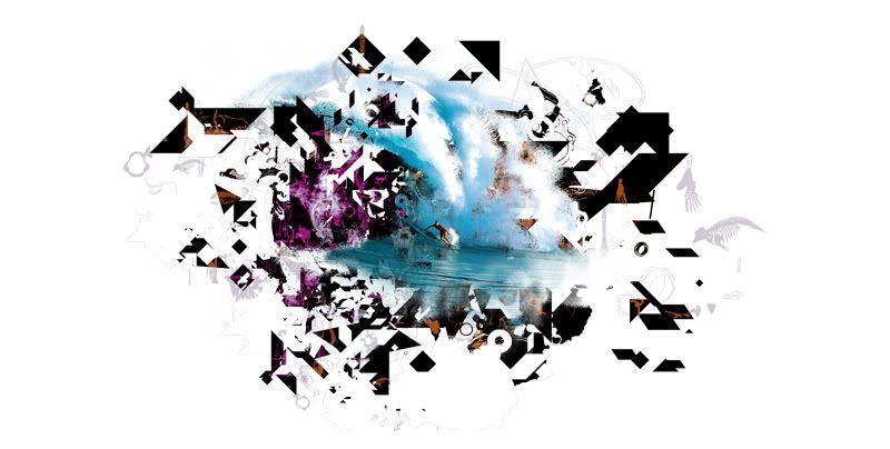
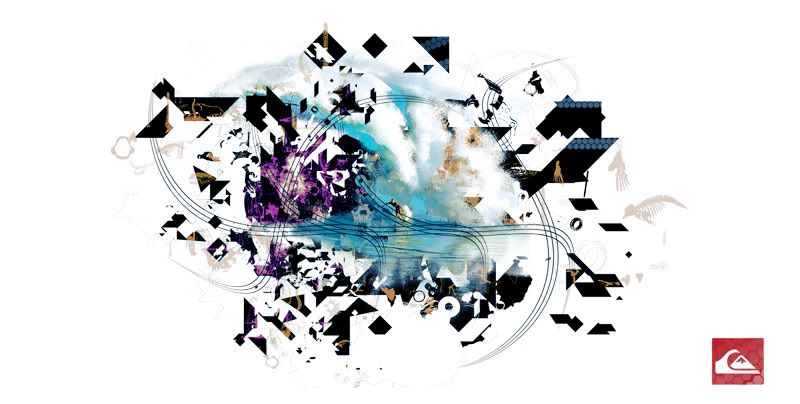
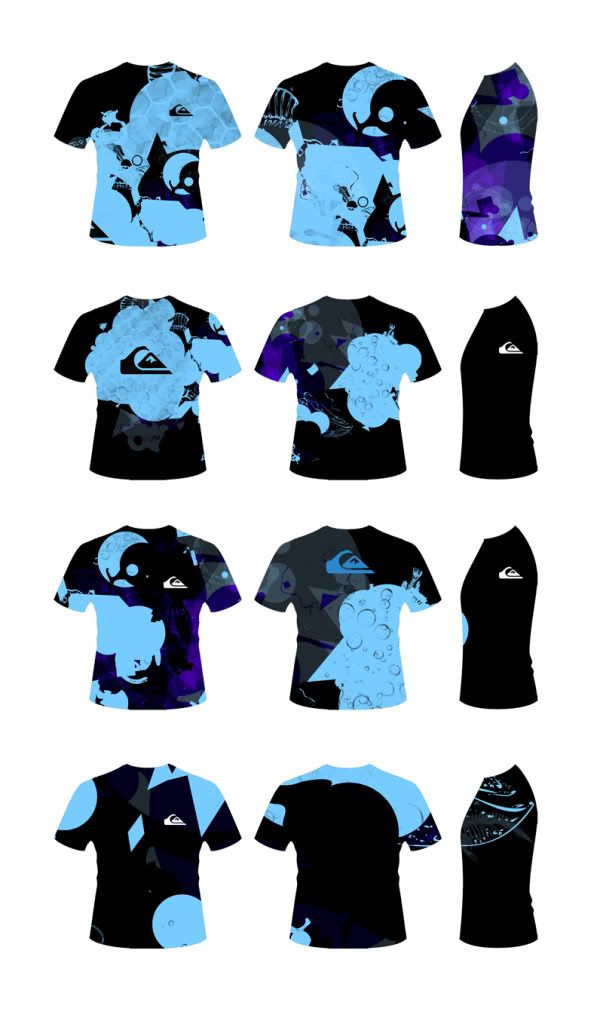
Product Range Shirts Tests
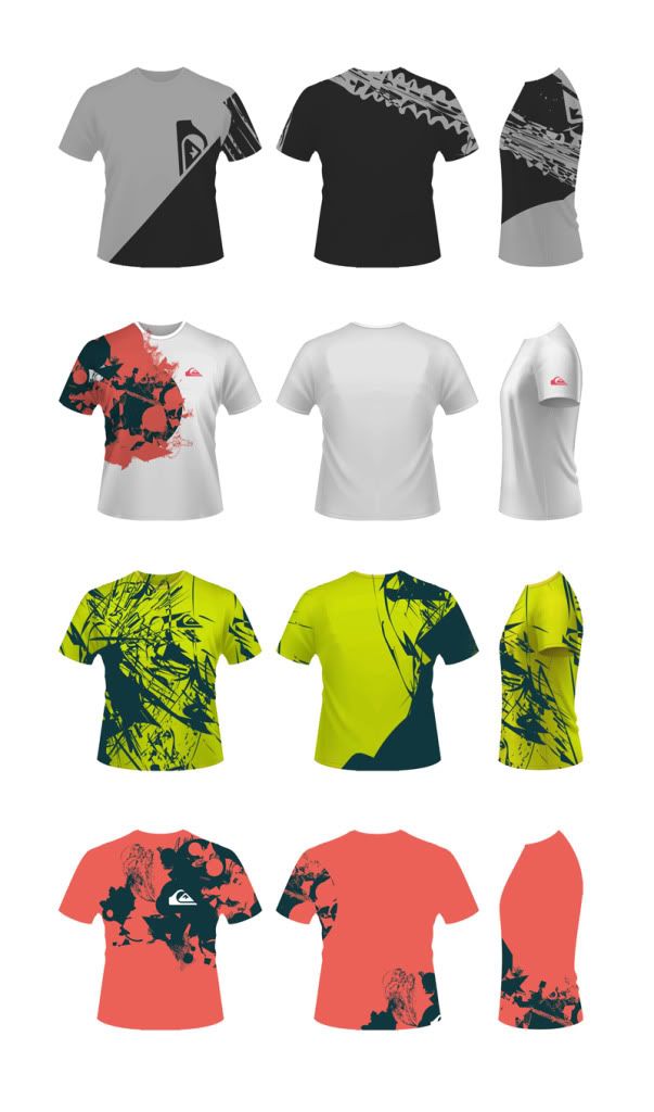
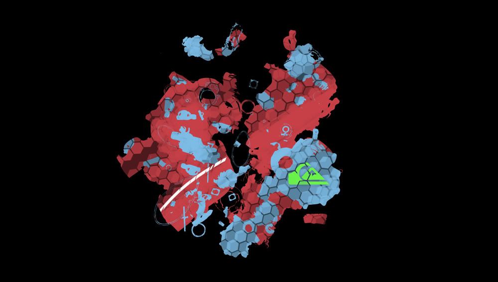
Here are some Quik designs working with vectors again. Not all of these have really being successful. I personally prefer the blue designs below although they do look a little like rash shirts (heat insulators for cold water surfing)
Second to these I also think the lime green images are also working slightly better. I reckon it's the vibrant colouring that is really making the designs stand out a little more. These designs are all full size prints that wrap around the T. This is mostly seen on more expensive products so this may have to be sacrificed to meet costing.
Friday, 5 November 2010
Design Feedback
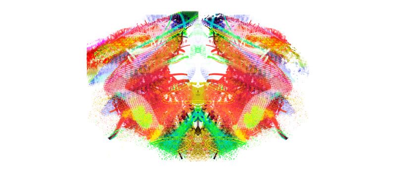
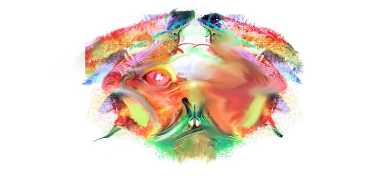
I conducted a ‘Quik’ questionnaire to 38 of my friends based on the initial design work. The feedback I received was that the digital paint idea wasn’t working and that I should continue to develop the vector based work.
It’s a shame really but as I personally prefer digital paint but I have to agree that in relation to the brand it is pretty out of place. I will however try blend in some other mediums to further develop the vectors.
The issue that I’ve come across is that I have all these shapes that sort of relate to the idea of modern trends with some beach refs such as the bones vectors but nothing really shouts Quiksilver to me. Going to have to develop this a little more, maybe try an incorporate the surf feel into the work and also run some tests at incorporating the charity.
Tuesday, 2 November 2010
Design Test
Tuesday, 19 October 2010
Possible Product Range
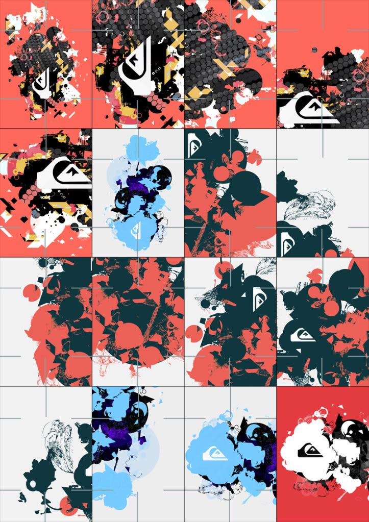
From looking for more net ideas I came across a cut card net. Simple design that features credit card size pieces with cut lines so that they can be arranged, stacked and built up to any shape.
VERY appealing and something that I believe would definitely appeal to our young TA. Products could prove an effective seller and be cheap to produce.
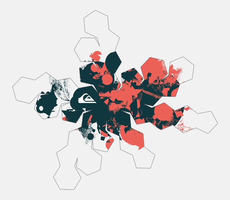
Small cuts were taken off my origional initial/developed ideas. See below-
Monday, 18 October 2010
Quiksilver Initial Ideas
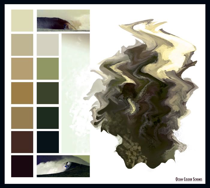
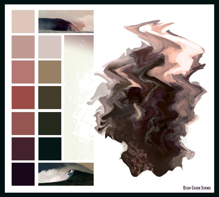
Quicksilver Colour Ideas/Tests

 Posted by RL Robinson at 11:29
