Total Pageviews

Wednesday 2 December 2009

Visual Language - Photography

In this session we were paired into groups, and given the task of collecting 100 images around the college, based on the letter 'A'. We set a rule of keeping the letter central framed, landscape and tried to based all the letterforms in uppercase. Towards the end however, we had to break this rule as we'd pretty much exhausted all the uppercase letters. We then printed and presented our photos to the group.

Below are 25 of our favourite/most successful images:

Monday 23 November 2009

No news is good news: Message & Delivery

To start off this project, we went back to our four coloured sheets and reviewed what we’d learnt from our articles so far. We were looking at open and closed questions and statements of fact and opinion. From this we basically refreshed our memory from the initial research project into getting some more idea for this brief.

The brief was to create a mail out that would have to be sent to ten recipients to who it would be appropriate. We would have to decide if we were, informing, persuading or advertising. I was struggling with this at first as I couldn’t decide why or who you’d be informing when it comes to “Brawn on Form”. I started to look at why you would be communicating that Brawn had a good season and what the point of promoting this would be. This was when I decided to down the route of Sponsorship.

I then went back and did some further research into F1 sponsorship to find the benefits of sponsoring and who is currently sponsoring F1. I also looked at some of the more detailed bits such as the sponsors estimated revenues and reviewed the percentages, figures and returns. From all of this information I was then able to get an idea of who would be my mailing list would be.

The mail out had to be based around an a6 envelope. The first designs I worked on was to make a new net. I wanted to make the net big enough to fit the information on whilst still being interesting and creative. I started testing a few ideas for making the side panels fold out which then give me a large area to work with. I obviously waned to develop the design whilst also keep the look of the original posters. To do this I thought I’d develop the original car symbols. I started to look at adding more line art in illustrator but it wasn’t really working. To solve this I thought I’d go back to usual style of work and start drawing in Photoshop using opacities this time. Using the opacity really opened up a few more possibilities in what could be done with the image.

At this point, I then started to get some feedback that would lead into the design of the mail out. The dimensions of the chosen net were just running over by around 40mm. This meant that if I wanted to use to larger panels and still keep the mandatory scale I’d be printing on a larger, more costly paper size. Some of the feedback reflected on my own thoughts that if the aim is to get multi-million pound sponsorship, costing shouldn’t be an issue. I completely agree with this however 10 double sided a2 sheets, was far from viable.

As the green colouring didn’t work so well on white background, I started to look at darker shades of grey to give it more impact. I also wanted to carry on the use of lines so drew up some bold lines in the brawn colouring, green and black.

When it came to content, I soon realised nothing on posters was really relevant in the new designs. Even the sketch of the car was starting to loose place in the design and was late discarded from the design altogether. To give a greater impact I thought I’d continue the bold brawn text and spread it across the width of the mail out. I tried a few ideas with the design by adding more and more, but this was slowly cluttering and cheapening the design. It was also drawing away from the simplicity of the posters, so I stripped it back which made it clearer to the message and less noisy. Small captions of information were also added beneath each panel promoting the benefits of F1 sponsorship and the Brawn team.

I printed 2 final sheets on the double A2 sheets. I was pleased with the outcome although there were a few issues with the material. The paper was matt which marked really easily and looked pretty terrible when it was. When the material was folded it also split and cracked leaving lots of white lines, which could also peal. Now, this wasn’t very god but I was told this would happen with any material and matt was the only medium for double sided printing anyway, leaving very little for me to do. The other eight finals cad to printed at a smaller scale onto standard printer-paper. The cost involved with a full was far too high and in the end this was the only option.

As a complete piece of work it was far more successful than the posters. I think this was mainly due to the use of colour contrast between the black and yellow, which really brought out the vibrancy. The feedback I received in the final critique suggested that the general design of mail out went well. Points behind items such as the chequered text and the lens flare asked why they were there, were they needed? Aside from saying that the image looked a little flat, and these gave a bit more added interest, I find it hard to really justify a good enough reason. Feedback during the design itself also suggested that it was a definite improvement, so I tend to go with what I think works towards the design.


FINAL DESIGN


CAR SKETCH

Sunday 15 November 2009

Sunday 8 November 2009

No News Is Good News | Research Brief

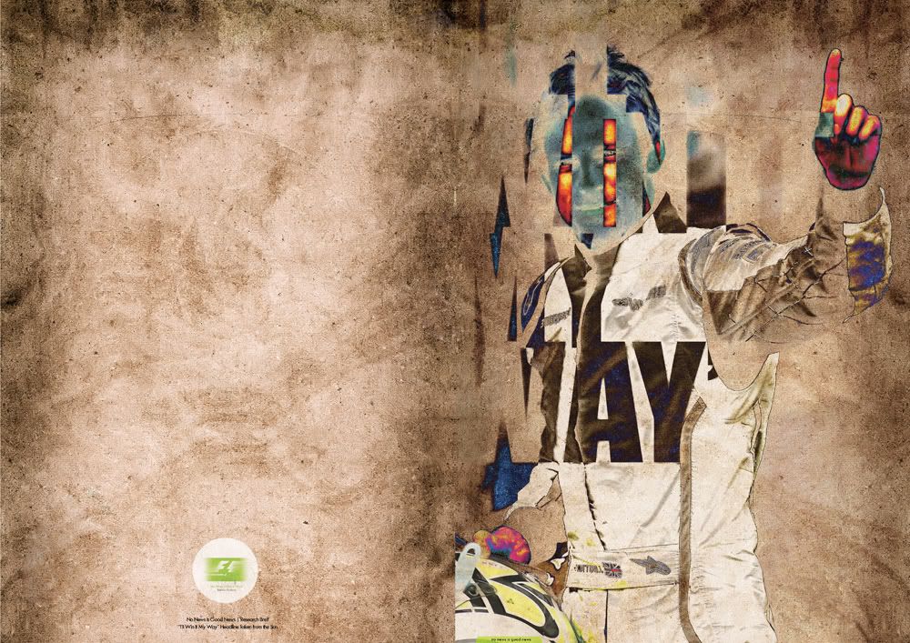
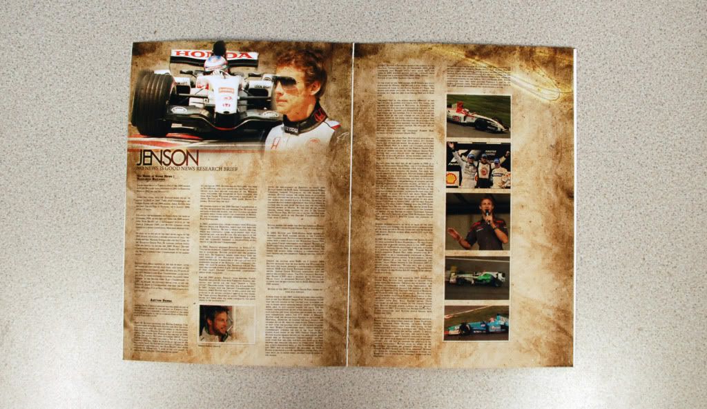
For this brief we set to collect a newspaper, and choose an article from which we would then research. One of the biggest stories at that time was Jenson Button’s possible championship win in the Grand Prix.

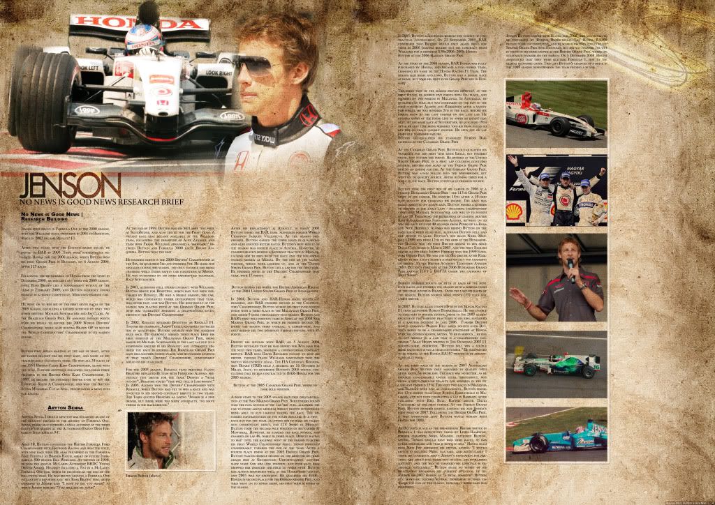
I started by looking at the team, drivers and Ross Brawn. I’m not really going to talk about my findings as it’s all in the research anyway but I then moved on to a closer look at Jenson Button in particular.

The main deliverable for this brief was to compile a clear and concise body of research. What I found, was that whilst gathering this research, I was getting buried in paper and started to lose clarity in the information. With all the information I had, I was then struggling to then find the more important and relevant points.

To solve this I started looking at layout and how I could present the research in an easier to view form. I started thinking about how we like to see large pieces of information. I then thought it would be a nice idea to make a short magazine based item, with a few pages to cover all the research.

There were six pages in all, so it wasn’t the biggest book, yet it had more than enough room for all the relevant points. I did find this an interesting test as I’d never tried to make a book or magazine before, and it made me think about how the pages would order together as well, what with the first page also being the last ect.

When it came to the design I was originally basing it on a newspaper theme. In doing this, everything was becoming a little tiring and I didn’t really want to just rip off an already existing style so I thought I’d make my own. I still wanted the pages to have a nice paper texture, so I set to make a nice gritty, almost grunge effect with some brushes until I was happy.

I wanted to keep the information clear and readable but try to make the pages look interesting as well. After a lot of tests with tonnes of various layers and effects, I decided upon the chosen theme and carried it throughout the book. I’ve tried to keep the pages simple and hopefully to the point. I wanted to the inside to concentrate more on the focal point of the brief than having busy backgrounds that would no doubt detract from the information.

Overall I think I was able to gather all the relevant information concerning my article. All the points I can see being useful, have all been looked into, and presented in an easier to view format. The main thing I would have probably liked to have changed would be Jenson’s race stat tables towards the back. They do the job, but are pretty horrible to look at.


I printed a few test pieces and printed a full a3 copy when I got back to college. Few pictures below:

Photoshop’s Before Print:


FINAL Prints


No news is good news: Message & Interpretation
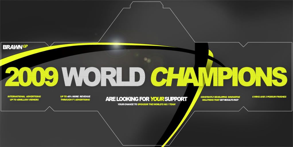
To put the research to some use, we then began designing a set of 3 posters, 2:1 format, with a two colour, plus stock restriction.

I started to look at my research and began to review my findings. For me, Jenson’s wasn’t just the only winner in all of this, there was also Brawn. Jenson’s had never been the best driver, the reason he won this year was purely down to Ross Brawn and what he brought to the car and the team. For this reason I wanted to make the poster more about the Brawn team rather than just the drivers.

It was hard to decide which way to go with this. You’d usually find that they’re all good drivers but they’d need a good car and a good team to win, this is what Brawn did for Jenson. It’s was hard to decide if was appropriate to make statements without considering the target audience and where these posters would be displayed.

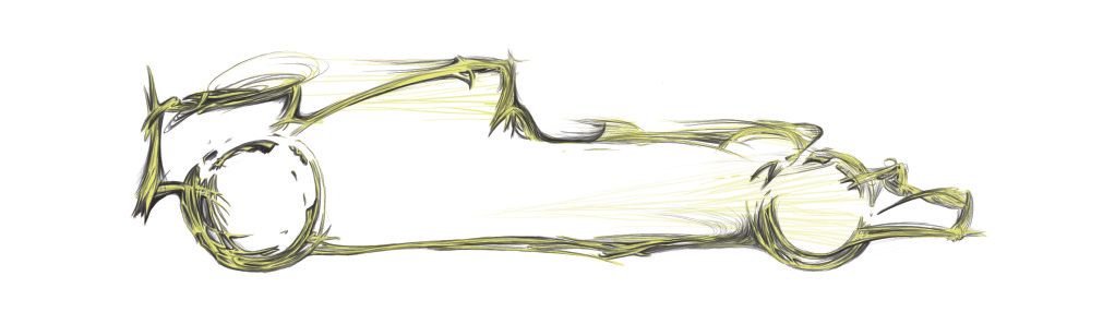
To start off the design process we began to create symbols and ideas based around the previous brief. We were then given a short amount of time to quickly fire out an idea for development. I personally prefer a little time to think over an idea and mull over a few possibilities in my head before progressing. Because of this the initial sketches were a little week and didn’t really have anything to them. Design wise it wasn’t while a couple of hours later and the following day that things started moving in the right direction.

Whilst looking at text, they were a lot of possibilities. There were lots of issues that could be communicated such as Jenson’s driving ability over the capability of the car, the progression of Jenson’s career, and the success of the Brawn Team in general could have also been looked at.

One of the things that can be easy to forget is that the initial research was compiled before Jenson actually won the grand prix. So because of this, it would be wrong to include statements about the win, and I purposely mentioned very little about the result at the end of my research.

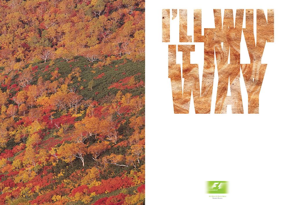
With this in mind, it was more appropriate to use the chosen statement ‘Brawn on Form’. I liked the play on words and it could still suggest a team win, making it still appropriate and relevant as a poster. The one clear message from the research is that Brawn has been very much on form this year, and they proved that throughout the season.

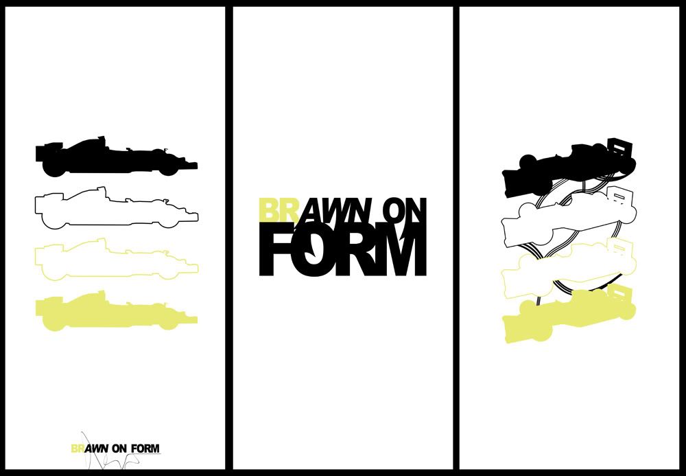
When it came to putting this onto paper the brief did state to keep them simple and to the point. To do this I began by incorporating some of the symbols that would relate to F1 such as the cars, trophies, chequered lines and racing style fonts. The two colour restriction was made rather easy in the sense that I could use the Brawn GP colour scheme of green and black on a white stock. This was an obvious choice as its instantly recognised as an F1 trademark when shown alongside the sport symbols.

The bad side to the restriction on colour was that the posters had to be mainly block colour leaving no room for photos or more complex images. Although, the posters had to have a cohesive effect anyway, so a two-colour theme helped aid the consistency.

The text poster is made from an Arial Black font with a low tracking and slightly smaller scale. The reason behind this was to emulate the current style of Brawns logo. This is further reinforced with the use of non- italicized lettering on the first two letters. ‘BR’ was also changed in colour to bring out the BR Racing side of things. The downside to this, and its only something you can see when it’s printed, is that, from a distance the yellow begins to slightly merge with the white. This then seems to accentuate the words “awn on” which doesn’t work, at all. If this were to be re-visited this would defiantly be something to be looked into.

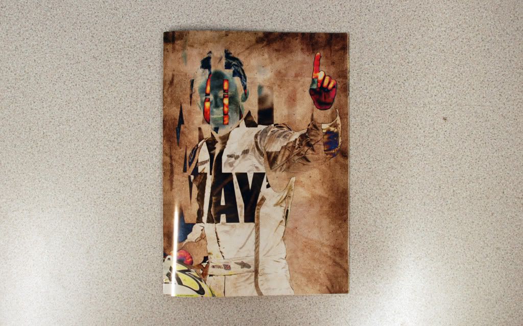
To add a little more interest to the poster I did a quick test of adding some old styled racing flicks that can be seem on a lot of racing imagery. The addition of this did seem to make a big difference and stopped it from looking a little flat and boring. I did question this with a few people in the studio and the general idea was that it did boost the aesthetic, so I decided to keep it on the final design.

When it came to text and image I obviously wanted to continue the tag line of ‘brawn on form’. I still wanted to make this visible but not to dominate the image; we already have that in the text poster so having a bold text image twice seemed a little pointless. I decided to break in down a little and subtly add it at the bottom of the page.

For the image side of the poster I looked back on the symbols created in the previous session and began to test numerous shapes and items. The more successful symbol was by far the formula one trace. It was far more clearer and to the point than some of the other objects. I was trying out ideas with trophies and helmets but these were far too vague to instantly suggest F1. I included a total of four cars in the design. During the research, I discovered than teams generally run two main and two support vehicles. I wanted to incorporate this by having two solid shapes to suggest those main cars and two outlines to show supports. Aesthetically, I think this gave the image a nice balance. I also think that, compared to some of the other experiments this idea was giving a much more formal and professional finish which intern reinforced the ideas behind the Brawn image.

For the image poster I wanted to keep with the car theme without just re-using the image. I did look into other areas, as can be seen in the development pages, however I feel keeping the car symbol maintained the consistent look. To relate back to the lines that were used in the text poster I started to look at the use of lines again. I added these to try and give a sense of movement and generally improve the aesthetics of the poster. The lines could also represent tyre markings or a racetrack look.

As a set I was please with the outcome. I think the main let down with the posters is that they’re not as high impact compared to others. I think this was mainly due to the fact that I was working with solid colour and didn’t work with opacity. I think if this entire project I could maybe use opacity to try and aid the impact I need, and should have had with this project. However, I do think the posters hold a sleek finish and believe the imagery and text that has been used, does reflect the bran team and there current design themes.


_________________________

Here are my final designs for the brief. The work was printed 2:1 on satin paper and presented to the group. Feedback sheets are visible in the PDD section of this blog.

Wednesday 4 November 2009

Colour Lecture 1

In this session we were looking at the how colour is perceived and how we interoperate different colour ranges.

We were each told to collect ten objects of a certain single colour, mine being red. Prior to some practical work we looked at the wide range of colour types such as subtractive and additive colours. Subtractive colours are the mixing of colours, the more you add, the dark, muggier the colour gets. Additive at the opposite end, works on the idea of the colour getting lighter.

The graph below explains it a bit better. On the left we have CYMK, K being the middle section showing subtractive and RGB on the right showing additive. What’s clear is RGB is visible in both. Televisions/Monitors, cameras and scanners are all based on RGB, where printing paint mixing for example use subtractive colours.


We also looked at how we perceive colour. We were shown a block of red colour, which appeared to be a vibrant red, and then another tone of red was shown with more saturation making the first block appear darker. This was done numerous times to the point in which the shades started to look like different colours all together, orange and brown. It was an interested task and linked back to what Fred was saying at the start of the session, you can’t trust colour!

With the practical side, we each joined into our groups giving us a wide range of collected objects. We were then set the task of categorising our objects. We decided to put them in order of light to dark, from the brightest shades of red through to the darker tones working with tint and luminance.

Here are some images below:


From this we were then given a brief introduction into Pantone Charts. The colours are printed on varied mediums and a unique colour code is given to each which can be used in nearly all professional software packages. I really can’t believe how much these things cost. I don’t doubt that in industry this will be an invaluable tool but this is probably why it warrants the price tag. Four hundred pounds for what’s basically a Dulux flip chart with some colour codes.

I didn’t actually want to touch these baring in mind “if you bend one page, your buying a new set” so for the next task I avoided flicking through the swatches at all. Knowing my luck it would have probably set on fire or something ridiculous like that. With the Pantones we selected 10 objects and tried to match each colour as close as possible using the chart.

As an extension from this I put each colour and sorted them in HUE/TINT. What I found is that even some of the brightest shades of red appear almost orangey compared to other objects and they move further down the HUE. Likewise some of the deep reds are very much purple.

Below an image of the objects against the colour comparison:


_________________________________________________

I’ve tried the sheet in a few different colours just to show how it can be harder to perceive when you get colour wrong. This is similar to a slide Fred showed us on how it can be nearly impossible to make out items with wrong colour and that’s why colour is so important within design.


Friday 30 October 2009

Visual Vocabulary IDENTS

For this lesson we finally moved away from the ten by ten squares and moved away from 2D altogether. The week prior to the task we were told to collect a range of small to large boxes, large being roughly the size of a shoe box.

The idea behind the task was to create a letter form that would be visible only at certain angles, much like the Channel 4 indent adds in which the camera pans over at one point the ‘4’ is risible. We were briefed on the general idea of the task, formed into our groups and chose the ‘a’ to work with.

Initially we arranged the boxed but were having trouble figuring out how we would plan out the letter. I had an idea of kind of cheating a little through taking a picture through the viewfinder and putting a letter over the top in Photoshop. This way you could clearly see where certain lines would cross certain points and it made it much easier.

We started shaping the letter using black card around a Helvetica font. There was still a few problems with getting the scale right and we were still struggling a little even though we had the template. Overall I think the image worked well though and we all liked the outcome.

Below are a few Photos taken of the process and you can see how the design is broken up over the scale.


Visual Vocabulary

Once again we were creating 10x10 images based around a given word, this time ‘scale’. We each created a set of designs that visually communicated the word and then this time, swapped four designs with another member of the class. We were then given the chance to further develop each other’s ideas, 3 more for each letter.

I found it pretty interesting to not only see other people’s interpretations but then being able to put in my input as well. I think in general I’m also finding these sessions more and more useful each time as it’s getting me to almost think as type as image and the line between the two is starting to become a little blurry. I’ve never really experimented with type in ways like this before and it’s definitely making me more aware and open to the possibilities within typography.

Below is my final 4 images


And here is the whole groups work

Visual Vocabulary

For this task we were given ten words in which to visually communicate through image. The ideas were created on 10cm2 pieces and we were given five minutes to work on each word before moving on. Because of the lack of time these were real quick fire responses and as such some did work better than others.

From left to right we have ‘link’. For this image I tried to make the letters look like a linked chain. Next image is ‘finish’ in the form of a chequered line and then ‘closed’ which I tried to make look like a key hole. Then there’s positive in the shape of an explanation mark which doesn’t really work but I was struggling to think of anything else and then there’s ‘above’ in the shape of an arrow. The bottom row we have, form, difference, scale and loop.

Sunday 18 October 2009

Soup - Jack's Font

Alphabet Soup Part Two
This brief was based on a font that visually represented our partner chosen from the randomiser. I was paired up with Jack and we were each given a short questionnaire to complete based on our personalities.

What stood out the most from Jack’s answers were music and the superpower of flight. I began to look into some of these areas, mainly on Wikipedia and other Internet sources. Jacks most admired people were artists such as Jimi Hendrix and his prized possession were his drums. From the research I found, Hendrix’s prized guitar was a Fender Stratocaster. I began outlining these shapes along with the drums and superpower to give me a range of lines that I could later include in the type.

When it came to getting these shapes onto a typeface, I wanted to make them look consistent. Initially they were lots of experimenting to see where shapes work best and I them moved on to making them all look consistent. I also tried around a few fill effects to see how it affected the style of the design. I found that the breaking away font had a nice effect in keeping with the wing design.

With a good range of research and initial to developed designs I took the work into Photoshop. The reason for this was just the ease of being able to try things quickly and test other possibilities that I could of missed on paper. With the final idea sorted, I completed the letter forms on an A1 sheet, printed it and traced it back in Indian ink to meet the requirements.

The end outcome was a really crisp detailed sheet. The only issue is that literally all of the detail escapes the image from a distance so this is only really effective up close. Making some of the features bolder could resolve this but I think that’s driving away too much from the original idea.


Sunday 11 October 2009

Visual Vocabulary

With this lesson we had to create four representations of each word we were given. The given word was spread across a series of four to visually communicate the idea. The words in order of image are:

1. Compress
2. Dissect
3. Duplicate
4. Hybrid
5. Edit


As an extension from this we were then given the word LAYER to try and create a final image. It was a little bit of a struggle at first but I then thought about the idea of layering the letters on top of each other to give the effect that all the lines are continuing. I liked the effect, here’s the image below.


Alphabet Soup LAYER

This brief consisted of the creation of tern letterforms based on an existing typeface. Each was to be manipulated around our given word from the randomiser, mine being ‘Layer’.

I started off by looking into all the different types of layers out there. This ranged from layers of rock, oceanic, atmospheric and then foods and music ect. After trying a few different styles and approaches I decided on the idea of breaking down layers of rock and earth. The concept was that the letterforms could appear to be stamped out from the planet leaving a shattered, breaking effect, allowing the viewer to see the individual layers of the earth.

The problem with creating more than two or three layers was that the area of white became smaller. This then started to make it more difficult to make out some of the forms, so the design had to be simplified a little to aid legibility.

I started out by sketching out some initial ideas onto paper and then re-scanning them back into Photoshop for development. I also came across an image of the earth which saved me attempting to paint the globe which given the time scale, could have looked a little tacky.

The designs themselves consist of the earth stock image, an image of the Alps and ocean. The rocks were manipulated and painted back over to give the layering effect with a small volcanic pool at the bottom. I was space, we wouldn’t really have a sitting pool but none of these were trying to be accurate.