
Thursday, 27 January 2011
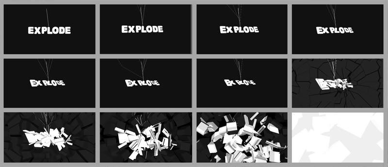
Motion Test With C4 Logo
Been experiencing a lot difficulties trying to get the panning to work correcting. Originally I was using all the animated comps in a larger comp which was parented to the motion of the background. However the complexity of all layers individually animating was causing the file to be almost unworkable.
To get a around this, I enlarged the frame of the original video files (scarface and godfather). With a larger background I was then able to mask off the hard edge and have the video file sit softly on the texture background. The comp is now made of 2 videos and the background fixing the running issues.
DEVELOPMENT
Remove the channel 4 logo after the record scratch sound effect
Sort out the smoke effect. No ones noticing this but the glitch is bugging me
Start incorporating the typography
Probably use the same sweeping SFX. Looks like it will tie in more as part of the soundtrack
Wednesday, 26 January 2011
Tuesday, 25 January 2011


Friday, 21 January 2011
Thursday, 20 January 2011

Boards

The Style I want to approach with this brief will be largely vector driven art. Animating this movement will be close to impossible within the time given although I could look at animating gradients ands lighting alongside panning and scale methods.
The word shown on this board is vector work by Cristiano Siqueira (www.crisvector.com) also referenced on my design context. The style looks really fresh and current although to avoid simply ripping it off I want to start to develop a similar idea overlaying textures to create a more comic effect.
From the list below, I have chose to go with 'Gangster Films'. The reason for this choice is largely due to how much this will tie into my context. There's a lot of scope for gritty, illustrated design which is a route I can see working quite well for this project.
This will also enable me to start producing some hand drawn work which I can then bring back into illustrator and photoshop to further develop skills in this area.
What I need to do:
The research I will be looking for is to first find my audience, who would be interested in watching the program. This will then underpin the look and feel of the idents and t'sequence. Lot's of studies into existing title sequences
I will then need to find my list, this can be done through film review sites such as rotten tomato and IMDB. The main reviewers will no doubt show the 'classic' gangster films, mostly American. It's difficult to decide whether to throw in some newer films that are more current today but maybe not the 'main' top 10. This can be decided later into the work however but it's something to be thinking about for now.
Below is a list for the possible Ideas for my subject matter:
- Songs/Music artists/Videos
- Wanted list - Product ranges - Cars/Holidays/Watches/Clothing etc
- Crime
- Money - Britains rich list
- Places to work as a designer
- Places to work as a student
- Comics
- Holiday Destination
- Food - Takeaway/Fast Food/Restaurants
- Comedy Film Moments
- Style of film - War/Comedy/Gangster/Family/Action/Thriller/Rom Com Etc
- Stand up comedians
- Christmas Don't List
- New Year Resolutions
Wednesday, 19 January 2011
Image - Editorial


Evaluation
I wouldn’t say this one of the strongest briefs I’ve done and I actually struggled with this a little. Fitting my idea of what I see for article into a pre detirmed space really limited my ideas. Designing for a specific area was a struggle for me mainly because I had my idea and focussed on it. When it came to making it fit it was something that I’d completely forgotten about it. Because of this the images lost relevance and generally looked out of place. If I were to look at this project again I’d definitely consider the possibilities within the area I have to work with an not just jump straight on the PC or Mac.
Tests - Blog Main Page
Continuation of after effets testing. Started working on making an impact video for the main blog page. Could have being anything really as I simply wanted to play around with some lens flaring and particle effects; but I thought it would be good for it to have some purpose as well.
Friday, 14 January 2011
OUGD202 Best/Worst
__________________________________________________________________________________________________________________________

Thursday, 13 January 2011
Tuesday, 11 January 2011
Monday, 10 January 2011
Sunday, 9 January 2011
Dream Scene
Another pointless unrelated task but sinse its more enjoyable than the brief here we go. With this video I wanted to make it look like vide. This was actually created from a still JPG from google. The image was scaled up and panned around to give the effect of video.
Tonned of effects were applied such as the subtle dust particles. The lens flaring as the view pans upwards and the the panning image of a camera lens reflection. Effects for the missle created by linking a lens flare to the source of the null object that travels across the path. Particle emiter parented to the to the object for the illusion of smoke.
Audio created from scratch. Samples from youtube of speech which was slowed down and reverbed. Screams from horror films, sped up sounds to create an alost electronic scratching noise as the night pockets show.
Was intended to be created like a bad dream. Just something thats dark, strange and unrealistic. The audio really helped to bring that side out I think, alone the videos a little empty the audio helped bring across that dark disturbed feel that I wanted in this video.
Third After Effect Video Composites / Tracking
Completely unrelated to the brief but I wanted to work on a project that I'd be intersted in for a little while, whilst still getting to grips with after effects.
This project really helped me understand complex layers and a little more into the time frame. Especially when items run in sequence such as muzzle flashin and the exit of shell casings. Timing in realtime from looking at the time scale in after effects was a bit of a challenge. Its hard to look at the time scale in AE an visualise what it will run like untill you run a preview.
Anyway.. The origional source footage was taken from an airsoft video up on YouTube (link below. Usin plugins, Action Movie Essentials and Optical flares by Video Co Pilot I started layering over lots and lots of footage from flashes, fire, smoke, debree etc.
The audio from this scene was completly stipped out and replaced by over 100 sound effects blended together with varied effects to create a war scene enviornment.
This was my first real attempt at complex layering and layer management which was greatly useful to expore. Found that labeling is essential as well as simple things like colour coding.
Tracking was a challenge at first, for the first half of the video I was tweening the layers and adjusting items like muzzle flashes, and smoke frame by frame. Very tedious. After a few more tutorials I started to look into Mocha. Brilliant tool that takes care of all the tweening for you, less a little adjustment at time. Most important lesson from this then was probably learning tracking but, strangly enough I enjoyed creating the audio sample most of all?
Orional footage:
Tuesday, 14 December 2010
Sunday, 12 December 2010
Wednesday, 8 December 2010
First After Effect Render
After a few days of watching Lynda.com tutorials and trying a few things out I started on this today. Took around 6 hours which was a little mental, mostly because I was faffing around a lot. I did learn a few new things about effects with this however. How to render in different formats, adding of audio and various effect related transitions and presets.
Not related at all in terms of being used for the breif as I'm aware it goes against the critera. This was simply a test for me learn some new techs in after effects.
Not related at all in terms of being used for the breif as I'm aware it goes against the critera. This was simply a test for me learn some new techs in after effects.
First After Effect from Richy Robinson on Vimeo.
Tuesday, 23 November 2010
OUGD 201 EVALUATION
Evaluation…
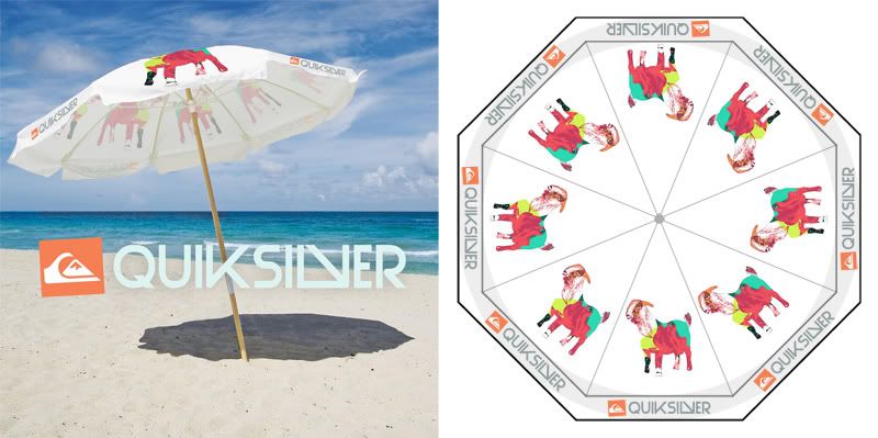
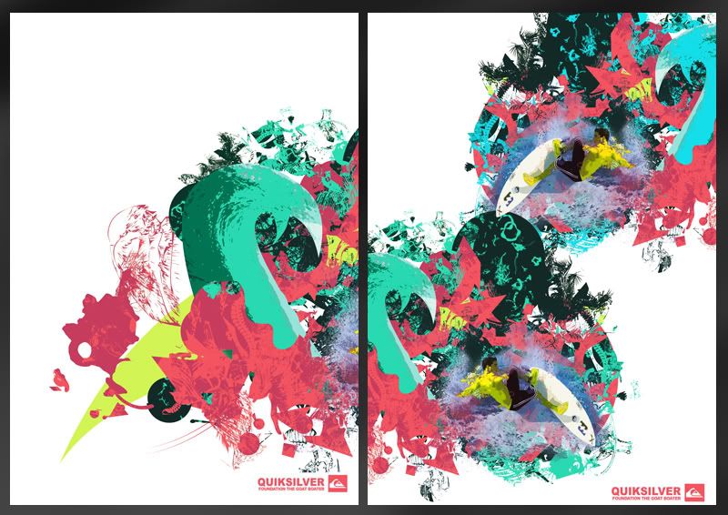
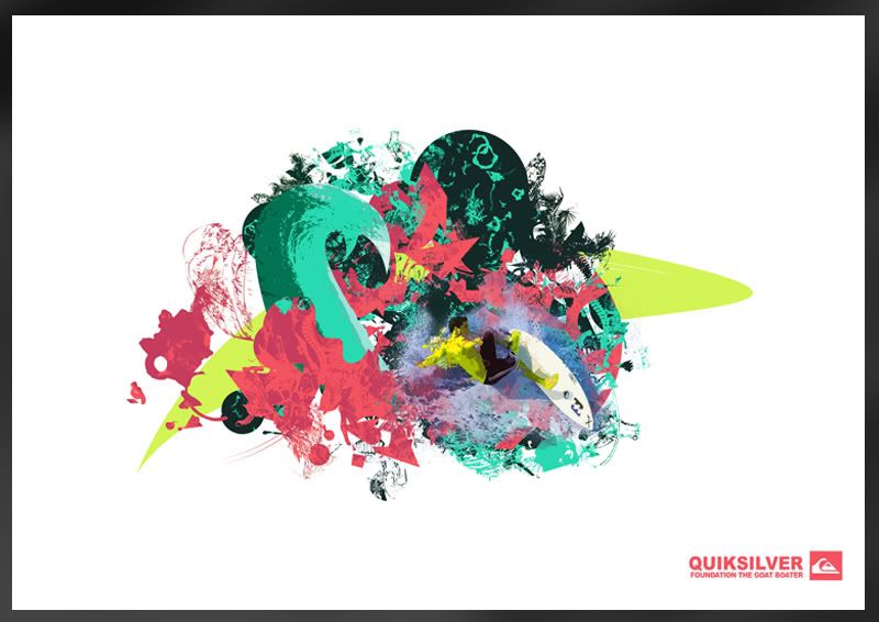
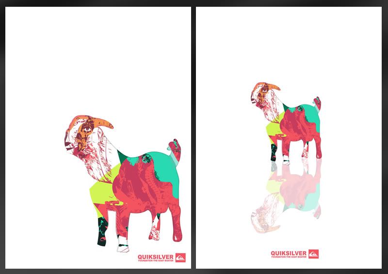
QuikSilver foundation is a charitable organisation running fundraisers for health and youth charities. The problem I addressed with the foundation was that QS’s current form of fundraising is not something well known. The events that have been run in the past tend to be small functions and individual challenges such as ‘Paddle to Live’.
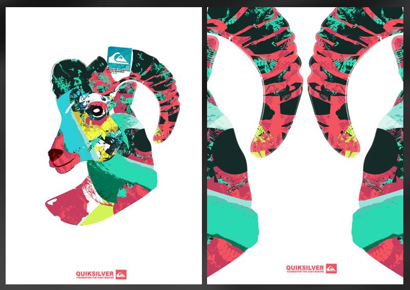
Incorporating Quiksilver’s Sponsored surf team I’ve proposed a charitable fund raising event. The event is a pay on entry day where you’d be able to view QS’s surfers whilst also being able to purchase low value products as means of donation throughout the day. The events title, Goat Boater is a derogatory term used in the early 80’s onwards, meaning ‘New Surf’.
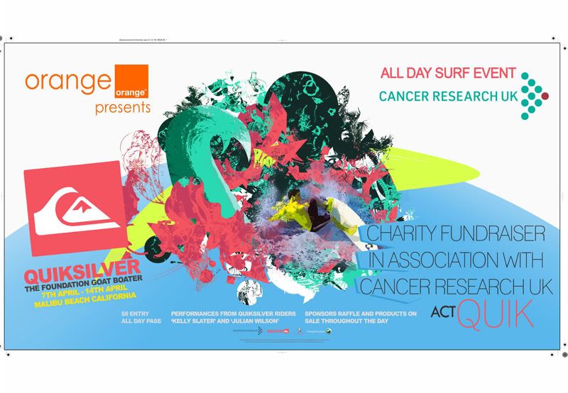
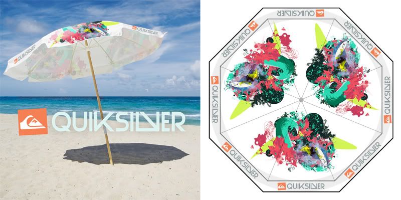
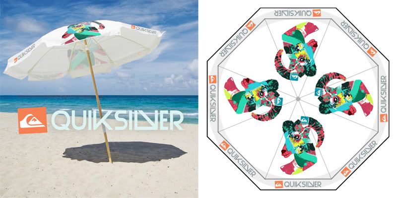
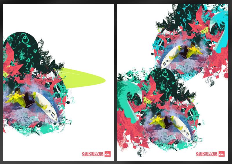
An identity was formed around the image of goats and the colour palette was taken from colours of coral and the ocean. To promote the event posters were made using the same coral colours seen in the ‘Goat Boater’ identity. It’s intended purpose would to be shown around the city acting as a method of awareness to the day. This is a large format product intended to show impact through bold shape and colouring. I’d say the poster is sufficient in it’s effectiveness however for me there was always something missing. I initially struggled to find a strong colour to use for the bottom of the page as most clashed against others or drew attention away from the central image.
Alongside the poster we have the smaller A6 Leaflet intended to be distributed around location. This could be included and or printed in relevant magazines to gain maximum awareness to the event and cause. The flyer uses a slightly different colour palette to the poster. With the flyer I went for a much milder colour in comparison to the blue as seen on the poster. I think this probably is a better colour choice but when tested on the landscape poster it didn’t work at all as there was simply too much of a dull colour.
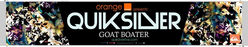
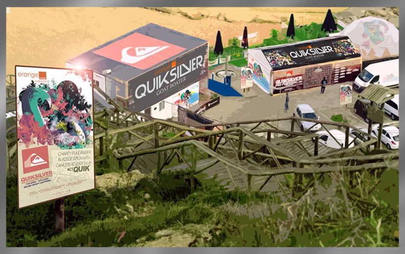
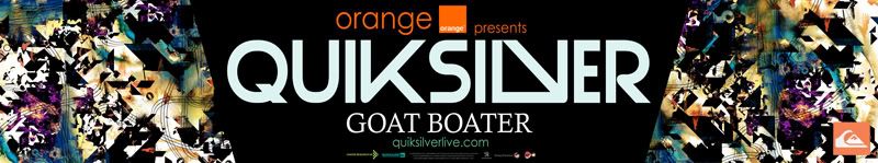
The banner is completely different to the other design work and intends to create a more striking point, something that could not be as so easily achieved with the GB’ colour palette.. The banner’s intended use was for location dressing and to display the relevant sponsors so it needed to stand out so it very clearly underlined the event, GOAT BOATER, and all the relevant sponsors that were to be involved in that event.
As far as products were concerned, I believe I did a fairly decent job. My main goal for this project was to make design that little bit more interesting. The problem I originally identified with existing charitable products was that they didn’t really serve purpose or had no real functionality. I wanted the viewer to look at the design and take it from something flat to 3D in there own interpretation. This way I believed it would make it more personal and hopefully make it something they’d want to keep.
A range of products that supported this idea were soon produced such as Quik Cards, and Quik Fold, named using the first part of the branding name, QuikSilver. All the products are aimed at youth market and upwards, so the idea of them being able to be creative with the work was something I felt was really important, and that physical interaction might hopefully make it seem more valuable and not throwaway.
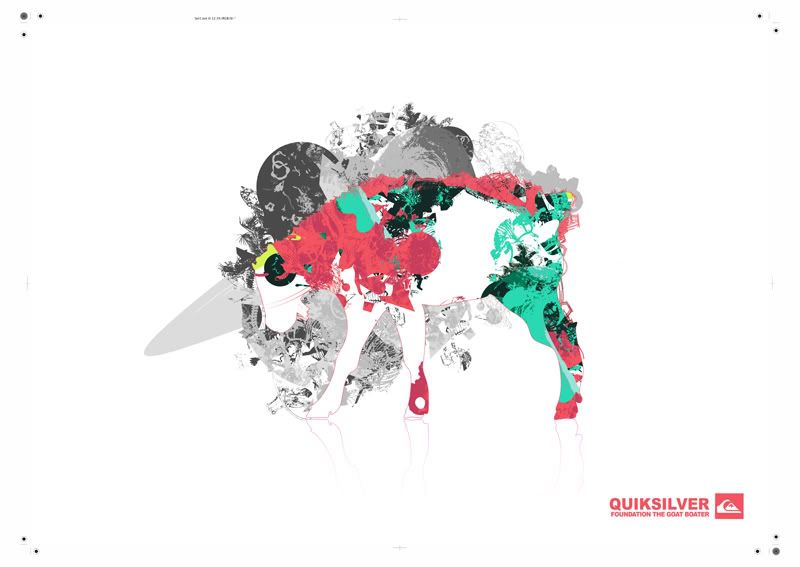
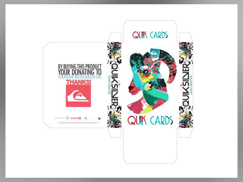
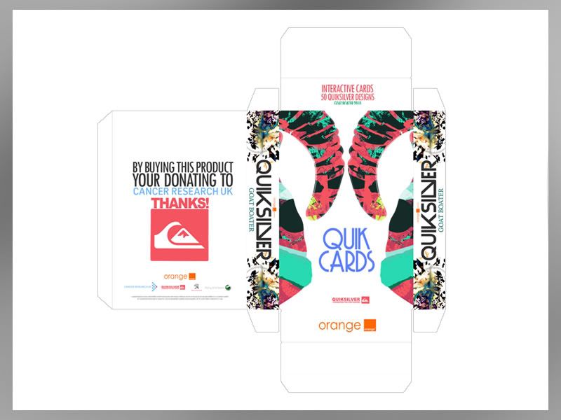
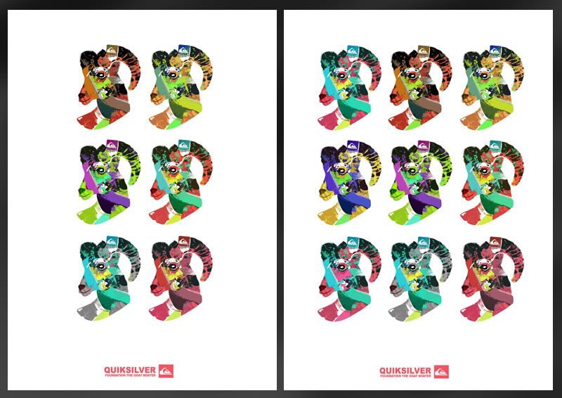
‘Quik Cards’ are packaged as a set of 50 cards. The cards are pre-cut so that they can be taken from 2D to 3D in an infinite amount of ways. The designs are based around sections of the previous poster art and other new pieces designed around the idea of surf culture, through shape and colour.
‘Quik Fold’ The idea behind this was the want to take an image off the page and make something interactive that the user could engage with. The Quik Fold works from a net which would be printed to the reverse of all the posters in the GB’ range. The posters would perforated so that can be easily popped out from the sheet and ‘Quikly’ made.
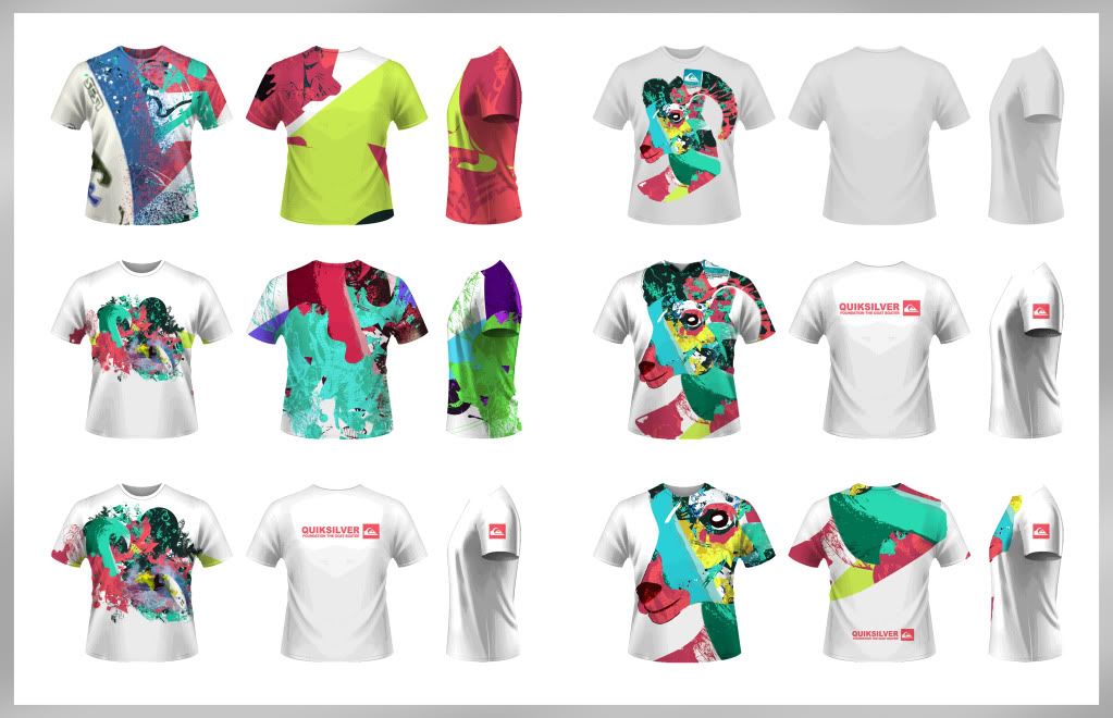
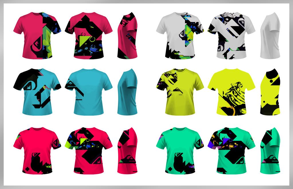
Branching off from this I also made a unisex T Shirt supported by a further 3 Quik designs. The Goat Boater colour palette was slightly altered to adhere to the unisex needs of the products; however it still retains the branding and identity of the event.
The shirt was something that I wanted to create from the start. Quiksilver’s branding awareness is largely achieved through its range of apparel, so clothing was something I wanted to get right. The issue with clothing in relevance to the idea behind the event was costing. I could have easily gone off and produced a range of 10 shirts to be sold at the event but why would I, would they sell? What needed to be addressed was the context. This is a charitable event so the product range shouldn’t necessarily go to the extent of an entire range as this is unrealistic. To narrow this down, the unisex shirt made perfect sense as it could be something that can be batch produced in a range of sizes and we don’t need to make 50 of each etc. The shirt features the main branding being the Goat Boater logo in simple soft colours.
QuikSilver foundation is a charitable organisation running fundraisers for health and youth charities. The problem I addressed with the foundation was that QS’s current form of fundraising is not something well known. The events that have been run in the past tend to be small functions and individual challenges such as ‘Paddle to Live’.
Incorporating Quiksilver’s Sponsored surf team I’ve proposed a charitable fund raising event. The event is a pay on entry day where you’d be able to view QS’s surfers whilst also being able to purchase low value products as means of donation throughout the day. The events title, Goat Boater is a derogatory term used in the early 80’s onwards, meaning ‘New Surf’.
An identity was formed around the image of goats and the colour palette was taken from colours of coral and the ocean. To promote the event posters were made using the same coral colours seen in the ‘Goat Boater’ identity. It’s intended purpose would to be shown around the city acting as a method of awareness to the day. This is a large format product intended to show impact through bold shape and colouring. I’d say the poster is sufficient in it’s effectiveness however for me there was always something missing. I initially struggled to find a strong colour to use for the bottom of the page as most clashed against others or drew attention away from the central image.
Alongside the poster we have the smaller A6 Leaflet intended to be distributed around location. This could be included and or printed in relevant magazines to gain maximum awareness to the event and cause. The flyer uses a slightly different colour palette to the poster. With the flyer I went for a much milder colour in comparison to the blue as seen on the poster. I think this probably is a better colour choice but when tested on the landscape poster it didn’t work at all as there was simply too much of a dull colour.
The banner is completely different to the other design work and intends to create a more striking point, something that could not be as so easily achieved with the GB’ colour palette.. The banner’s intended use was for location dressing and to display the relevant sponsors so it needed to stand out so it very clearly underlined the event, GOAT BOATER, and all the relevant sponsors that were to be involved in that event.
As far as products were concerned, I believe I did a fairly decent job. My main goal for this project was to make design that little bit more interesting. The problem I originally identified with existing charitable products was that they didn’t really serve purpose or had no real functionality. I wanted the viewer to look at the design and take it from something flat to 3D in there own interpretation. This way I believed it would make it more personal and hopefully make it something they’d want to keep.
A range of products that supported this idea were soon produced such as Quik Cards, and Quik Fold, named using the first part of the branding name, QuikSilver. All the products are aimed at youth market and upwards, so the idea of them being able to be creative with the work was something I felt was really important, and that physical interaction might hopefully make it seem more valuable and not throwaway.
‘Quik Cards’ are packaged as a set of 50 cards. The cards are pre-cut so that they can be taken from 2D to 3D in an infinite amount of ways. The designs are based around sections of the previous poster art and other new pieces designed around the idea of surf culture, through shape and colour.
‘Quik Fold’ The idea behind this was the want to take an image off the page and make something interactive that the user could engage with. The Quik Fold works from a net which would be printed to the reverse of all the posters in the GB’ range. The posters would perforated so that can be easily popped out from the sheet and ‘Quikly’ made.
Branching off from this I also made a unisex T Shirt supported by a further 3 Quik designs. The Goat Boater colour palette was slightly altered to adhere to the unisex needs of the products; however it still retains the branding and identity of the event.
The shirt was something that I wanted to create from the start. Quiksilver’s branding awareness is largely achieved through its range of apparel, so clothing was something I wanted to get right. The issue with clothing in relevance to the idea behind the event was costing. I could have easily gone off and produced a range of 10 shirts to be sold at the event but why would I, would they sell? What needed to be addressed was the context. This is a charitable event so the product range shouldn’t necessarily go to the extent of an entire range as this is unrealistic. To narrow this down, the unisex shirt made perfect sense as it could be something that can be batch produced in a range of sizes and we don’t need to make 50 of each etc. The shirt features the main branding being the Goat Boater logo in simple soft colours.
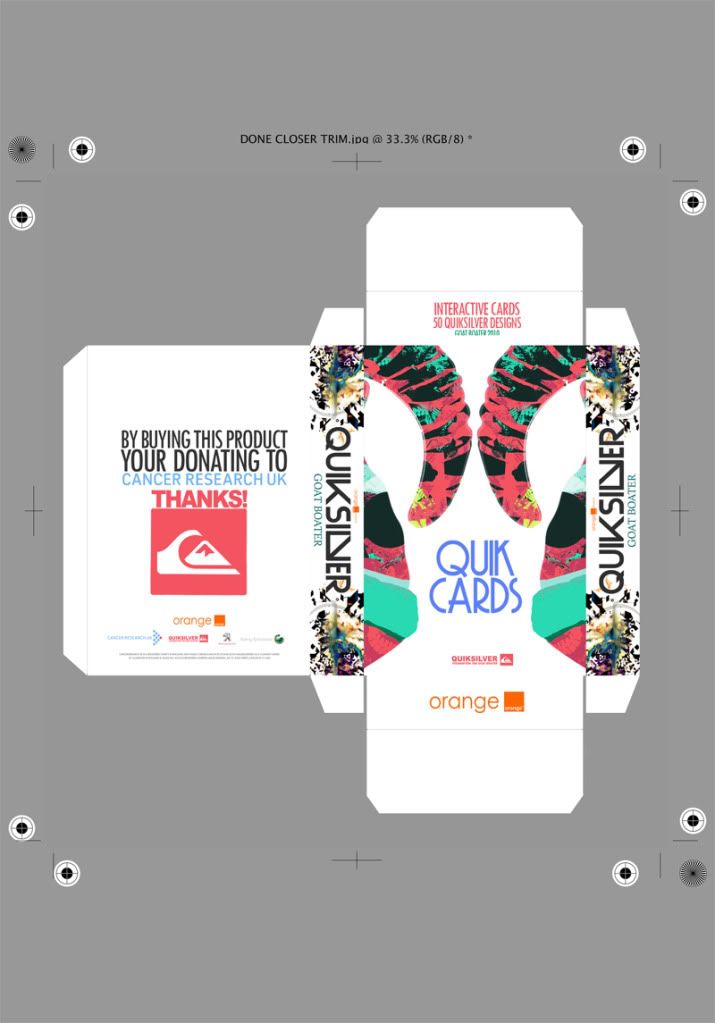
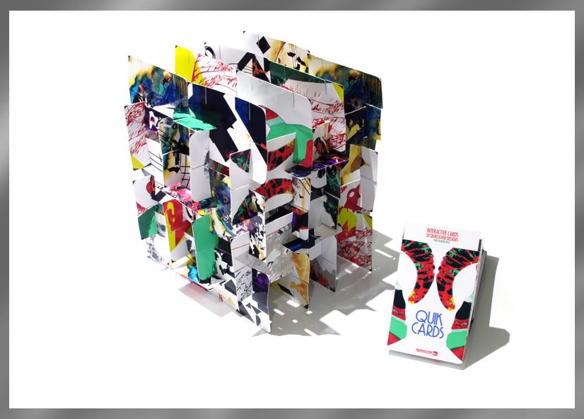
Quik Cards - The Make & Packaging
The nets that package the Quik Cards.‘Quik Cards’ are packaged as a set of 50 cards. The cards are pre-cut so that they can be taken from 2D to 3D in an infinite amount of ways. The designs are based around sections of the existing poster art and other new pieces designed around the idea of surf culture, through shape and colour.
Origional Idea, Didnt really work once it was made up so I went back to PhotoShop..
Final
Built up model using 48 cards -
Origional Idea, Didnt really work once it was made up so I went back to PhotoShop..
Final
Built up model using 48 cards -
Monday, 22 November 2010
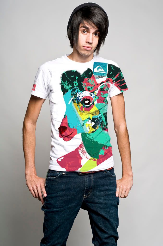
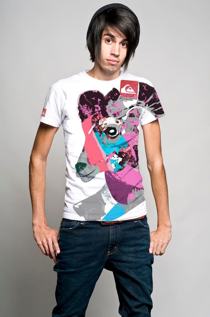
Clothing Part II
Development from the previous work. This time I tried to focus more on the Goat Boater branding by using one of the logo images. Although I still think the brighter more attractive colours work best as an item of clothing I think the final result has worked quite well.
To make production and costing a little more easier I decided to change the colouring slightly so that it may appeal more to both girls and boys alike. A uni sex product seems to make much more sense, both in costing and manufacturing.
To make production and costing a little more easier I decided to change the colouring slightly so that it may appeal more to both girls and boys alike. A uni sex product seems to make much more sense, both in costing and manufacturing.
Tuesday, 16 November 2010
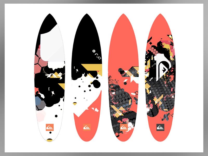
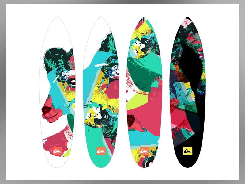
Vinyl Skins for Surfboards
These are the skins that could be sold at the event. The designs are based around the exhisting material shown previously. The colour palletes are the same and I've tried to make the design as current and in keeping with QS themes as possible, whilst obviously putting my own spin on what I see as the brand.
The idea of a skin is actually something completly new for surf boards. There may be a reason for this however with the affects of water and adhesive. But on the other hand you can get waterpoof/colourfast vinyl and have been able for years.
My thoughts on this though, was that instead of replacing the entire boards at 500 quid a shot, you could buy a skin at the tenth the cost and completly update the look of your board. An idea at least, whether it would work in context is debateable..
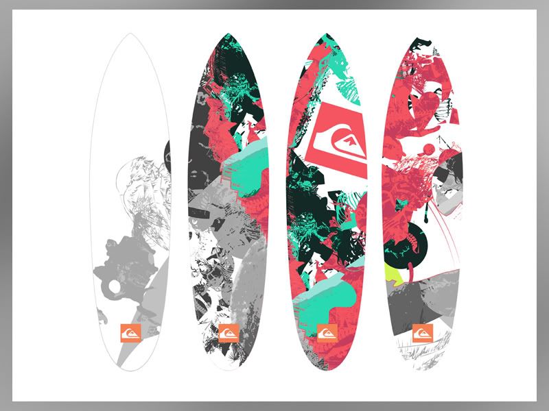
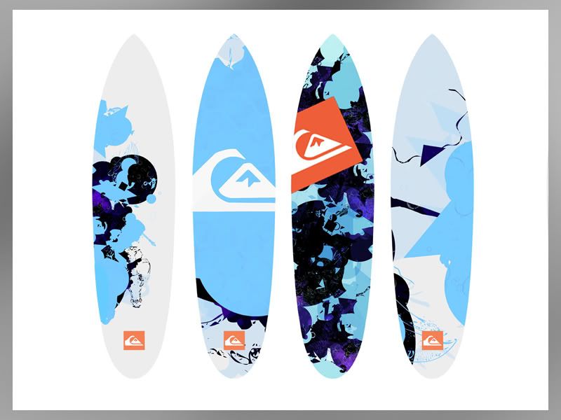
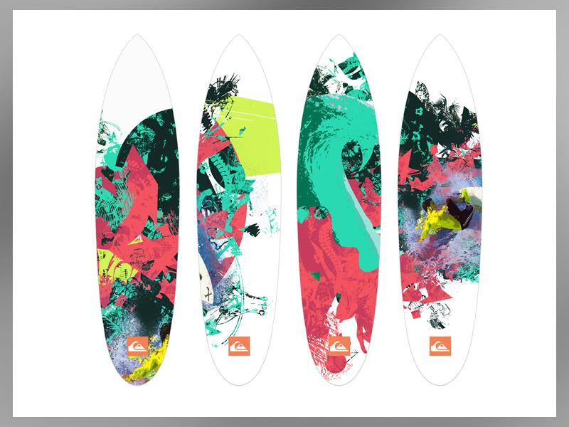
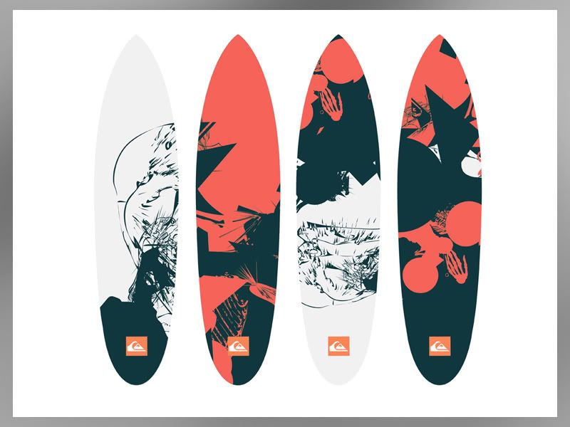
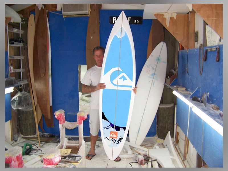
Just an idea for one of the designs in context, help get a sense of scale etc:
The idea of a skin is actually something completly new for surf boards. There may be a reason for this however with the affects of water and adhesive. But on the other hand you can get waterpoof/colourfast vinyl and have been able for years.
My thoughts on this though, was that instead of replacing the entire boards at 500 quid a shot, you could buy a skin at the tenth the cost and completly update the look of your board. An idea at least, whether it would work in context is debateable..
Just an idea for one of the designs in context, help get a sense of scale etc:
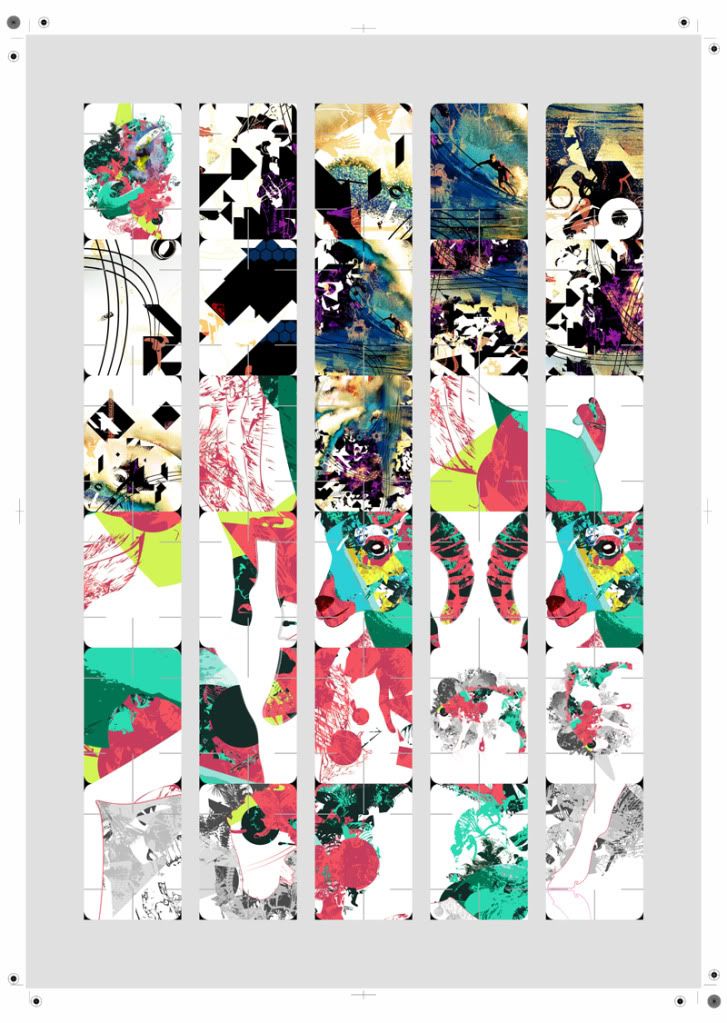
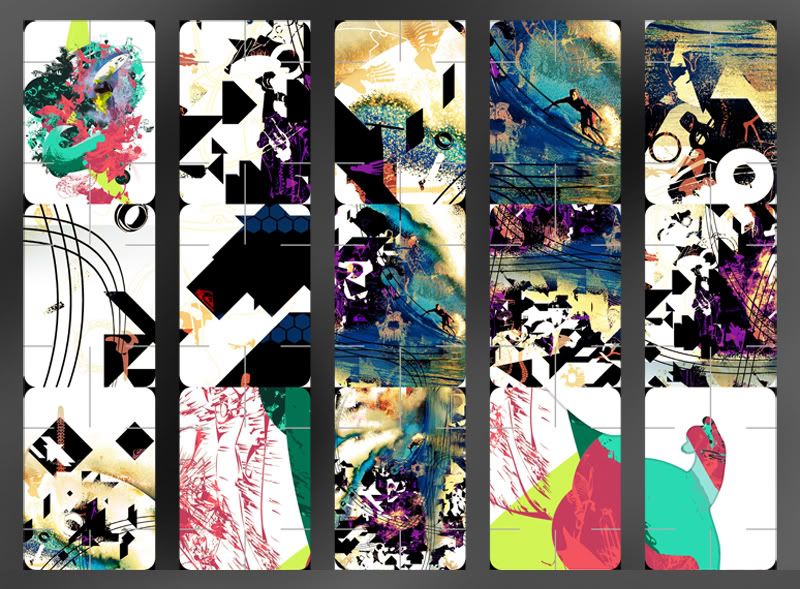
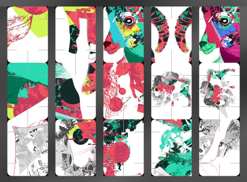
Quik Cards
A selection of cards with pre cut lines which alows the cards to be constructed in an unlimited number of ways.
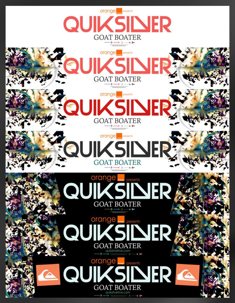
Banner Design
Below is the design for the banner to be displayed around the event. The banner brings the first real introduction of type into the designs. I chose to make the font quite modern in design and in keeping with past styles. QS' doesn't really have a set font that they use throughout and is regulary changed and updated. For me this was perfect as it left me to try a few possible ideas.
Other possible ideas/development
Other possible ideas/development
Monday, 15 November 2010
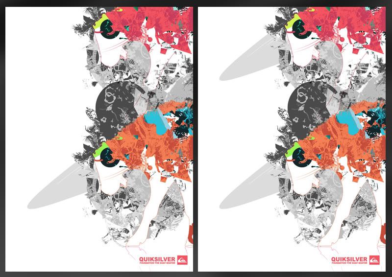
Poster Design III
The seperate posters that are not used for promotion but for sale and event dressing. These posters will be displayed around the event with the possibility of buying them as means to donate to charity.
There's lots of variations to each poster, some of which I've chosen to not to upload as theres literally too many. The ones I have put together can be seen below. I'll later pick 5 of these which will be used and taken forward to print or further development if needed.
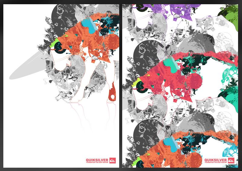
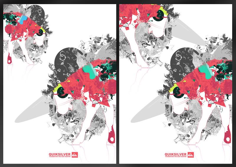
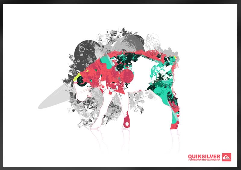
Bery clear that this image just isn't working with the others so it's getting thrown out:
There's lots of variations to each poster, some of which I've chosen to not to upload as theres literally too many. The ones I have put together can be seen below. I'll later pick 5 of these which will be used and taken forward to print or further development if needed.
Bery clear that this image just isn't working with the others so it's getting thrown out:
Subscribe to:
Posts (Atom)